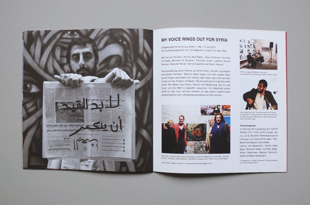
Project Info
Exhibition announcement material:
BOX Freiraum, As If, At Home
BOX Freiraum, As If, At Home
As If, At Home
Keyvisual and announcement material for the group exhibition
As If, At Home – Artists in Europe, 24 June – 31 October, 2016, at BOX Freiraum, Berlin.
The exhibition curated by Juriaan Benschop was accompanied by artist talks and collects various voices – personal and abstract, rooted in memory and the present – of 11 artists throughout the continent. Together they build a forum to contemplate the current changes in Europe, working in painting, sculpture, drawing, photography and video.
Exhibiting Artists: Mirosław Bałka, Norbert Bisky, Michaël Borremans, Irina Botea, Valérie Favre, Ali Kaaf, Lia Kazakou, Marie Lund, Šejla Kamerić, Flo Kasearu, and Sean Scully.
As If, At Home — Keyvisual design/layout
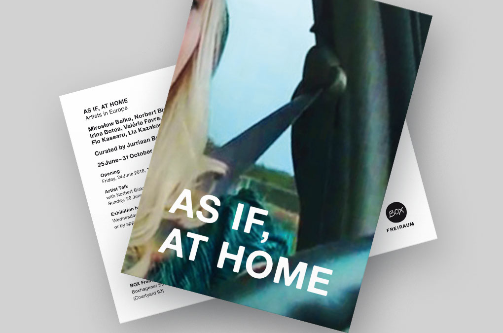
As If, At Home — Invitation/postcard design/layout
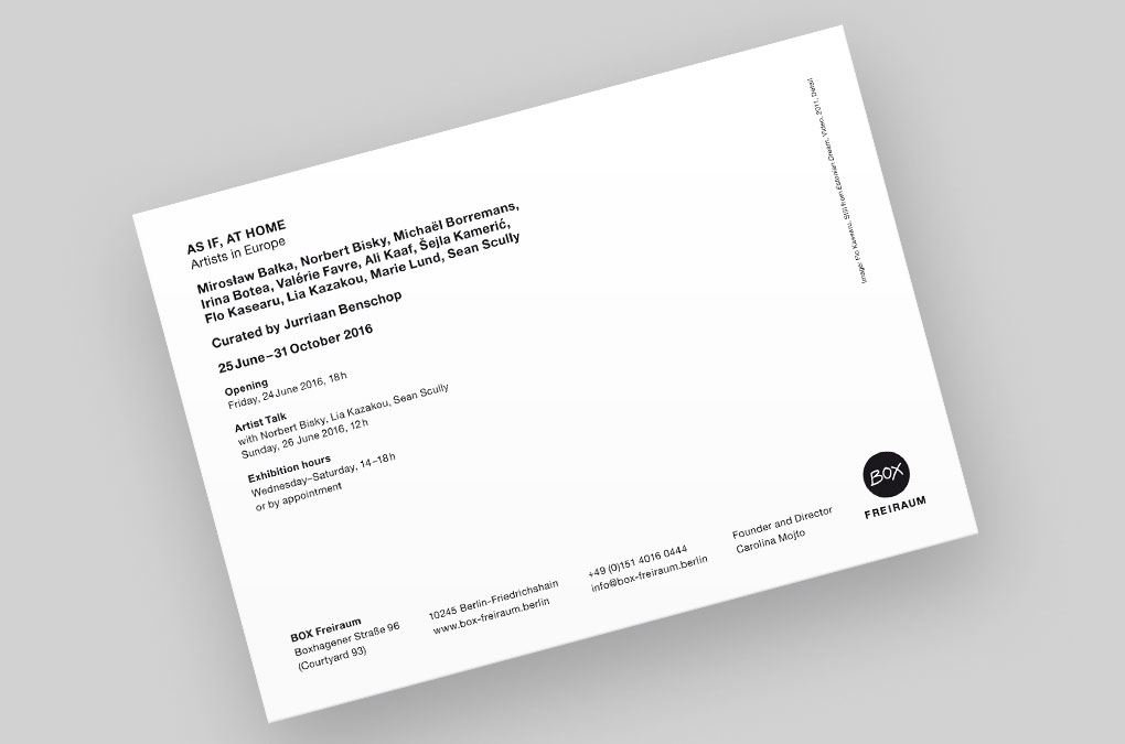
As If, At Home — Invitation/postcard(backside) design/layout
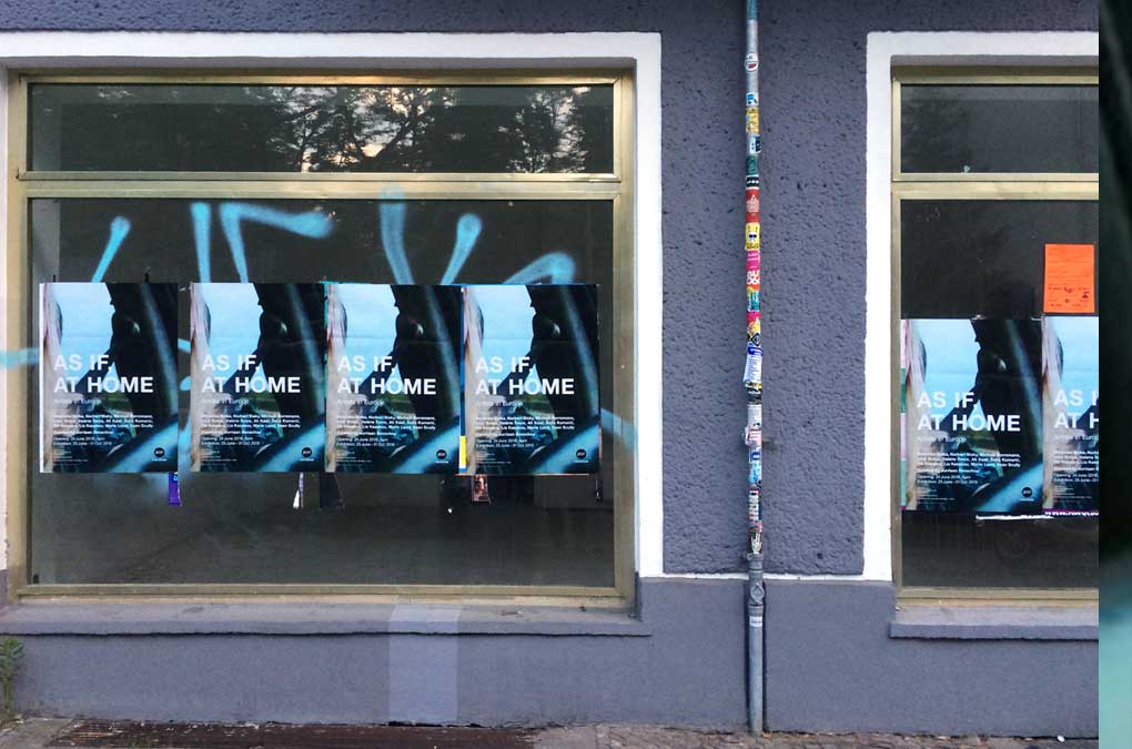
As If, At Home — Poster documentation
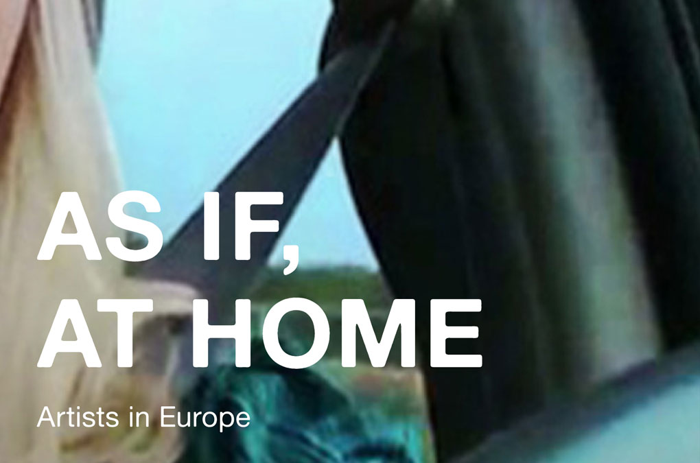
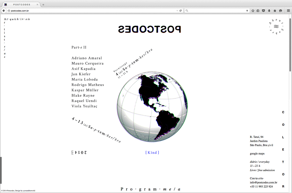
The keyvisual shows the typographically simple white title on a zoomed-in video still from Flo Kasearu’s Estonian Dream, 2011. By zooming in the motif, the image became an abstract placeholder linking the diverse artistic and cultural perspectives that encounter during the exhibition. For a distinctive recognition value the visual was applied to all announcement materials for the exhibition, e.g., poster, invitation/postcard, e-mail invite, website, facebook page.
Year: 2016
Language: EN
Design/Layout and Implementation: Chan-Young Ramert
In coordination with Juriaan Benshop, Carolina Mojto, and Sophie Jung.
Links:
box-freiraum.berlin
artberlin.de
Year: 2016
Language: EN
Design/Layout and Implementation: Chan-Young Ramert
In coordination with Juriaan Benshop, Carolina Mojto, and Sophie Jung.
Links:
box-freiraum.berlin
artberlin.de
Project Info
Booklet:
Thinking Beyond “Crisis”
Thinking Beyond “Crisis”
Thinking Beyond “Crisis”
The booklet was published on the occasion of the symposium
Thinking Beyond “Crisis”: Historical, artistic and media approaches to contemporary migration in Europe,
May 17th 2016, BOX Freiraum, Berlin.
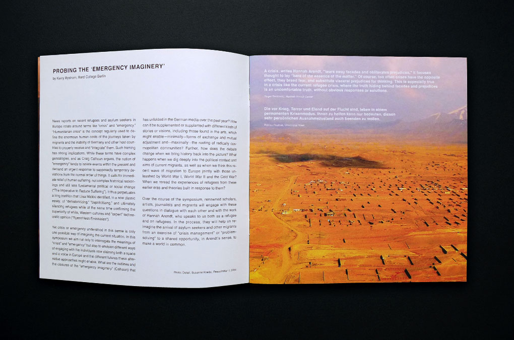
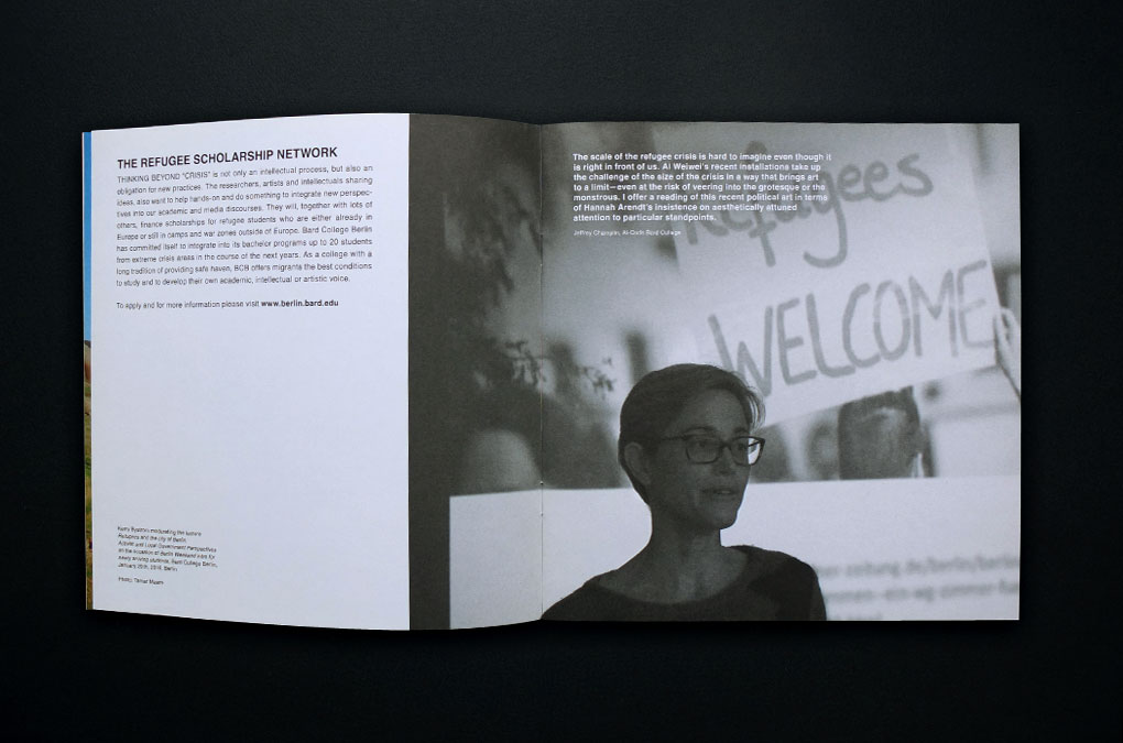
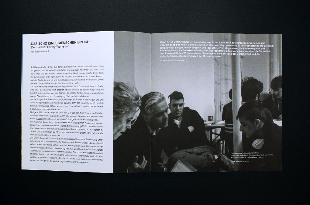
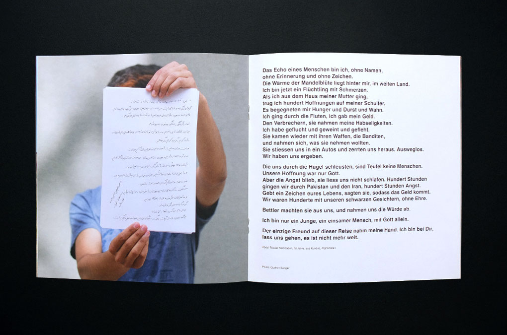
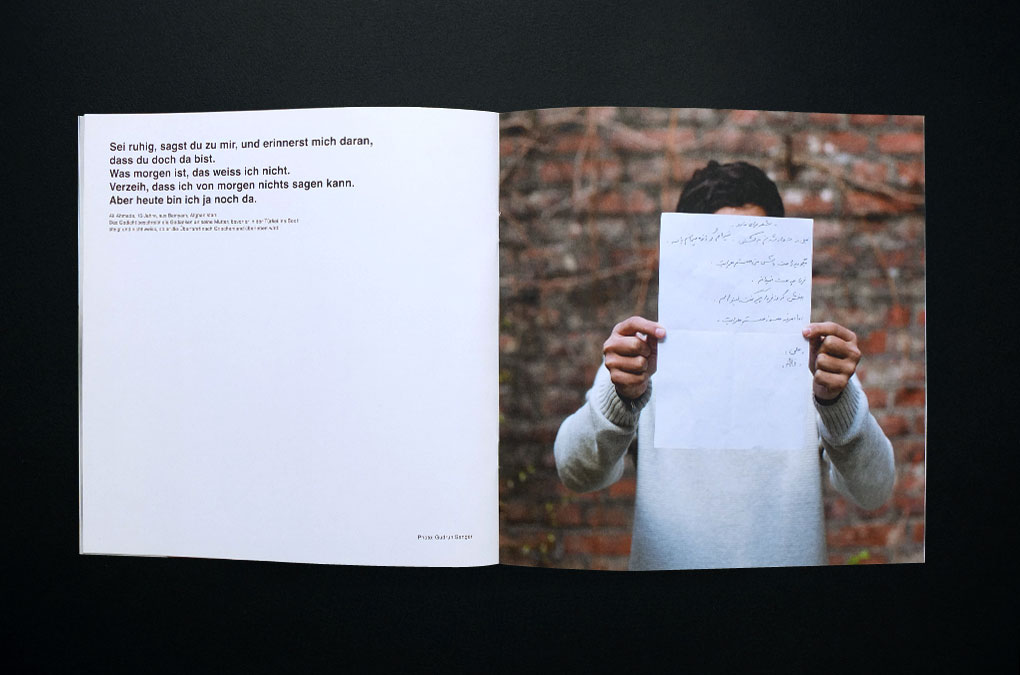
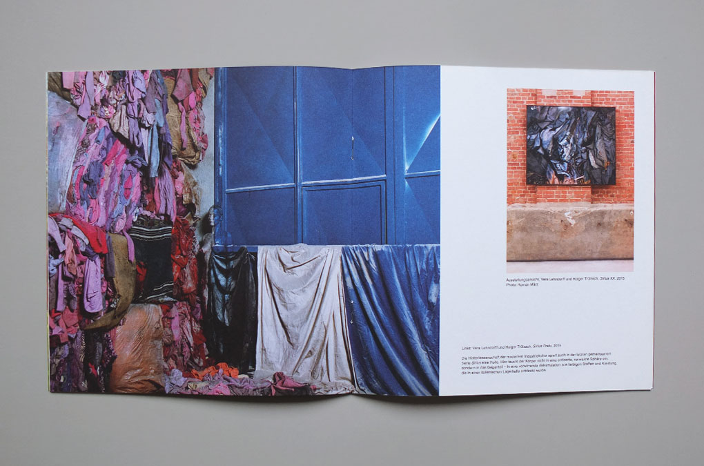
The symposium was a cooperation between Bard College Berlin, the Centre for Contemporary History (Zentrum für Zeithistorische Forschung Potsdam), the Hannah Arendt Center at Bard College, BOX Freiraum and ‘wir machen das’. It combines historical, artistic and media approaches to contemporary migration in Europe with the attempt to overcome the “crisis”- and “emergency”-imaginary that is dominating the discourse. Accompanied by the exhibition ‘Susanne Koelbl, PeaceInWar’ and a poetry reading with poems written by young refugees who participated in the BOX Freiraum poetry workshop, it was also the launch event for a Scholarship Network that will support Bard College Berlin in giving safe haven to up to 20 refugee students.
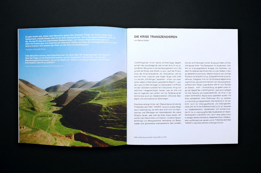
The unobtrusive design and layout follow the publication design of BOX Freiraum—Einblicke 2015 that was conceived in 2015. Carried by images of Susanne Koelbl’s PeaceInWar series and statements of participating symposium speakers, it contains informations and texts about the programm and the symposium itself, brief introductions of the cooperating institutions, and a selection of the poems that were presented during the poetry reading. Taking the attempt serious to overcome the “crisis”- and “emergency”-imaginary, Koelbl’s landscape photography and the portraits of the young poets (photographed by Gudrun Senger) oppose the common visual media display of countries at war and the people who fled them.
The symposium was a cooperation between Bard College Berlin, the Centre for Contemporary History (Zentrum für Zeithistorische Forschung Potsdam), the Hannah Arendt Center at Bard College, BOX Freiraum and ‘wir machen das’. It combines historical, artistic and media approaches to contemporary migration in Europe with the attempt to overcome the “crisis”- and “emergency”-imaginary that is dominating the discourse. Accompanied by the exhibition ‘Susanne Koelbl, PeaceInWar’ and a poetry reading with poems written by young refugees who participated in the BOX Freiraum poetry workshop, it was also the launch event for a Scholarship Network that will support Bard College Berlin in giving safe haven to up to 20 refugee students.
The unobtrusive design and layout follow the publication design of BOX Freiraum—Einblicke 2015 that was conceived in 2015. Carried by images of Susanne Koelbl’s PeaceInWar series and statements of participating symposium speakers, it contains informations and texts about the programm and the symposium itself, brief introductions of the cooperating institutions, and a selection of the poems that were presented during the poetry reading. Taking the attempt serious to overcome the “crisis”- and “emergency”-imaginary, Koelbl’s landscape photography and the portraits of the young poets (photographed by Gudrun Senger) oppose the common visual media display of countries at war and the people who fled them.
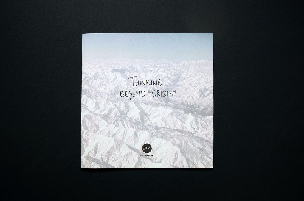
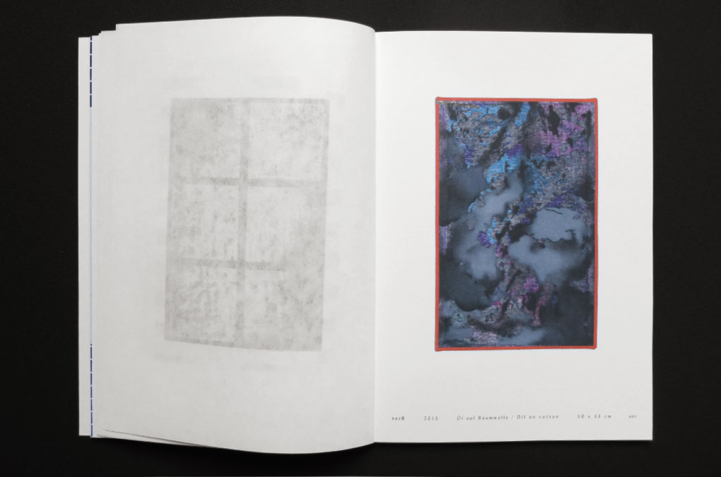
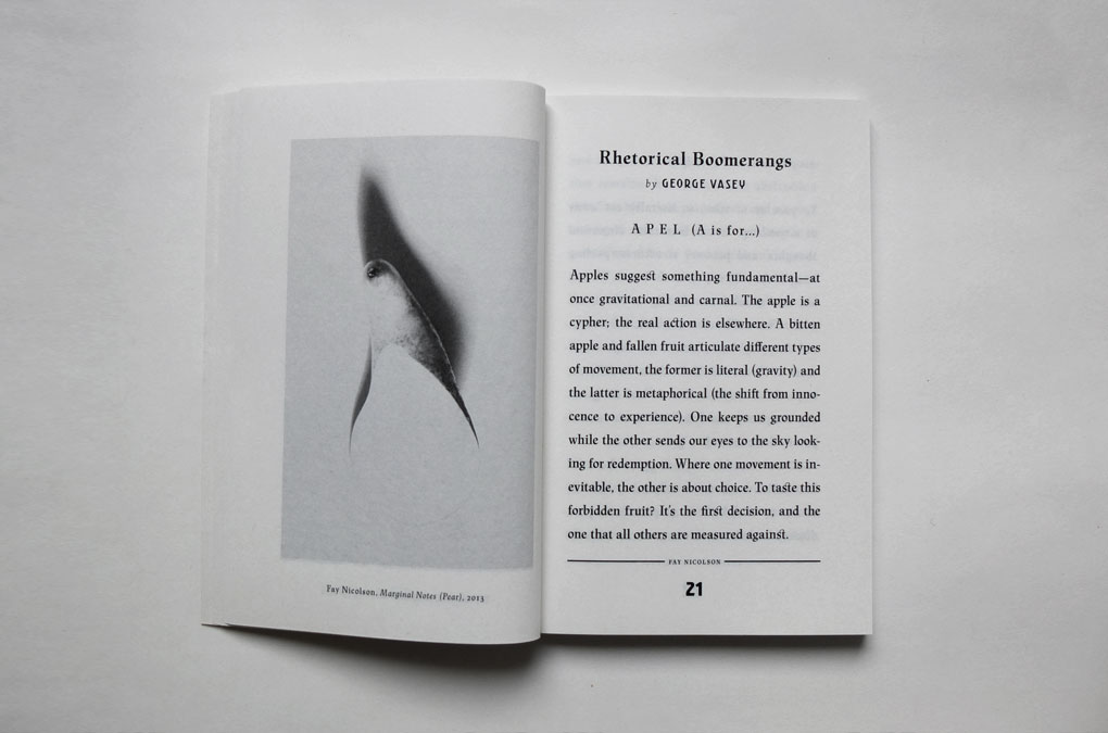
Thinking Beyond Crisis, Cover and title design (Image: Susanne Koelbl, PeaceInWar 4)
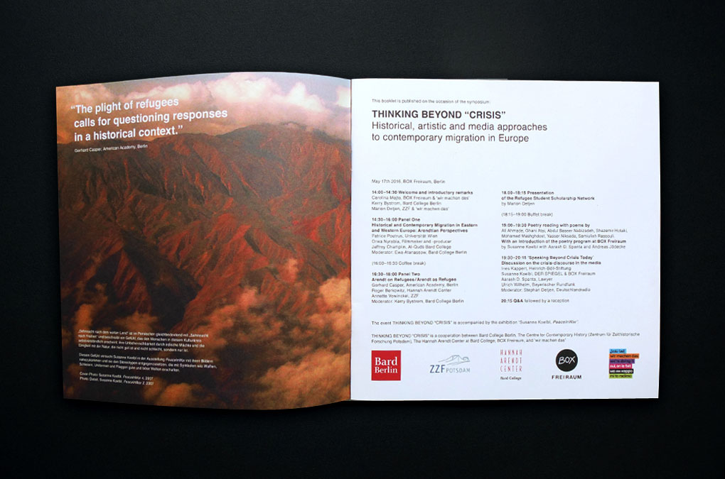
Thinking Beyond Crisis, Design/layout, programme
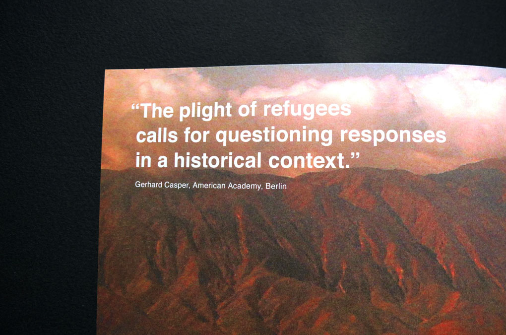
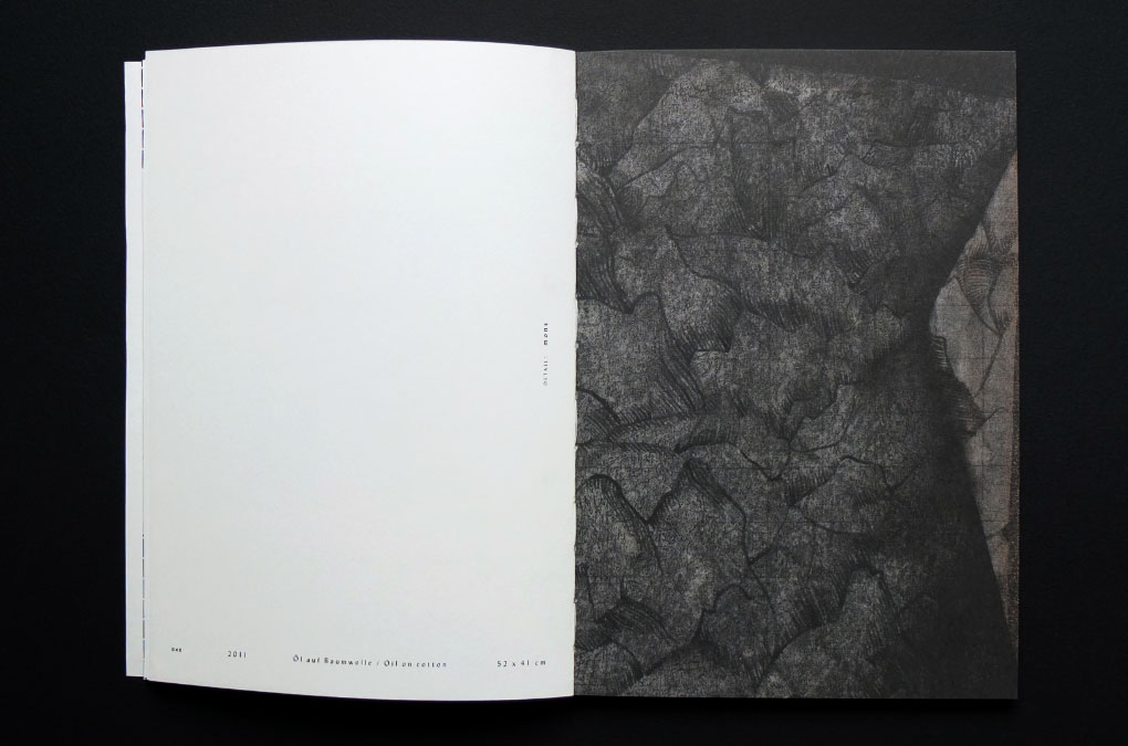
Thinking Beyond Crisis, Design/layout example, detail
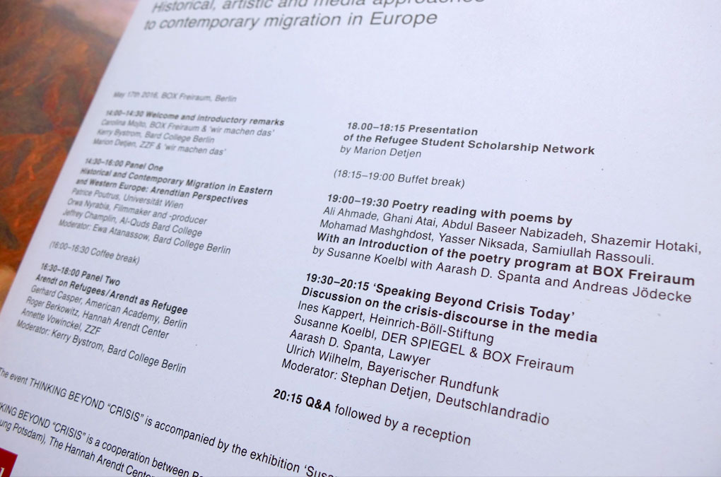
Thinking Beyond Crisis, Design/layout example, detail
Thinking Beyond Crisis, Design/layout example
Thinking Beyond Crisis, Design/layout example
Thinking Beyond Crisis, Design/layout example
Thinking Beyond Crisis, Design/layout example
Thinking Beyond Crisis, Design/layout example
Thinking Beyond Crisis, Design/layout example
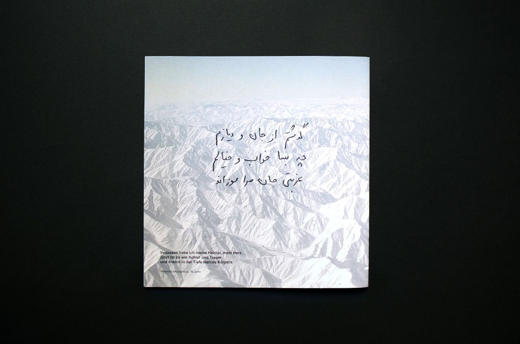
Thinking Beyond Crisis, Back cover design (handwritten poem by Mohamad Mashghdost)
Year: 2016
Language: EN, DE, FA
Specs: 21×21 cm, 24 pages, Colour, Softcover, 2-fold stapled
Editor: BOX Freiraum, Berlin
Editing: Marion Detjen, Susanne Koelbl, Carolina Mojto
Photography: Khalid Alaboud, Andreas Jödecke, Susanne Koelbl, Tamar Maare, Gudrun Senger
Design and Art direction: Chan-Young Ramert
Print and Binding: Laserline Berlin
Edition of 1000
Available at box-freiraum.berlin
Project Info
Artist book:
Emanuel Röhss, Location Scout
Emanuel Röhss, Location Scout
Location Scout
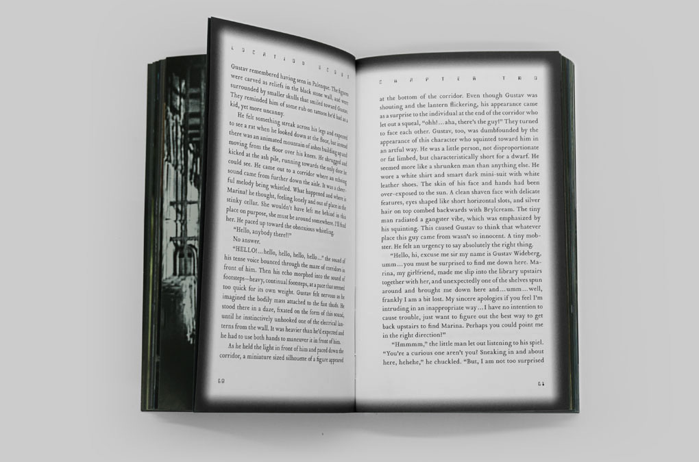
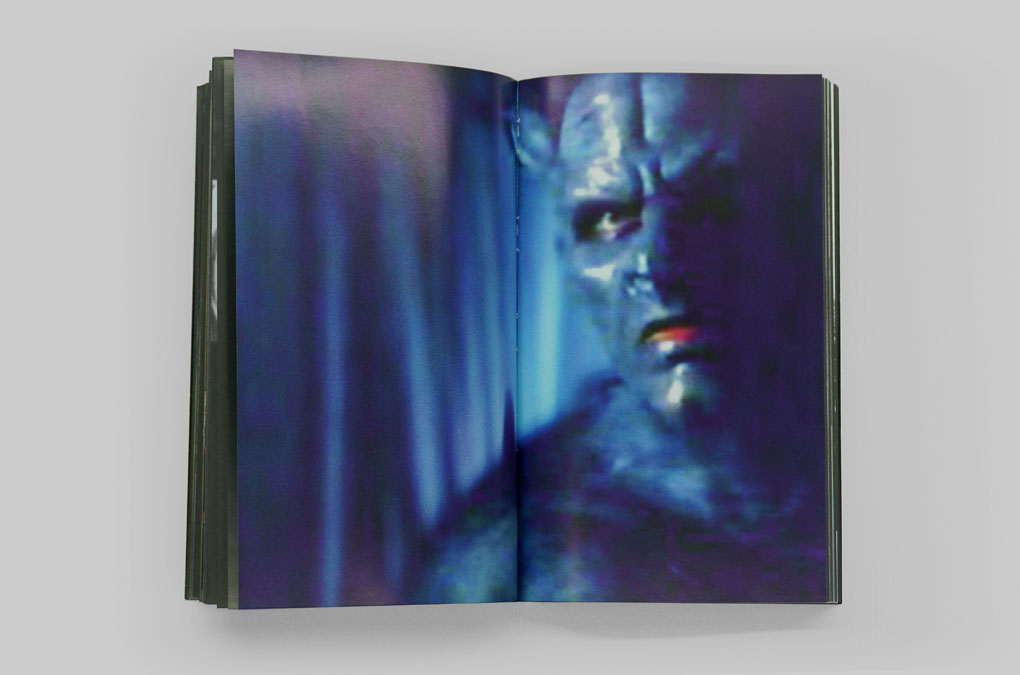
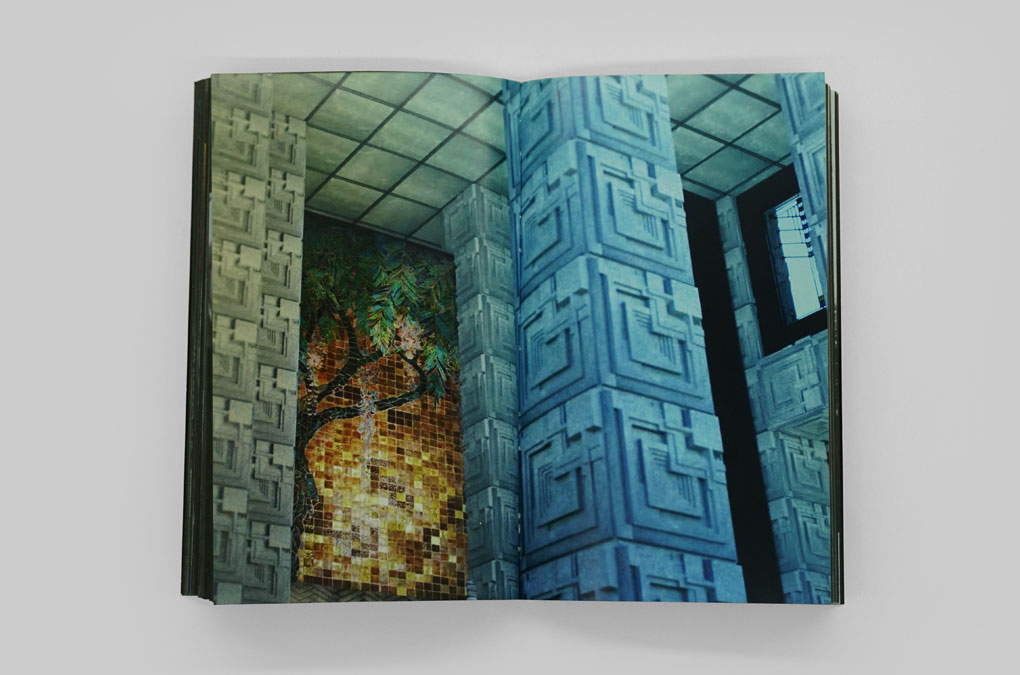
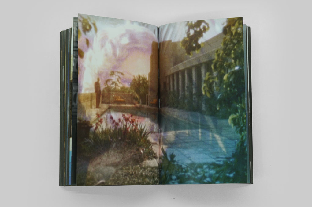
Location Scout is an artist book by Emanuel Röhss and has been conceived as part of his project commenced in early 2015, that addresses the interrelation between the Ennis House (Frank Lloyd Wright, 1924), and the Hollywood movie industry in particular, and the production of pop culture at large. The book is intended to operate as an artwork in itself, not an index, catalogue or re-iteration of other artwork within Röhss’ Ennis House project, yet its consumption and distribution is that of a book. It contains an array of imagery that the artist has been hoarding as part of his research of the mediation of the Ennis House through movies, TV-shows, music videos, computer games, and commercial advertising. Intertwined with the imagery is a short story written by Röhss. It revolves around a Swedish-American couple, featuring the artist’s girlfriend and himself as protagonists. Breaking into the Ennis House in Los Angeles, they enter an oneiric state and are confronted with a number of fantastical scenarios and challenges that they’ve got to overcome in order to unwind the mystery and find the secrets kept by the house…
Under the umbrella of Röhss’ Ennis House project Location Scout has been proceeded by three exhibitions, the initial one within the group show Ytterstad at Johan Berggren Gallery (Malmö, 2015), followed by two solo presentations: The Night Holds Terror at SALTS (Basel, 2015–16) and Invitation to Love at Thomas Duncan Gallery (Los Angeles, 2016).
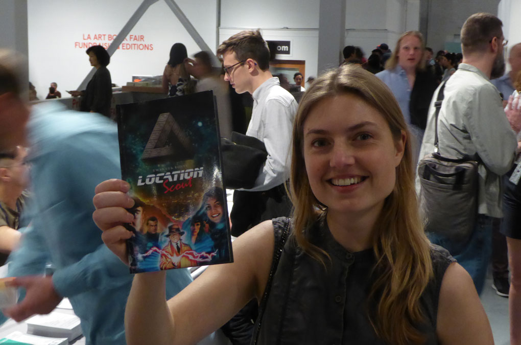
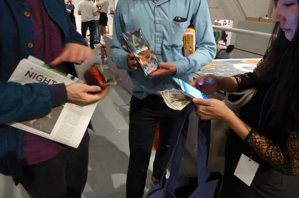
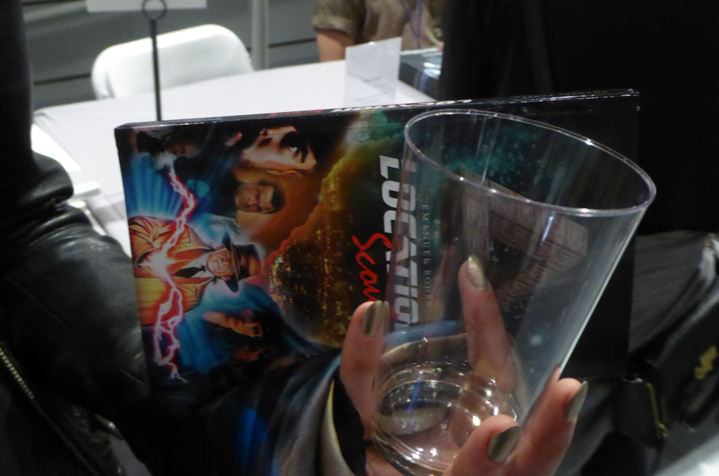
The book was released and presented on the occasion of LA Art Book Fair, Los Angeles, 11–14 February 2016, The Geffen Contemporary at MOCA.
As the inaugural part of the programme for the exhibition MAD HORIZON, 24 September–4 December 2016, at Index, The Swedish Contemporary Art Foundation, Stockholm, Emanuel Röhss presented a performance based on his book Location Scout in collaboration with the musician Anne Gry Friis Kristensen and four actors.
Under the umbrella of Röhss’ Ennis House project Location Scout has been proceeded by three exhibitions, the initial one within the group show Ytterstad at Johan Berggren Gallery (Malmö, 2015), followed by two solo presentations: The Night Holds Terror at SALTS (Basel, 2015–16) and Invitation to Love at Thomas Duncan Gallery (Los Angeles, 2016).
The book was released and presented on the occasion of LA Art Book Fair, Los Angeles, 11–14 February 2016, The Geffen Contemporary at MOCA.
As the inaugural part of the programme for the exhibition MAD HORIZON, 24 September–4 December 2016, at Index, The Swedish Contemporary Art Foundation, Stockholm, Emanuel Röhss presented a performance based on his book Location Scout in collaboration with the musician Anne Gry Friis Kristensen and four actors.
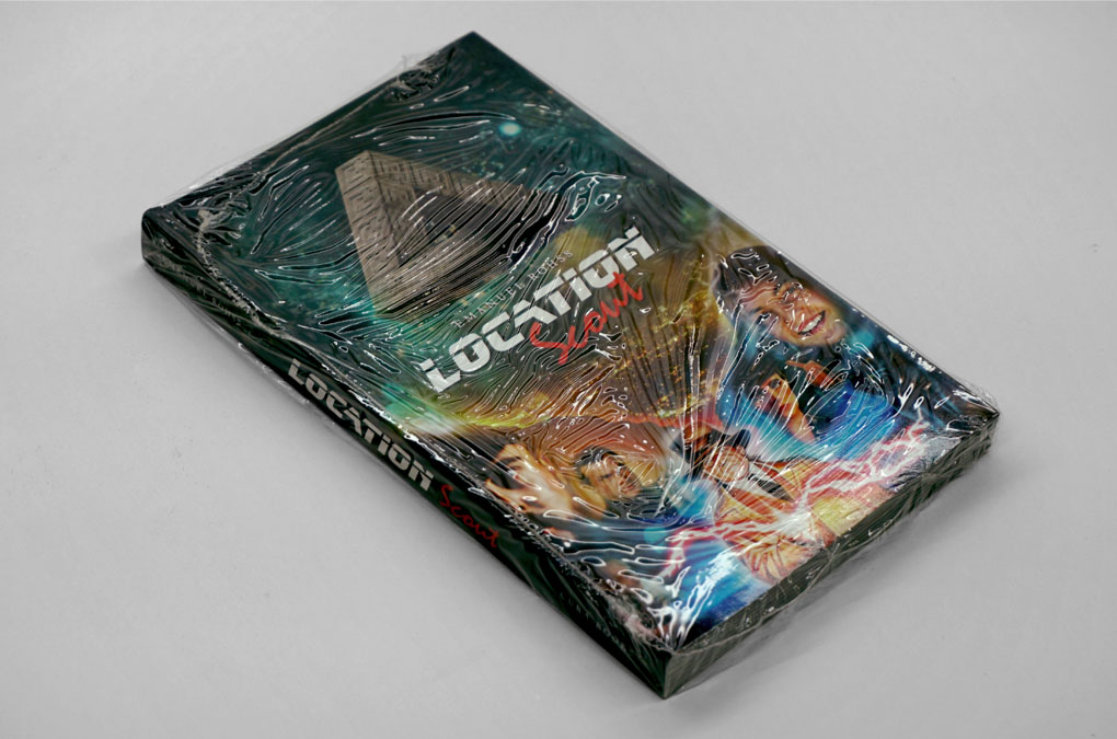
Location Scout, Cover and Title Design / Illustration (wrapped)
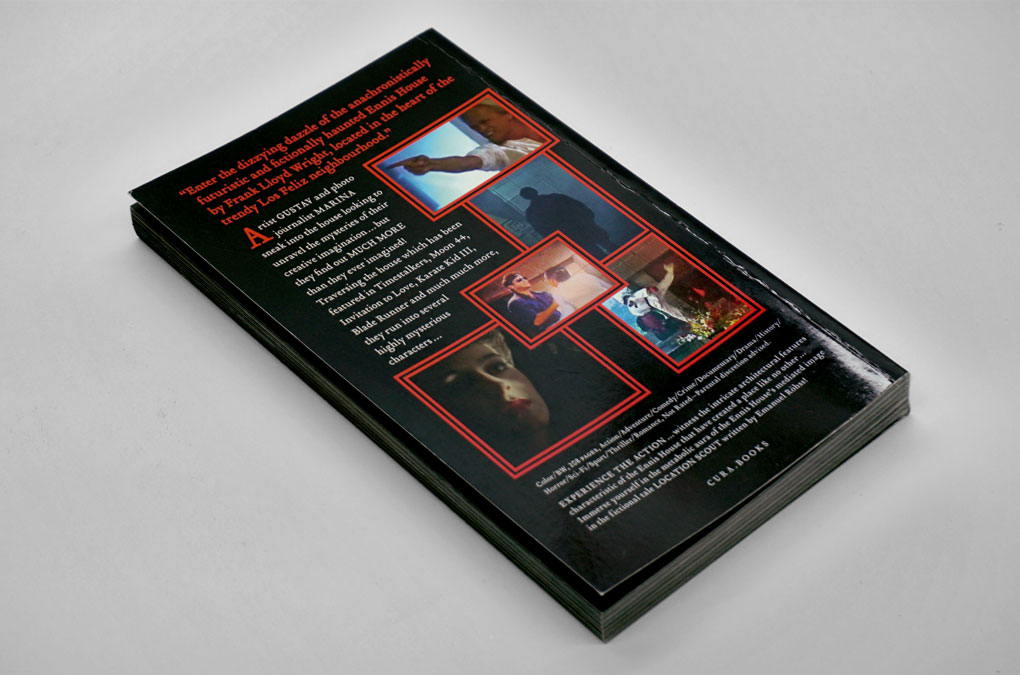
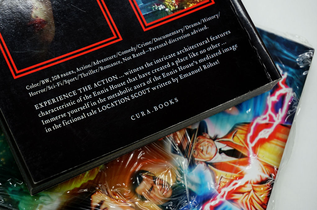
Location Scout, Back Cover Design
Location Scout, Detail: Cover/Back cover

Location Scout, Title Design/Title Page

Location Scout, Contents
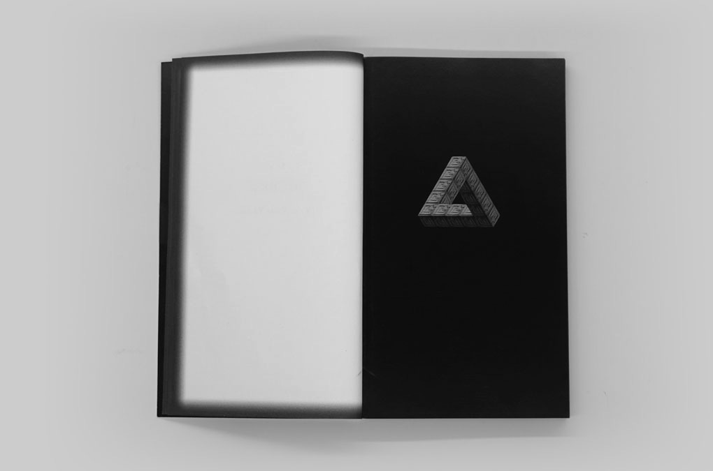
Location Scout, Keyvisual Design (working title: Ennis house triangle)

Location Scout, Layout example, Full bleed images

Location Scout, Typography layout/design, Chapter One

Location Scout, Design/layout example, Full bleed image

Location Scout, Design/layout example, Full bleed images

Location Scout, Design/layout example, Full bleed images
Location Scout, Typography layout/design, Chapter Two

Location Scout, Design/layout example, Full bleed image
Location Scout, Design/layout example, Full bleed image
Location Scout, Design/layout example, Full bleed image

Location Scout, Design/layout example, Full bleed images

Location Scout, Design/layout example, Full bleed images
Location Scout, Design/layout example, Full bleed images
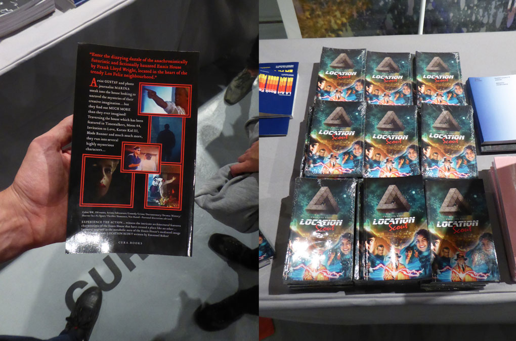
Location Scout, LA Art Book Fair documentation (photo: M. R.)
Location Scout, LA Art Book Fair documentation (photo: M. R.)
Location Scout, LA Art Book Fair documentation (photo: M. R.)
Location Scout, LA Art Book Fair documentation (photo: M. R.)
Complemented by further research and an additional investigation on design and typography that was used in the aforementioned sources, the image material is appropriated to form a suggestion for a new narrative, or reading, through its juxtaposition within the book. Drawing on the many tales, characters, elements and environments that have used the house as their setting, e.g. films and shows, the footage was re-worked in close collaboration and coordination, and made both literal appropriations as well as amalgamations of the origins. The artist’s approach was transferred onto the process of the design, layout, application of typography and color scheme.
Year: 2016
Language: EN
Specs: 12×20 cm, 208 pages, Colour and BW, Softcover, Sewn binding
Publisher: CURA.BOOKS, Rome
Conceived and written by: Emanuel Röhss
Cover illustration and Design: Chan-Young Ramert
Edited by: Lucy Chinen
Printed in Italy
Edition of 999 copies
ISBN-978-88-97889-25-0
Available at: curamagazine.com
Related projects → Ennis House Timeline
Project Info
Timeline/diagramme:
Emanuel Röhss, ENNIS HOUSE TIMELINE
Emanuel Röhss, ENNIS HOUSE TIMELINE
Ennis House Timeline
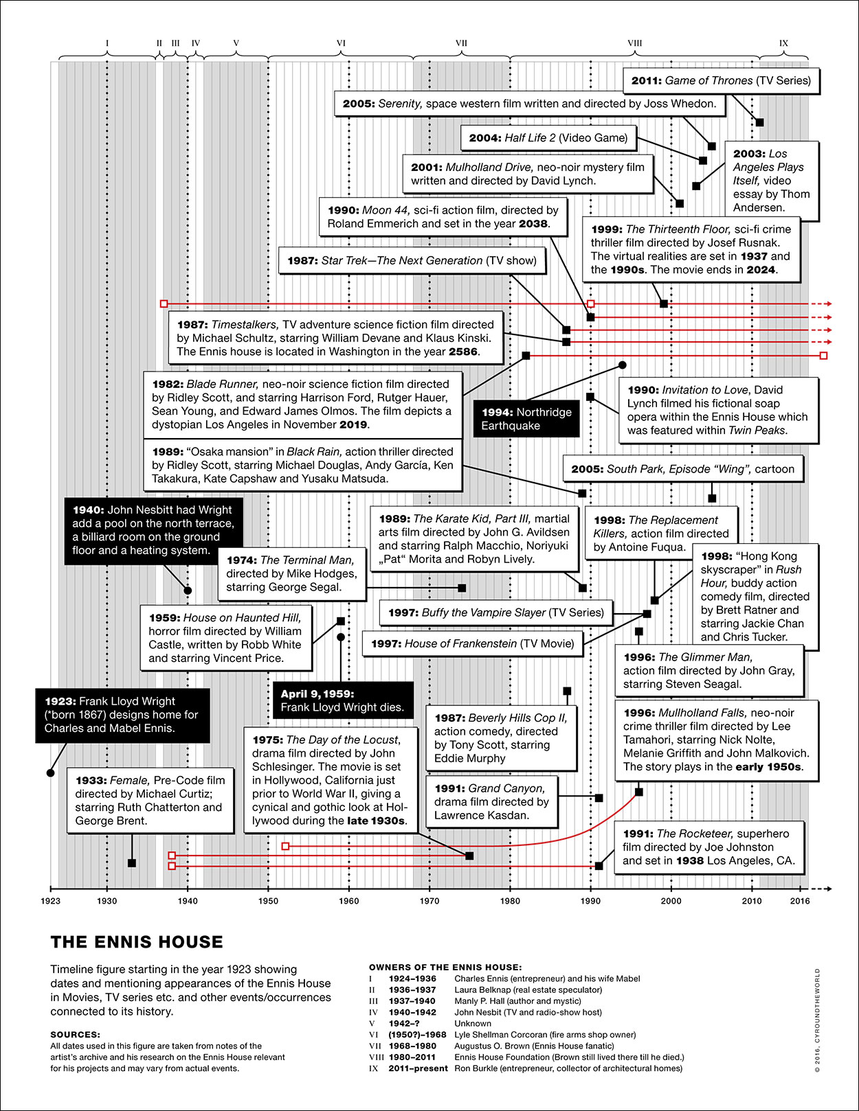
The Ennis House Timeline was conceived in conjunction with Emanuel Röhss’ project and artist book Location Scout.
The timeline figure starts in 1923, the year Frank Lloyd Wright designed the house for Charles and Mabel Ennis, and shows dates and mentioning appearances of the Ennis House in Movies and TV series, and other events/occurrences connected to its history.
All dates used in the figure are taken from notes of the artist’s archive and further research on the Ennis House relevant for his projects and may vary from actual events.
The timeline was published online at indexfoundation.se on the occasion of the exhibition MAD HORIZON, 24 September–4 December 2016, at Index, The Swedish Contemporary Art Foundation, Stockholm, where Emanuel Röhss presented a performance based on his book Location Scout in collaboration with the musician Anne Gry Friis Kristensen and four actors.
Year: 2016
Language: EN
Design: Chan-Young Ramert
Edited by Lucy Chinen and Chan-Young Ramert.
Related projects → Emanuel Röhss, Location Scout
Language: EN
Design: Chan-Young Ramert
Edited by Lucy Chinen and Chan-Young Ramert.
Related projects → Emanuel Röhss, Location Scout
Project Info
Artist book:
Yves Scherer,Whenever I get gloomy with the state of the world, …
Yves Scherer,Whenever I get gloomy with the state of the world, …
Whenever I get gloomy
with the state of the world,
I think about the arrivals gate
at Heathrow Airport
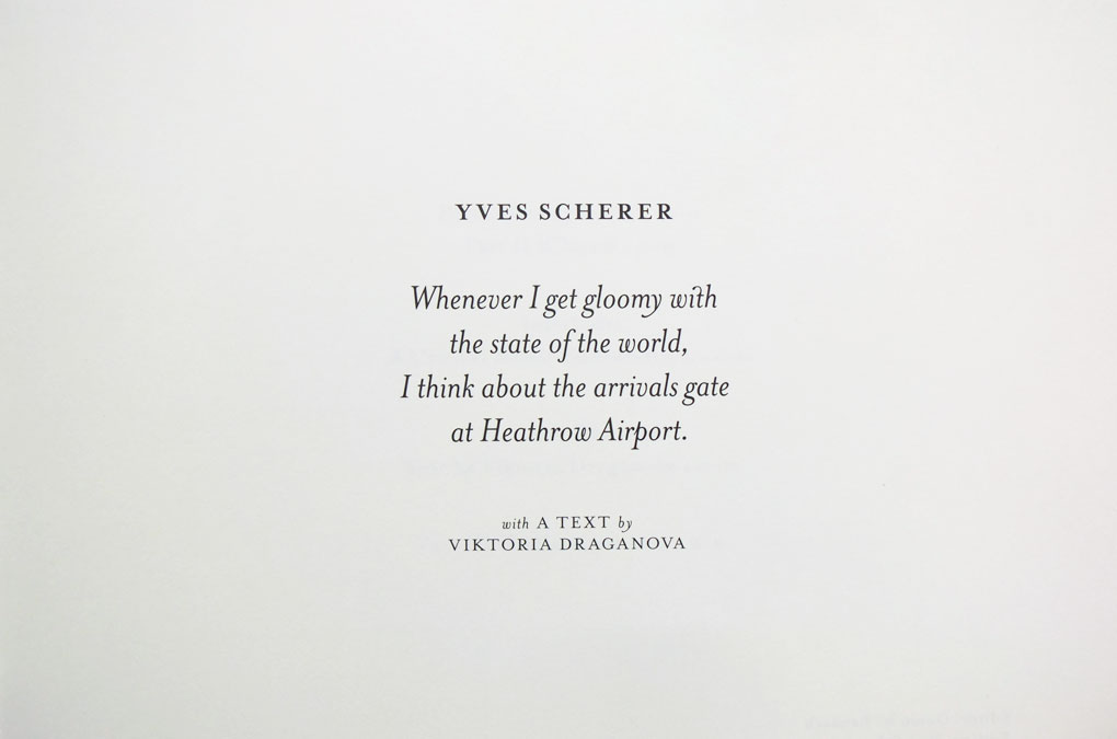
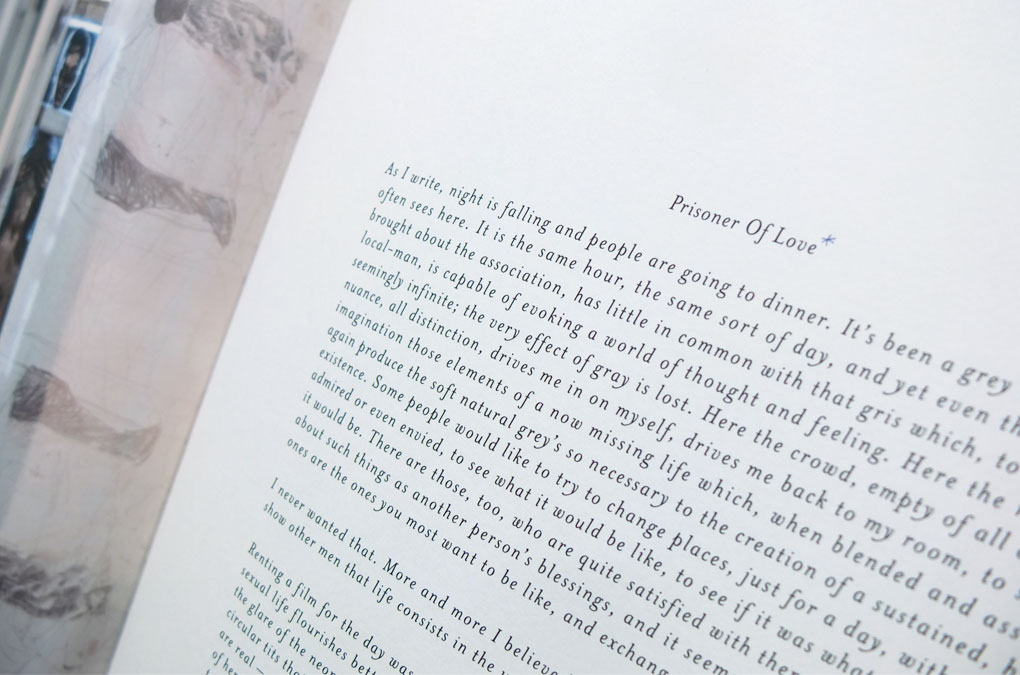
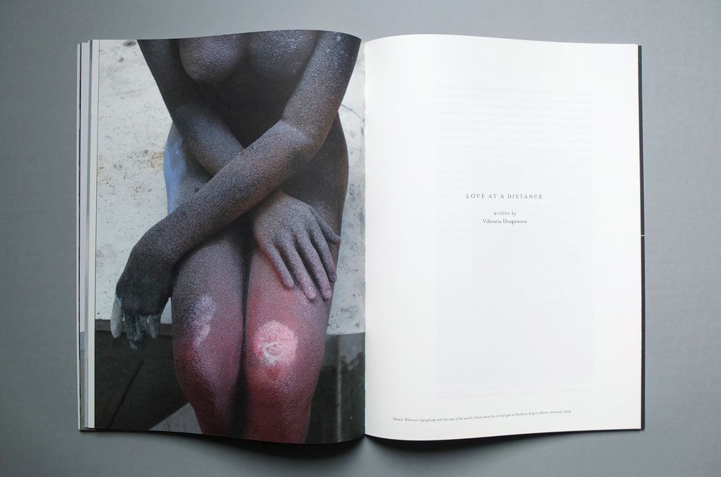
Yves Scherer’s book Whenever I get gloomy with the state of the world,
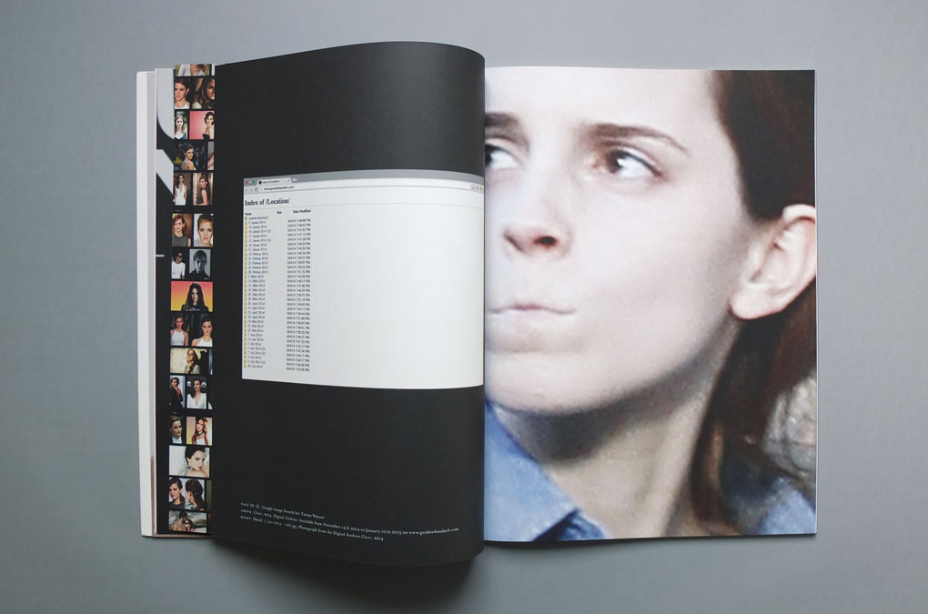
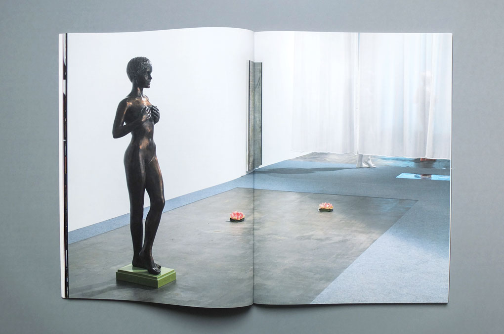
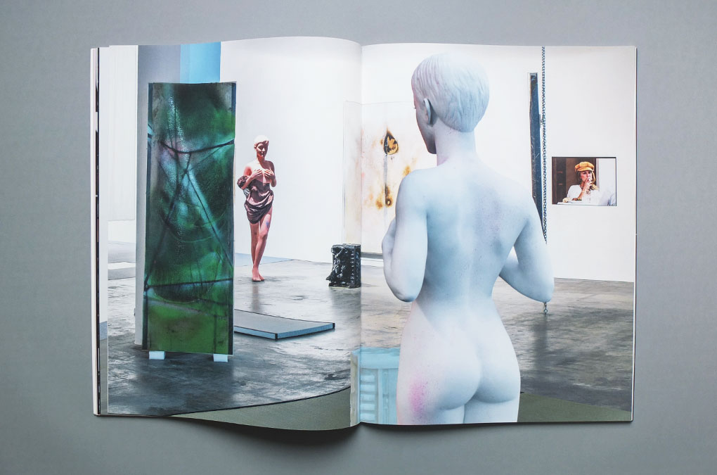
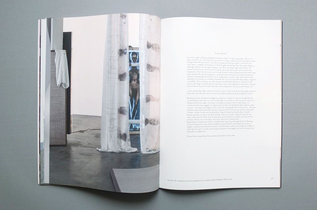
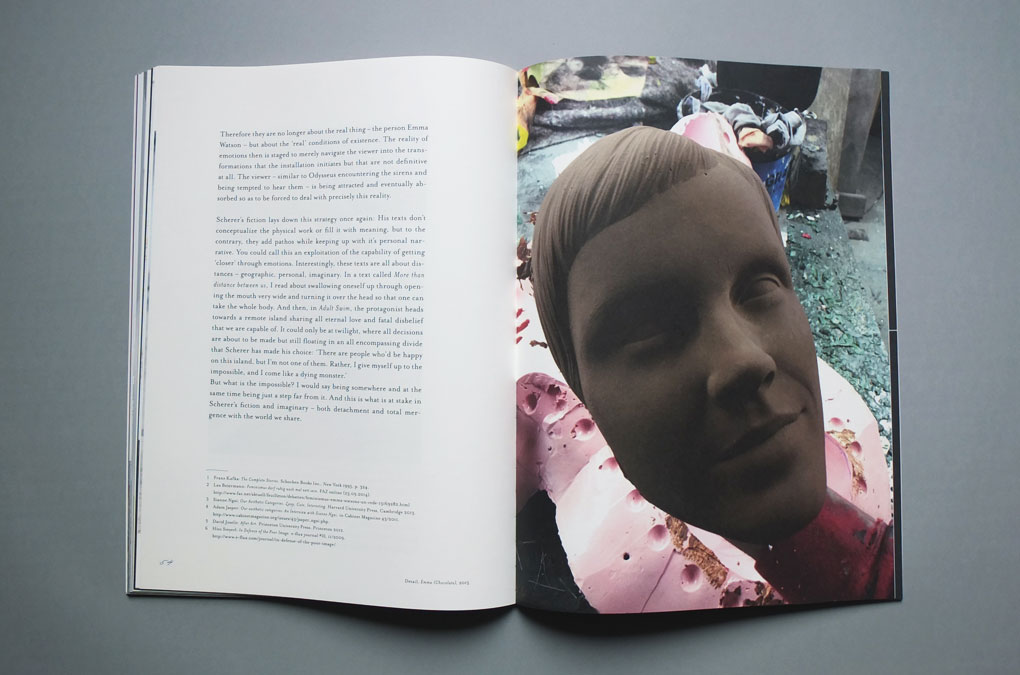
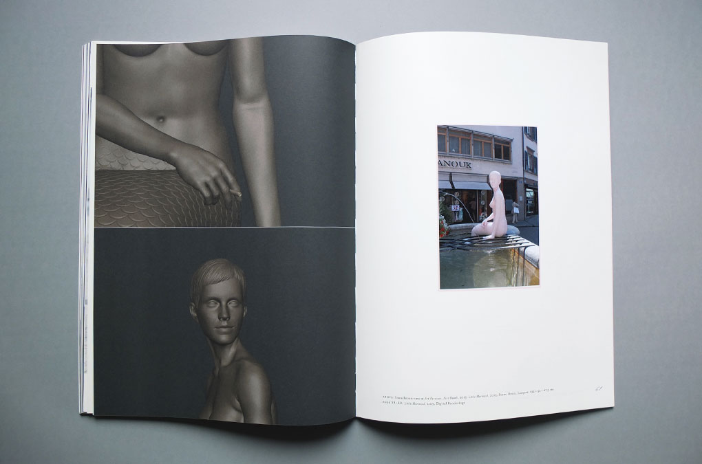
I think about the arrivals gate at Heathrow Airport was published on the occasion of the artist’s solo presentation Little Mermaid at the Art Parcours section of Art Basel 2015. The 3D printed mermaid sculpture was shown in Dreizackbrunnen, a fountain on Münsterberg and comprises a mermaid’s tail merged with the torso and head of actress Emma Watson. The 3D models on which the sculpture is based, are renderings of an ‘average’ Emma, constructed from multiple portraits that were found online.
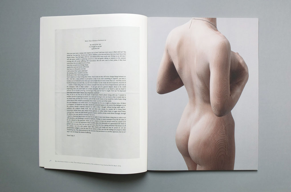
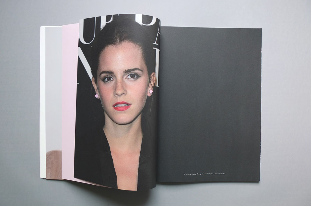
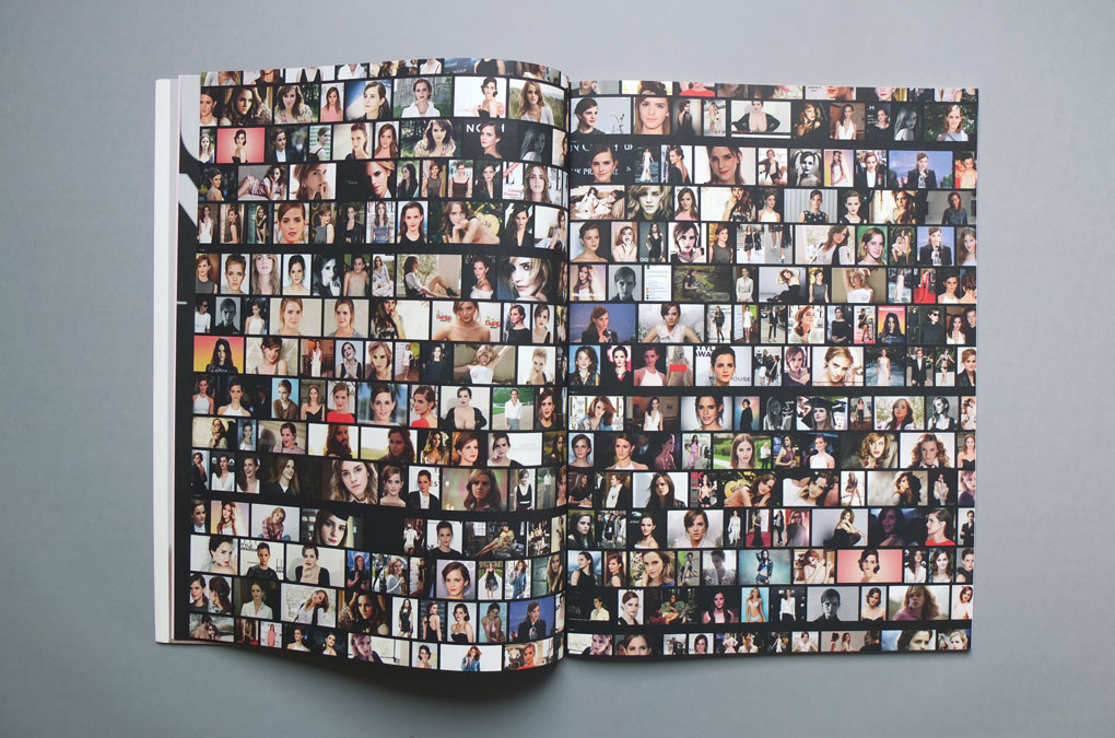
Emma Watson plays a significant role as a model and motif in Scherer’s work—the book emphasizes the obsessive character of his Emma sculptures and is a representative collection of photographic reproductions and documentations of his Emma sculptures and installations, intertwined with footage from his digital archive Closer, 2014. (For the duration of his solo exhibition Closer, 2014, at Guido W. Baudach, Berlin, Scherer had taken over the gallery’s website and turned it into an archive of high-resolution images showing Watson in her leisure time.)
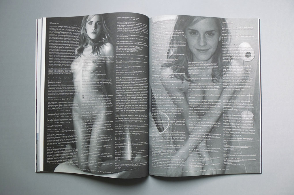
The book features a text by Viktoria Draganova and writings by the artist himself. A transcribed excerpt of a facebook group conversation where Yves Scherer’s art practice is evaluatively discussed, adds another layer onto his artistic engagement with the controversial use of online material.
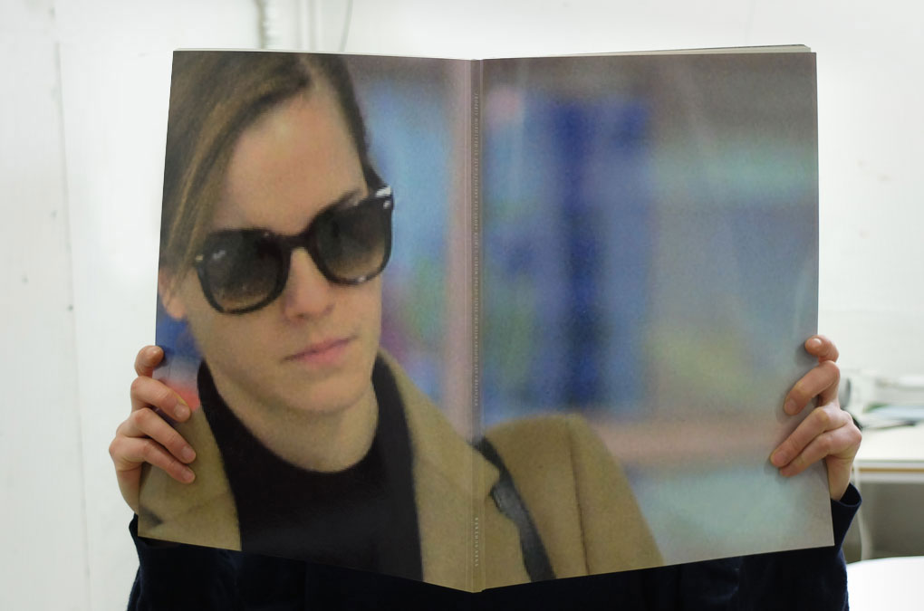
The large format reminds on glossy (fashion) magazines, repealed by the lack of a front cover-girl/celebrity and title, while a highly pixelated and blown-up image of Emma Watson wearing dark sunglasses is covering the backside of the cover. A decent interplay of visual opposites and contrasts runs through the whole publication appearance, staging Emma in a soft pink twilight zone between fetishism/obsession and love/romance.
Emma Watson plays a significant role as a model and motif in Scherer’s work—the book emphasizes the obsessive character of his Emma sculptures and is a representative collection of photographic reproductions and documentations of his Emma sculptures and installations, intertwined with footage from his digital archive Closer, 2014. (For the duration of his solo exhibition Closer, 2014, at Guido W. Baudach, Berlin, Scherer had taken over the gallery’s website and turned it into an archive of high-resolution images showing Watson in her leisure time.)
The book features a text by Viktoria Draganova and writings by the artist himself. A transcribed excerpt of a facebook group conversation where Yves Scherer’s art practice is evaluatively discussed, adds another layer onto his artistic engagement with the controversial use of online material.
The large format reminds on glossy (fashion) magazines, repealed by the lack of a front cover-girl/celebrity and title, while a highly pixelated and blown-up image of Emma Watson wearing dark sunglasses is covering the backside of the cover. A decent interplay of visual opposites and contrasts runs through the whole publication appearance, staging Emma in a soft pink twilight zone between fetishism/obsession and love/romance.
Whenever I get gloomy…, Cover
Whenever I get gloomy…, Title page, detail
Whenever I get gloomy…, Design/layout example
Whenever I get gloomy…, Design/layout example
Whenever I get gloomy…, Design/layout example
Whenever I get gloomy…, Design/layout example
Whenever I get gloomy…, Design/layout example
Whenever I get gloomy…, Design/layout example
Whenever I get gloomy…, Design/layout example
Whenever I get gloomy…, Design/layout example, detail
Whenever I get gloomy…, Design/layout example, detail
Whenever I get gloomy…, Design/layout example
Whenever I get gloomy…, Design/layout example, detail
Whenever I get gloomy…, Design/layout example
Whenever I get gloomy…, Design/layout example, detail
Whenever I get gloomy…, Design/layout example
Whenever I get gloomy…, Design/layout example
Whenever I get gloomy…, Design/layout example, detail, pagination
Whenever I get gloomy…, Spine
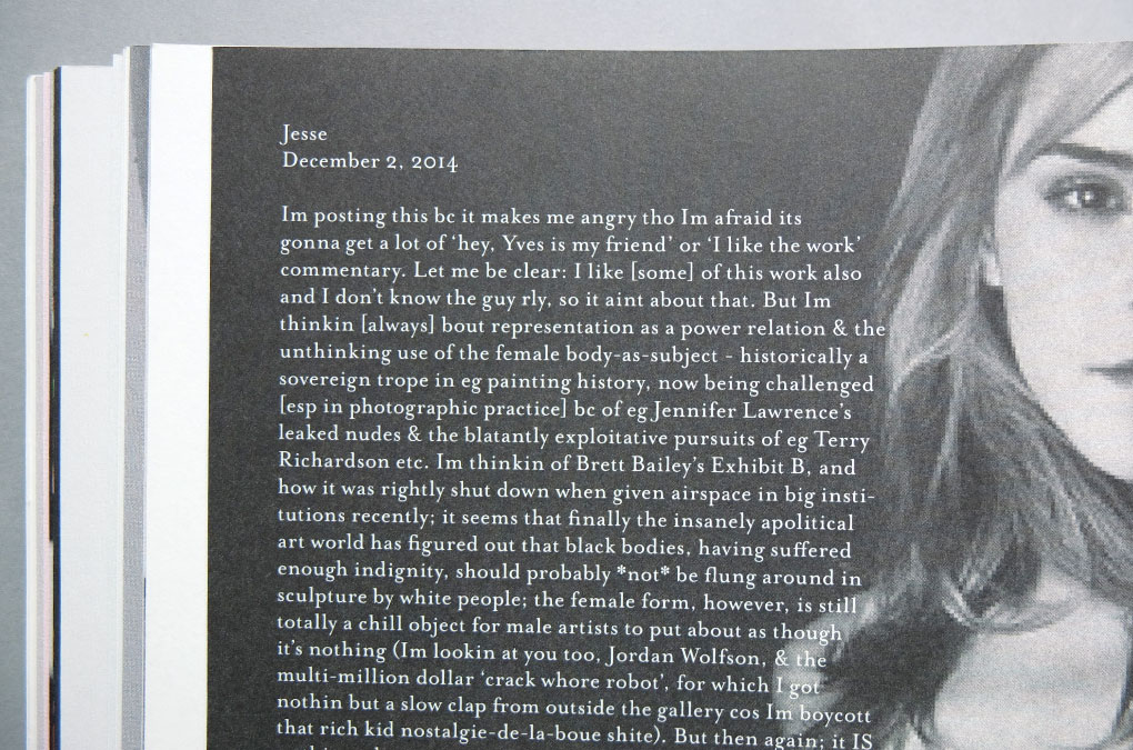
“ […] Today celebrities have lost their claim to privacy to an unprecedented extent. But whilst traditional and publicist-controlled channels still project an image of glamour and fame mostly, the darker places of the net and paparazzi do their best to show celebrities as people with bad habits and dumb choices. As people just like ourselves. That this paradigm goes very far was proven with last year’s The Fappening (a portmanteau of the slang ‘fap’, meaning masturbation, and the 4chan’s, It’s Happening meme), the event of hacking accounts of celebrities such as Jennifer Lawrence, Rihanna or Kim Kardashian and releasing nude images they’ve taken with their phones. Just after her speech at the UN in her new role as Goodwill Ambassador for female rights, Emma Watson, already one of the most scrutinized celebrities on the Internet, has been threatened with a nude photo leak too. Although this turned out to be a hoax, the parallel prosumer activity of posting fake nude images of famous, mostly female people – collaging the head of the respective star onto another person’s body – exists for several years longer than the leaks.
[…]
We could understand this as fan fiction turned DYI porn, and any of the Emma figures as a downloaded voyeuristic experience. The figures show the same fetishism and obsession with an idol, together with a definitely instrumental approach towards the female body and a down-graded criticality towards gender questions. But contrary to online porn, Scherer’s figures appear almost shy and their material realization seems to decelerate or slow down the velocity of the virtual. These figures are retro and it feels as if the whole talk about love and the attached pathos is outdated as well; irrelevant to the current state of the world. Scherer opts for a classical form that is neither symbolically hyped up, nor, as true for minimalism, cooled down. Rather, these sculptures borderline kitsch, with all its freedom of formal experimentation and content excess. […] ”
Excerpts from Viktoria Draganova, Love at a Distance,
published in Yves Scherer, Whenever I get gloomy with the state of the world,
I think about the arrivals gate at Heathrow Airport, p.49/51, Berlin, 2015
Year: 2015
Language: EN
Specs: 27×36 cm, 64 pages, Colour, Softcover, Sewn binding
Editor: Guido W. Baudach
Editing: Yves Scherer
Text Contributions: Viktoria Draganova
Design: Chan-Young Ramert
Copy Editor: Robin Cameron, Sebastian Lloyd Rees
Photography: Gunnar Meier, Roman März, Yves Scherer, Jessica Walters
3D Artist: Ryan Oley
Print and Binding: Europrint Medien, Berlin
Edition of 300 copies
Each signed and numbered by the artist
Available at guidowbaudach.com
Project Info
Booklet:
BOX Freiraum
BOX Freiraum
BOX Freiraum
BOX Freiraum is literally a ‘free’ space on a mental and real level. It shows art exhibitions and organizes cultural events, that involve current questions about our society to evoke open-minded debates and discussions. The programme contains readings, screenings, workshops, and concerts. Carolina Mojto, initiator and director of BOX Freiraum turned the 400 m² areal in Berlin Friedrichshain (that used to be a horse stable) into a unique platform and centre for encounter of art and culture.
BOX Freiraum—Einblicke 2015, was published as a booklet with retrospective insights on BOX projects and exhibitions. A design and layout was created to refine and carry the visual identity and appearance of BOX Freiraum in printed matter that was already rudimentarily present on the BOX Freiraum website. To be easily adoptable for future publications and brochures an underlying basic raster was applied, as well as pre-defined typographic character styles and sizes.
BOX Freiraum—Einblicke 2015, was published as a booklet with retrospective insights on BOX projects and exhibitions. A design and layout was created to refine and carry the visual identity and appearance of BOX Freiraum in printed matter that was already rudimentarily present on the BOX Freiraum website. To be easily adoptable for future publications and brochures an underlying basic raster was applied, as well as pre-defined typographic character styles and sizes.
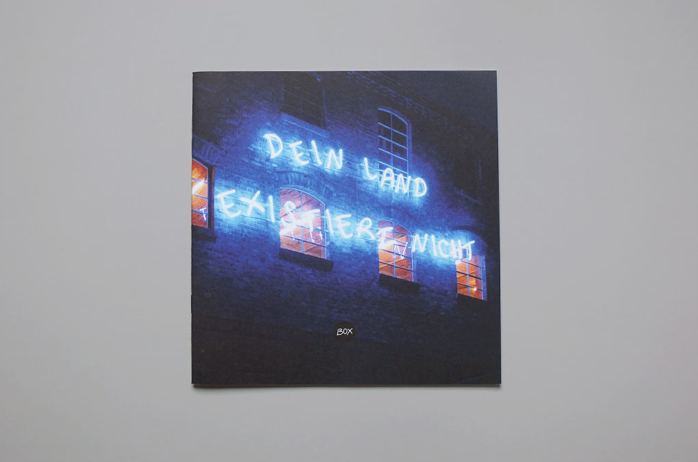
BOX Freiraum – Einblicke 2015, Cover design (image: Libia Castro & Ólafur Ólafsson, Dein Land existiert nicht)
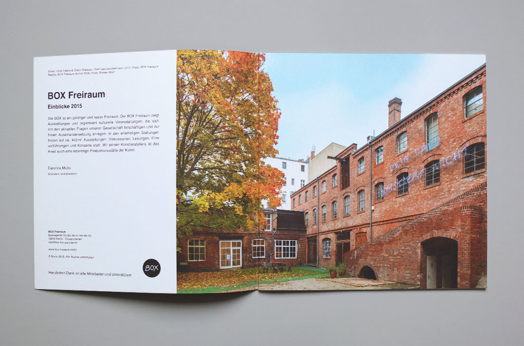
BOX Freiraum – Einblicke 2015, Design/layout example, Introduction page
BOX Freiraum – Einblicke 2015, Design/layout example
BOX Freiraum – Einblicke 2015, Design/layout example
BOX Freiraum – Einblicke 2015, Design/layout example
BOX Freiraum – Einblicke 2015, Design/layout example
BOX Freiraum – Einblicke 2015, Design/layout example
BOX Freiraum – Einblicke 2015, Design/layout example, detail
BOX Freiraum – Einblicke 2015, Design/layout example
BOX Freiraum – BOX Freiraum—Einblicke 2015, Design/layout example
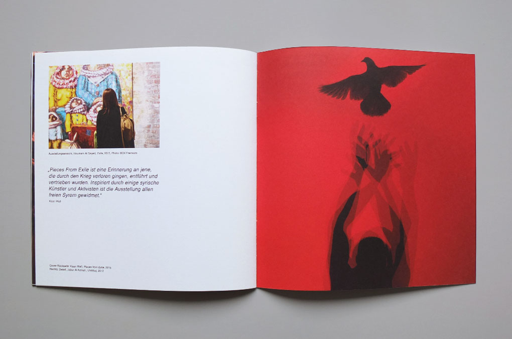
BOX Freiraum – BOX Freiraum—Einblicke 2015, Back cover design (image: Kaan Wafi, Pieces from Exile)
Year: 2015
Language: DE
Specs: 21×21 cm, 20 pages, Colour, Softcover, 2-fold stapled
Editor: BOX Freiraum, Berlin
Editing: Carolina Mojto, Chan-Young Ramert
Text: BOX Freiraum
Design: Chan-Young Ramert
Photography: BOX Freiraum, Jennifer Hoyer, Roman März, Kaan Wafi
Print and Binding: Laserline Berlin
Edition of 1000
box-freiraum.berlin
Project Info
Exhibition catalogue:
Sabrina Fritsch, P V
Sabrina Fritsch, P V
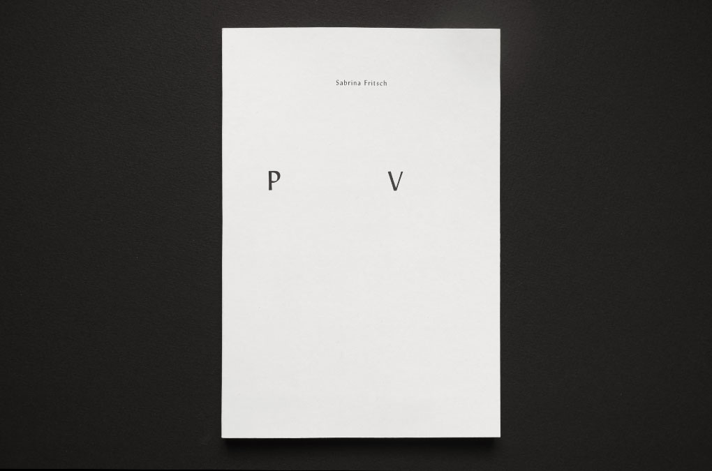
P V
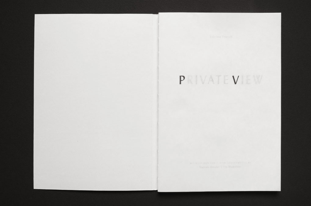
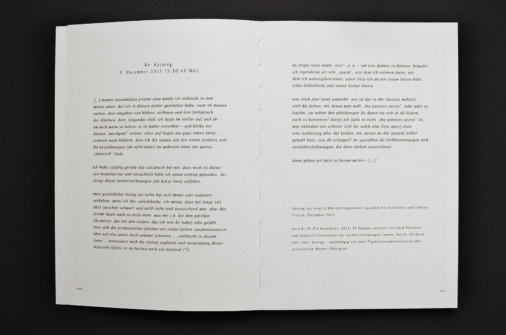
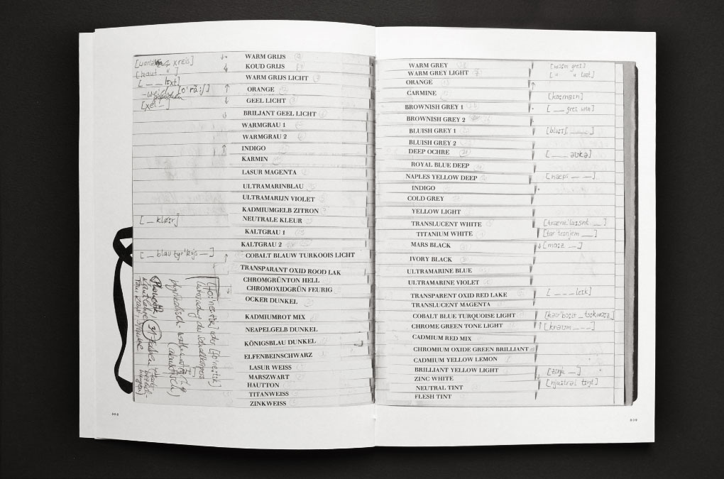
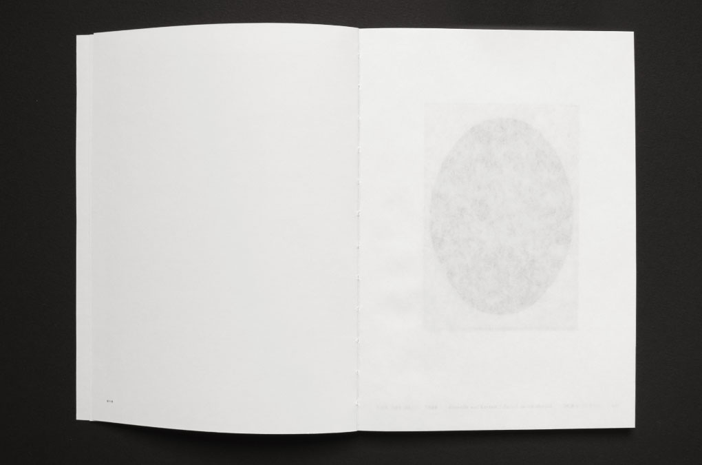
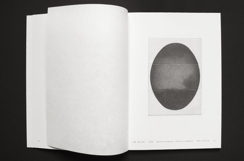
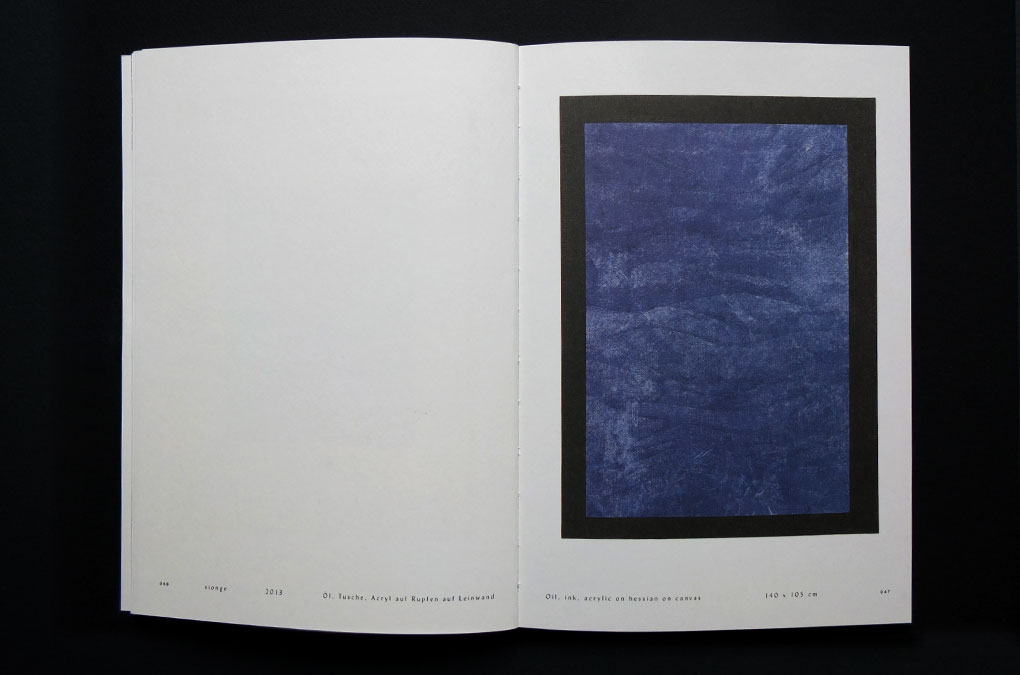
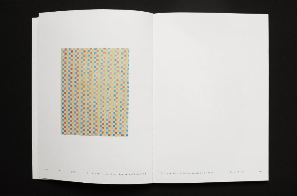
The catalogue P V was published on the occasion of Sabrina Fritsch’s solo exhibition Private View, 12 Febuary – 5 April 2014, Institut für moderne Kunst, Atelier- und Galeriehaus Defet, Nürnberg. In her show Private View Sabrina Fritsch presented a selection of paintings that were developed during her five-month artist residency at the Marianne-Defet-Malerei-Stipendium. In the catalogue the paintings are shown together with a selection of older works alongside (text) contributions by Stefanie Kreuzer and Pia Niewöhner. The pure and restrained catalogue design seizes the audacious fragility of the unvarnished exhibition title: an open binding and partly implemented cloudy-translucent paper evoke a visual and haptic experience of intimate concealment/exposure. The delicate typographic layout emphasizes the rhythmical sound in Fritsch’s painting structures and patterns while the rectilinear image layout picks up on their straightforwardness.
P V , Design/layout, cover
P V , Design/layout, half title
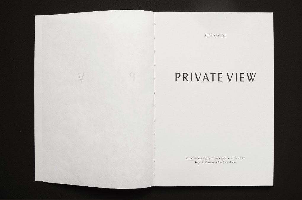
P V , Design/layout, title page
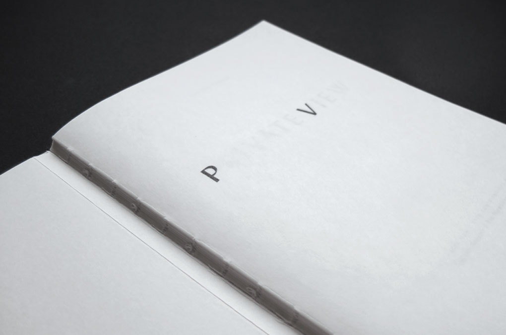
P V , Design/layout, detail half title, translucent paper/open binding
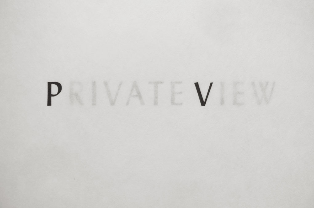
P V , Design/layout, detail: half title, translucent paper
P V , Design/layout example
P V , Design/layout example (image contribution: Pia Niewöhner)
P V , Design/layout example
P V , Design/layout example
P V , Design/layout example
P V , Design/layout example, detail
P V , Design/layout example
P V , Design/layout, example
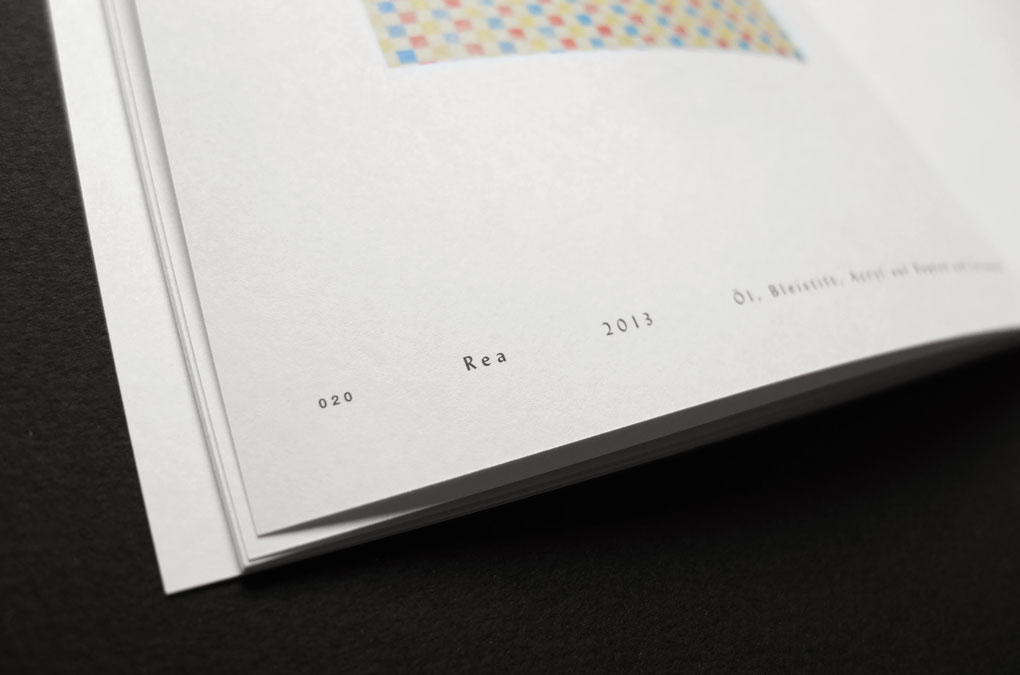
P V , Design/layout, detail, pagination/work titles
P V , Design/layout example
P V , Design/layout example
P V , Design/layout example
P V , Design/layout, detail translucent paper
P V , Design/layout example
P V , Design/layout example
P V , Design/layout example
P V , Design/layout example
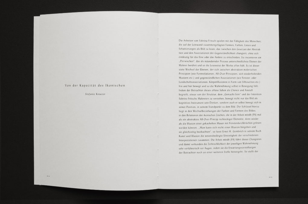
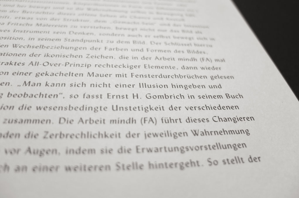
“In her works she stages an ‘in-between’ aspect, a meandering process that touches upon diverse levels of painting and thus leaves her works to be read in various ways. It is this continuous change of levels that oscillates between abstract principles of painting (such as the relations of forms, the principles of all-over painting, repeating patterns, etc.) and representational associations (such as associations of windows or landscapes, illusions of bodies in the form of silhouettes, etc.) and thus keeps perception itself in motion. If viewers see this open-minded kind of looking as an opportunity and impulse to understand something of the structure, the ‘making’ and the intention of Sabrina Fritsch’s paintings, not only their thoughts are moved by the picture as a cognitive instrument, but also their positions, their points of view of the picture.”
Excerpt from Stefanie Kreuzer, The Capacity of Iconic Symbols, published in
Sabrina Fritsch, P V ,p. 53–54, Nürnberg, 2014
Year: 2014
Language: DE, EN
Specs: 14.8×21 cm, 60 pages, Colour, Swiss brochure with open binding
Editor: Institut für moderne Kunst Nürnberg
Editing: Kathrin Mayer, Anke Schlecht, Petra Weigle
Contributions: Stefanie Kreuzer, Pia Niewöhner
Cover and Design: Chan-Young Ramert
Translation: Susanne Eder
Photography: Sabrina Fritsch, Annette Kradisch, Achim Kukulies, Pia Niewöhner
Image Editing: Alex Kovacs
Print and Binding: Druckerei Conrad, Berlin
Edition of 600 copies
Available at moderne-kunst.org
Project Info
Visual Identity & Logo:
UNION PACIFIC
UNION PACIFIC
UNION PACIFIC
UNION PACIFIC is a contemporary art gallery representing young emerging artists at an international level. Founded in 2014 by Nigel Dunkley and Grace Schofield, the space is located at 17 Goulston Street, East London. The gallery is run as an organic platform where the gallerists and the artists work together based on an equal footing. UNION PACIFIC is unpretentious and unconventional. With the primary interest in realizing ambitious and exciting projects, the exhibition programme is exceptional and versatile. The starting point for its visual identity was a two-part logo consisting of a word mark and a figurative mark, acting autonomously within the gallery branding. The logo was followed by the design of a stationary including letterhead and business cards, the website, various templates for the gallery business, artist-pdfs, the gallery sign, and a door plate.
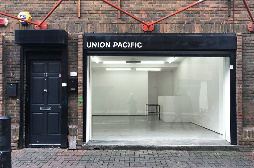
UNION PACIFIC, Gallery (window) sign
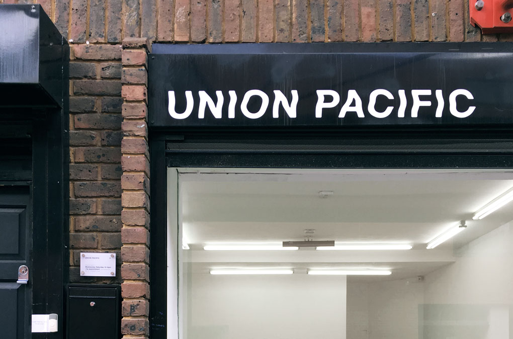
UNION PACIFIC, Detail: Gallery sign
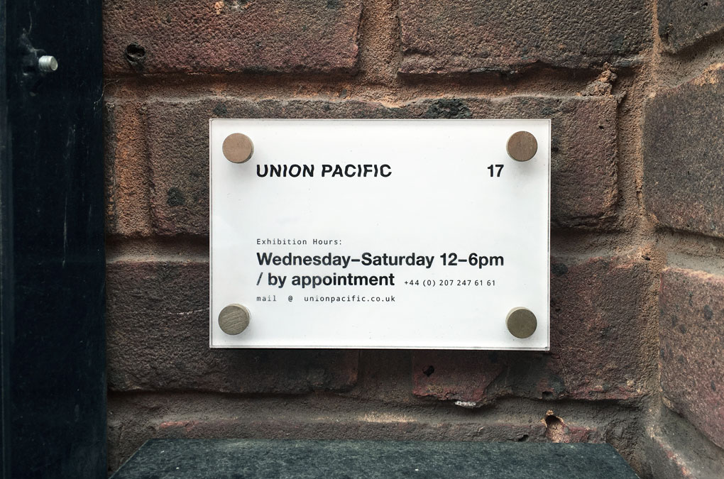
UNION PACIFIC, Door plate

UNION PACIFIC, Stationary: Letterhead & Business card
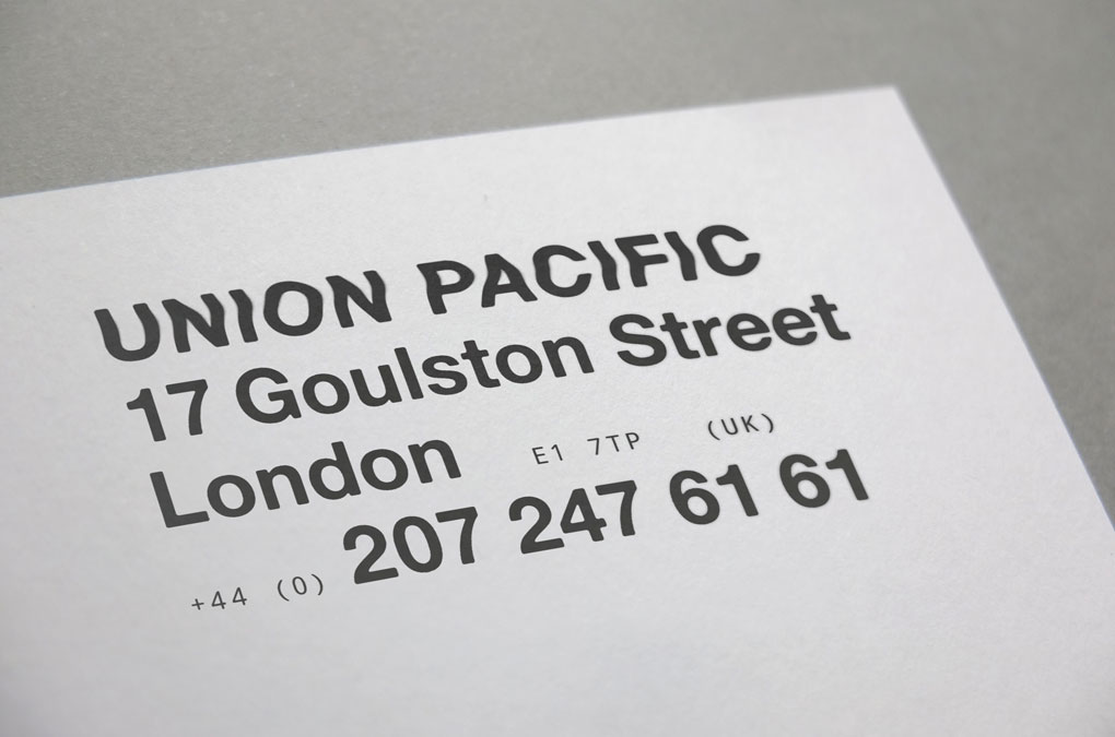
UNION PACIFIC, Detail: Letterhead
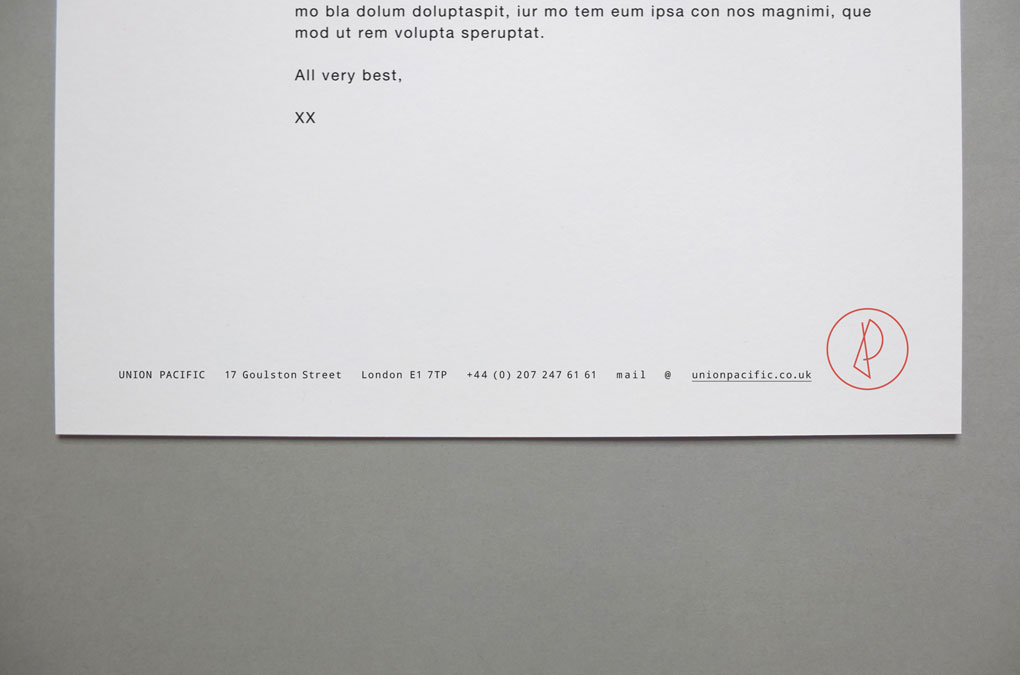
UNION PACIFIC, Detail: Letterhead
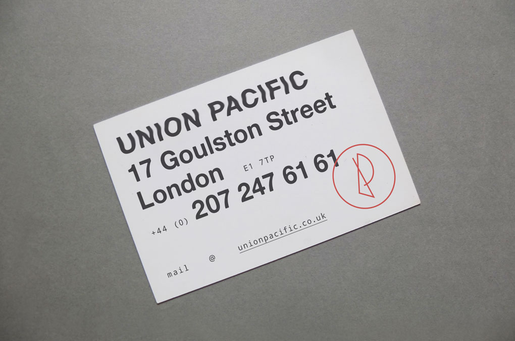
UNION PACIFIC, Business Card
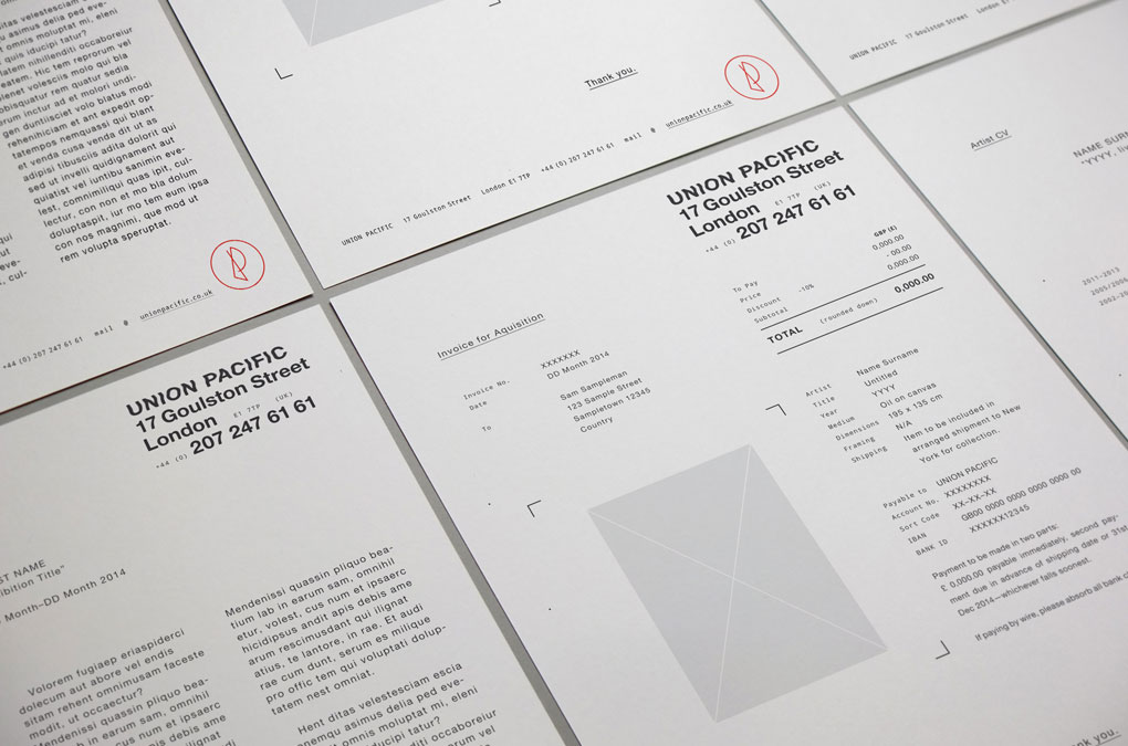
UNION PACIFIC, Templates (Press release, Invoice, Artist CV)
UNION PACIFIC, Logo and type design (word mark)
UNION PACIFIC, Logo design (figurative mark)
UNION PACIFIC, Webdesign, Landing page/Upcoming and/or current exhibition
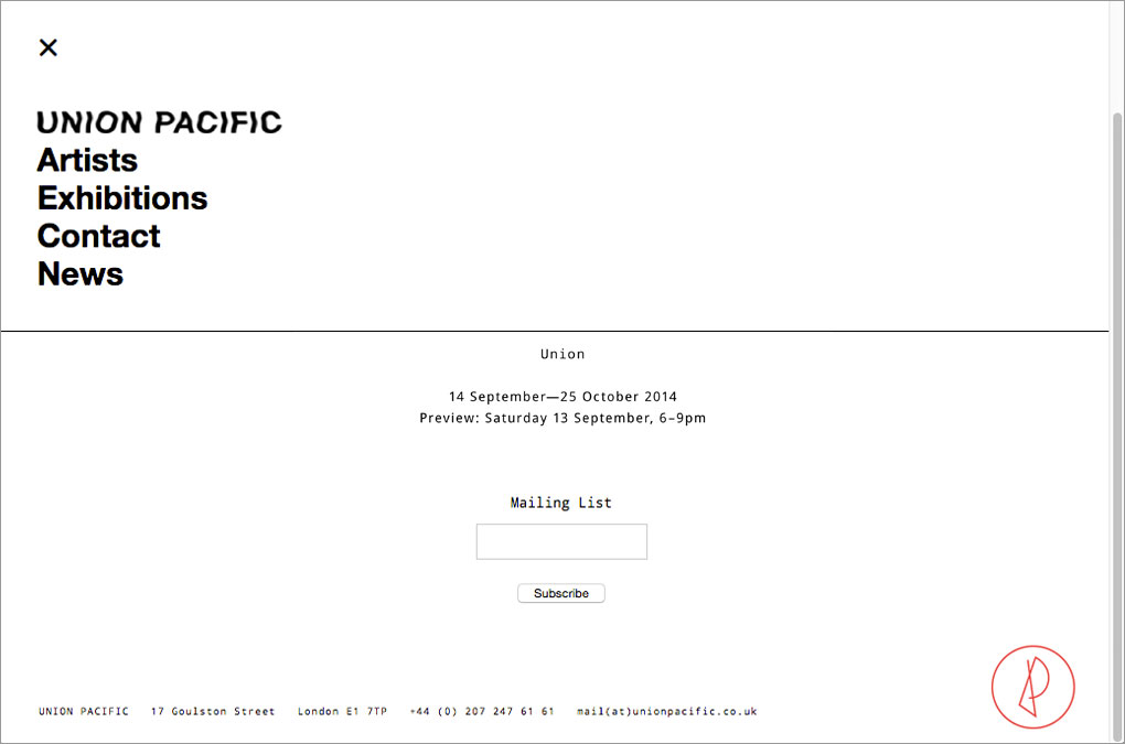
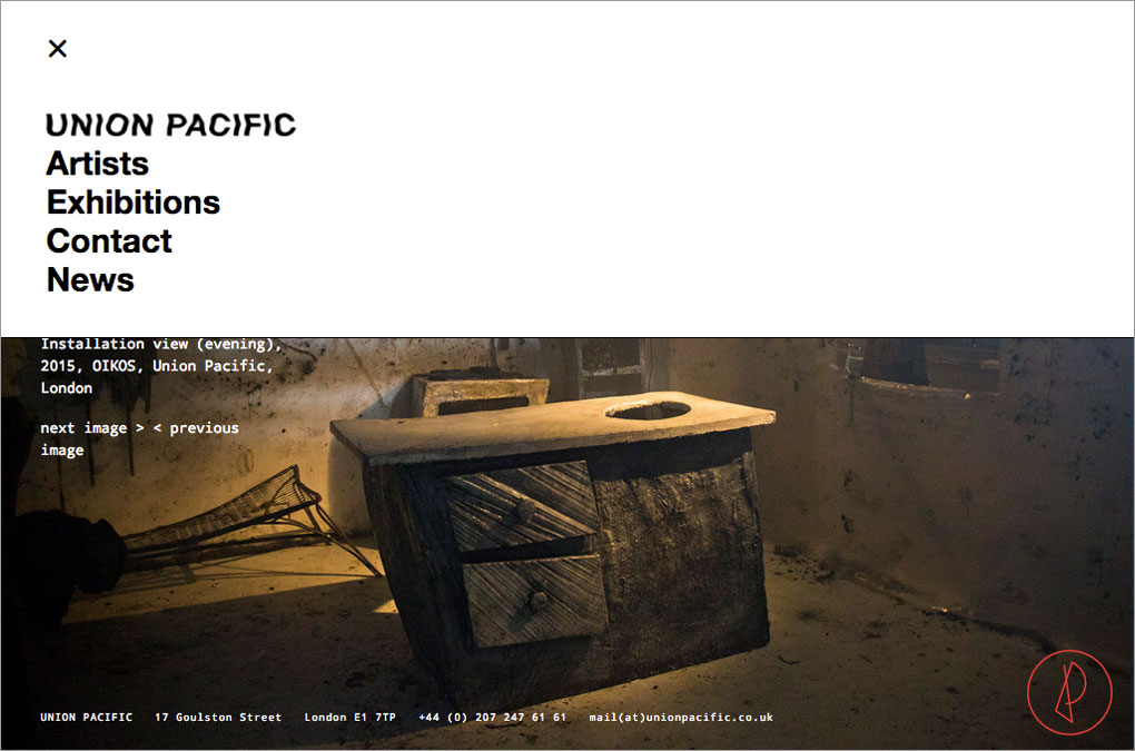
UNION PACIFIC, Webdesign, Menu
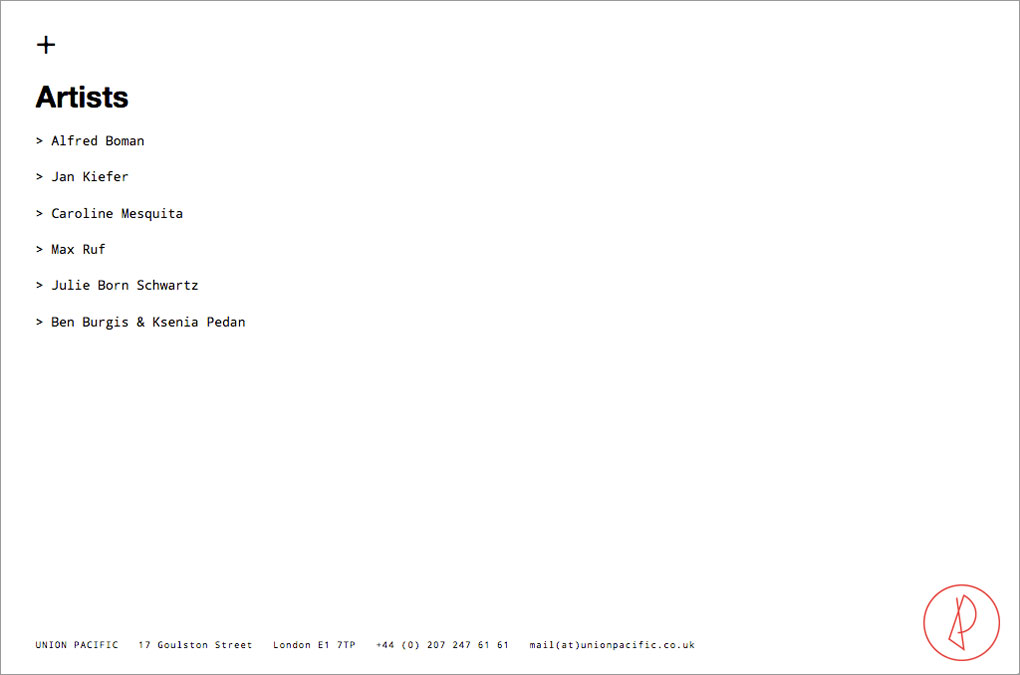
UNION PACIFIC, Webdesign, Artist list
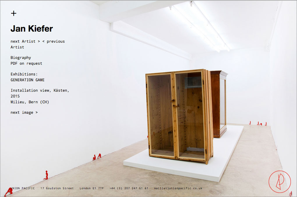
UNION PACIFIC, Webdesign, Artist page example: Jan Kiefer
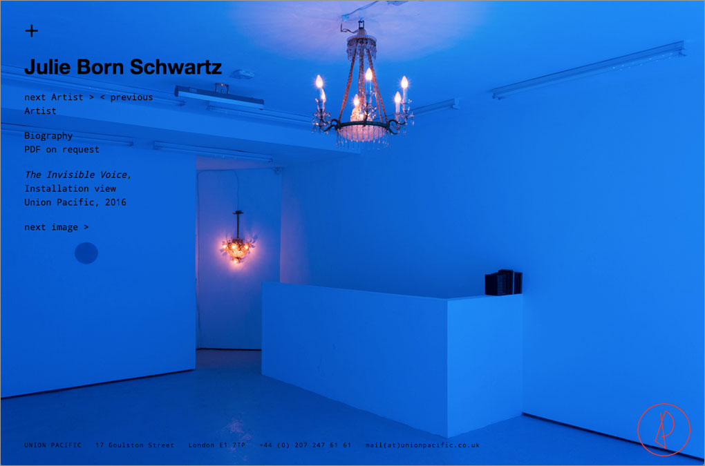
UNION PACIFIC, Webdesign, Artist page example: Julie Born Schwartz
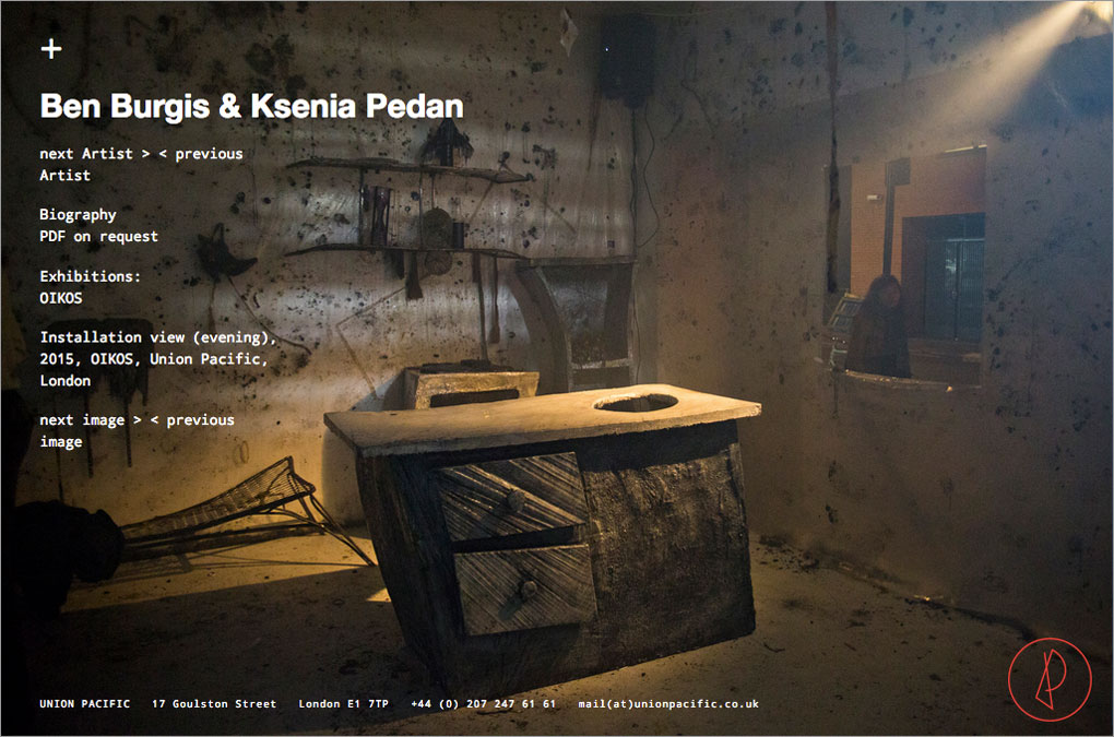
UNION PACIFIC, Webdesign, Artist page example: Ben Burgis & Ksenia Pedan
UNION PACIFIC, Webdesign, Artist page example with menu
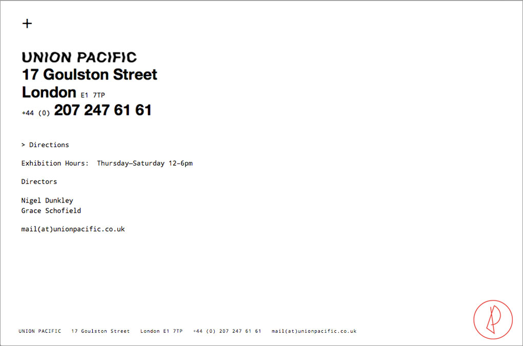
UNION PACIFIC, Webdesign, Contact page
Year: 2014
Language: EN
Design: Chan-Young Ramert
Website built by: Sara Nunes Fernandes
Language: EN
Design: Chan-Young Ramert
Website built by: Sara Nunes Fernandes
Project Info
Logo, Virtual Identity, Flyer:
POSTCODES
POSTCODES
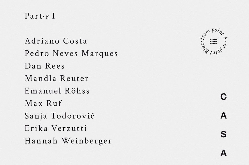
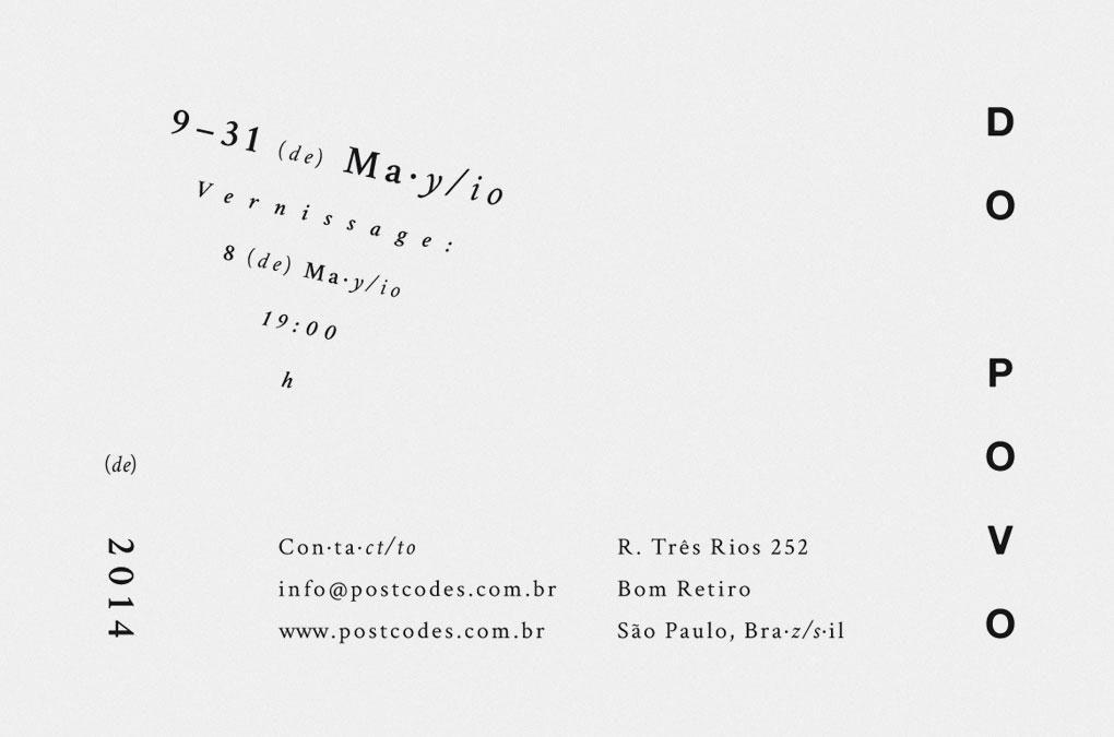
Postcodes
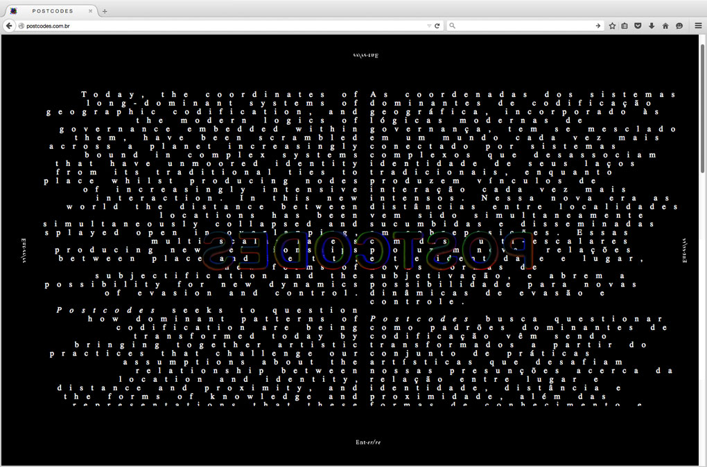
Created and curated by the cosmo-metropolitan artists Gabriel Lima and Pedro Wirz, the project and vision Postcodes arose in 2014. Lima and Wirz invited local and oversea artists to participate Postcodes in a cultural exchange and artistic dialogue, articulated through exhibitions and performances held in historical spots of the city São Paulo in Brazil. A bilingual virtual identity including a logo were designed and carried on to printable announcement material, communicating Postcodes and its exhibitions. (Side note: The website is currently inaccessible.)
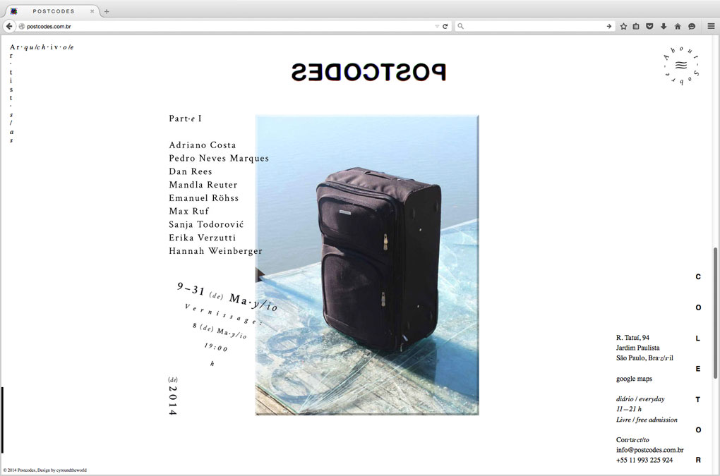
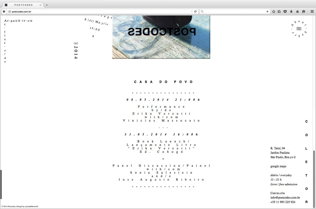
The first exhibition Soft (Postcodes Part I), 9–31 May 2014, hosted by Casa do Povo, presented works by Adriano Costa, Pedro Neves Marques, Dan Rees, Mandla Reuter, Emanuel Röhss, Max Ruf, Sanja Todorović, Erika Verzutti, and Hannah Weinberger.
The second exhibition, Kïnd, 4–13 September 2014, hosted by Coletor, gathered the artists Adriano Amaral, Asif Kapadia, Blake Rayne, Jan Kiefer, Kaspar Müller, Maria Loboda, Mauro Cerqueira, Raquel Uendi, Rodrigo Matheus, and Viola Yeşiltaç.
Postcodes, Webdesign, Intro page
Postcodes, Webdesign, Landing page, Kïnd
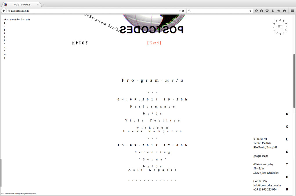
Postcodes, Webdesign, Landing page, Kïnd, Programme
Postcodes, Webdesign, Landing page, Soft (Part I)
Postcodes, Webdesign, Landing page, Soft (Part I), Programme
Postcodes, Logo, Type design
Postcodes, Logo, Type design
Postcodes, Type design, Letter “O”, Genesis
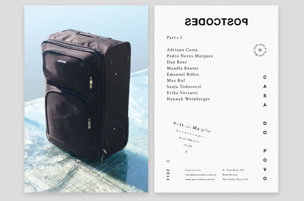
Postcodes, Invitation/flyer design and layout (front and backside)
Postcodes, Invitation/flyer, Backside detail 1
Postcodes, Invitation/flyer, Backside detail 2
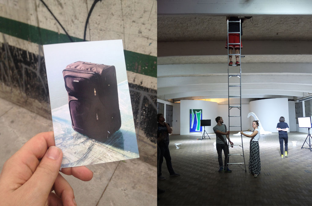
Left: Postcodes invite; Right: Postcodes exhibition install / documentation
“Today, the coordinates of long-dominant systems of geographic codification, and the modern logics of governance embedded within them, have been scrambled across a planet increasingly bound in complex systems that have unmoored identity from its traditional ties to place whilst producing nodes of increasingly intensive interaction. In this new world the distance between locations has been simultaneously collapsed and splayed open in overlapping, multi-scalar layers producing new relationships between place and identity, new forms of subjectification and the possibility for new dynamics of evasion and control.
Postcodes seeks to question how dominant patterns of codification are being transformed today by bringing together artistic practices that challenge our assumptions about the relationship between location and identity, distance and proximity, and the forms of knowledge and representations that these relationships are grounded upon and the subjectivities they produce. The program poses these interrogations within the context of the city of São Paulo, and aims to dynamically respond to the complexities of an emerging international cultural hub.”
Excerpt from the Postcodes introduction, written by Gabriel Lima
Year: 2014
Language: EN, pt-BR
Visual/virtual design and Website code: Chan-Young Ramert
Language: EN, pt-BR
Visual/virtual design and Website code: Chan-Young Ramert
Project Info
Exhibition invite/flyer:
FRIDAY
FRIDAY
FRIDAY
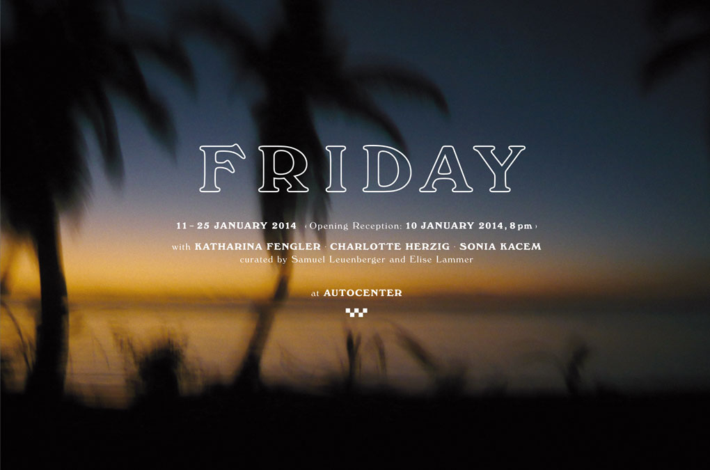
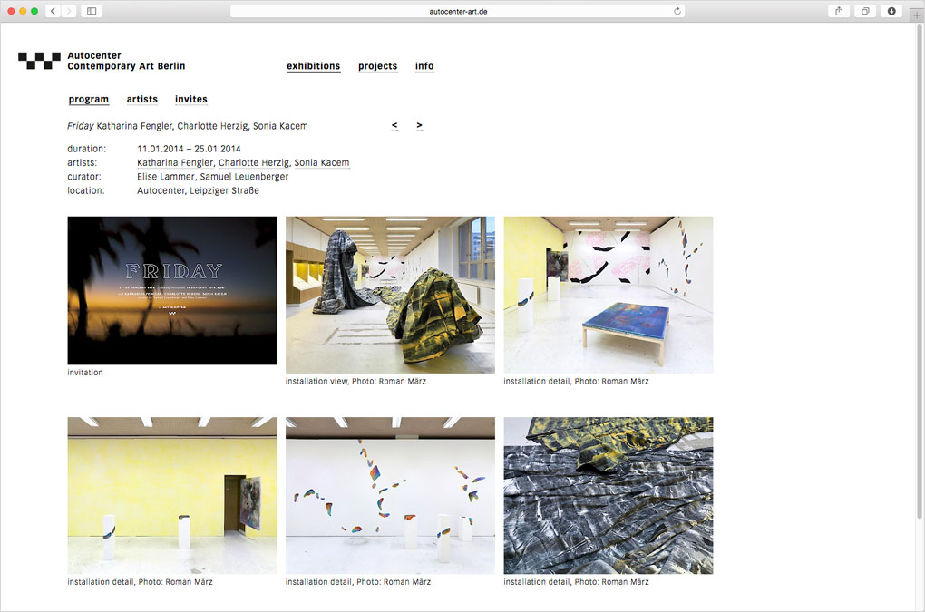
Invitation design for the exhibition FRIDAY featuring Katharina Fengler, Charlotte Herzig and Sonia Kacem, curated by Elise Lammer and Samuel Leuenberger, 11 – 25 January 2014, at Autocenter, Berlin.
“FRIDAY is an homage to Friday, or the Other Island, a novel by Michel Tournier from 1967. The story retells Daniel Defoe’s Robinson Crusoe, who after being shipwrecked on an island in the Pacific, slowly adapts to a new life with the help of Friday, a native islander, who introduces him to new ways of experimenting time and space.
[…]
The exhibition FRIDAY refers to the symbolic meaning of the island understood as an idealised and recluse conceptual space for the creation of new meanings. The show gathers the work of three artists who meet for the first time, bringing existing works as well as creating site-specific works together. FRIDAY speculates on the ongoing challenge involved in bringing different practices together, with the intention to create a “real” visual dialogue between three strangers. The show symbolises the coming together of various artistic positions, getting accustomed to each other, learning from each other to finally go separate ways again.
FRIDAY brings together three very different artistic positions with the goal to merge with the space they occupy and the architecture they are surrounded with. Taking intuition as a starting point, all the works on display translate a wide range of painterly emotions, having been produced in a common attempt to assimilate the primitive and the sophisticated.”
Excerpts from the press release by Samuel Leuenberger & Elise Lammer: http://moussemagazine.it/friday-autocenter/#sthash.sjfGRQV6.dpuf
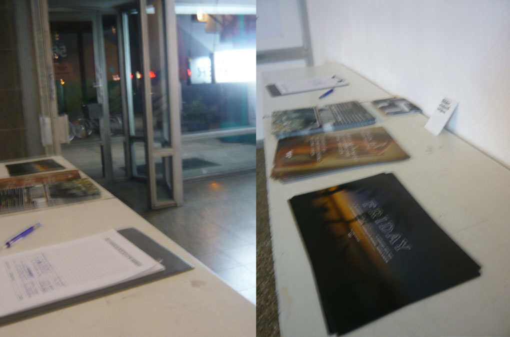
Autocenter entry hallway
Friday, Invitation/flyer design
Friday, Invitation/flyer design (Retroverso)
Friday, Autocenter website screenshot
The visual for the invite is a photograph taken in 2008 at Île aux Nattes, a tiny island south of Île Sainte-Marie, an island in the Indian ocean off the east coast of Madagascar.
Year: 2014
Language: EN
Design and Photography: Chan-Young Ramert
Year: 2014
Language: EN
Design and Photography: Chan-Young Ramert
Project Info
Exhibition visual, coat of arms/logo:
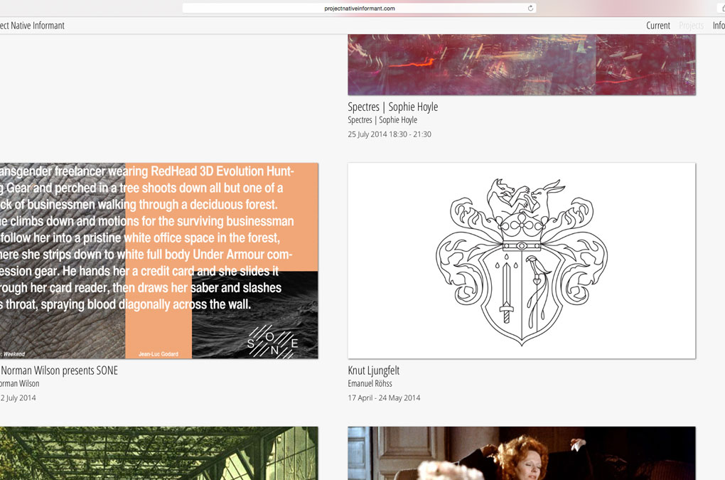
Emanuel Röhss, Knut Ljungfelt
Emanuel Röhss, Knut Ljungfelt
Knut Ljungfelt
Knut Ljungfelt is the exhibition title of Emanuel Röhss’ solo show, 16 April – 17 May 2014, at Project Native Informant, London. The artist’s press release (see below) illustrates a story of Knut and his fiancee Beatrice.
To announce his exhibition Röhss chose to have Knut's coat of arms as a visual. The contemporary “heraldic” design
was created based on research about heraldry, and the artists description of Knut and his background.
To announce his exhibition Röhss chose to have Knut's coat of arms as a visual. The contemporary “heraldic” design
was created based on research about heraldry, and the artists description of Knut and his background.
Project Native Informant website screenshot (27 August 2015)
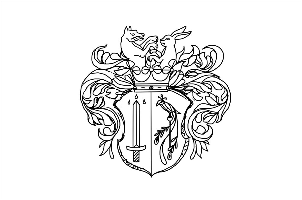
Knut Ljungfelt, Coat of arms, Sketch
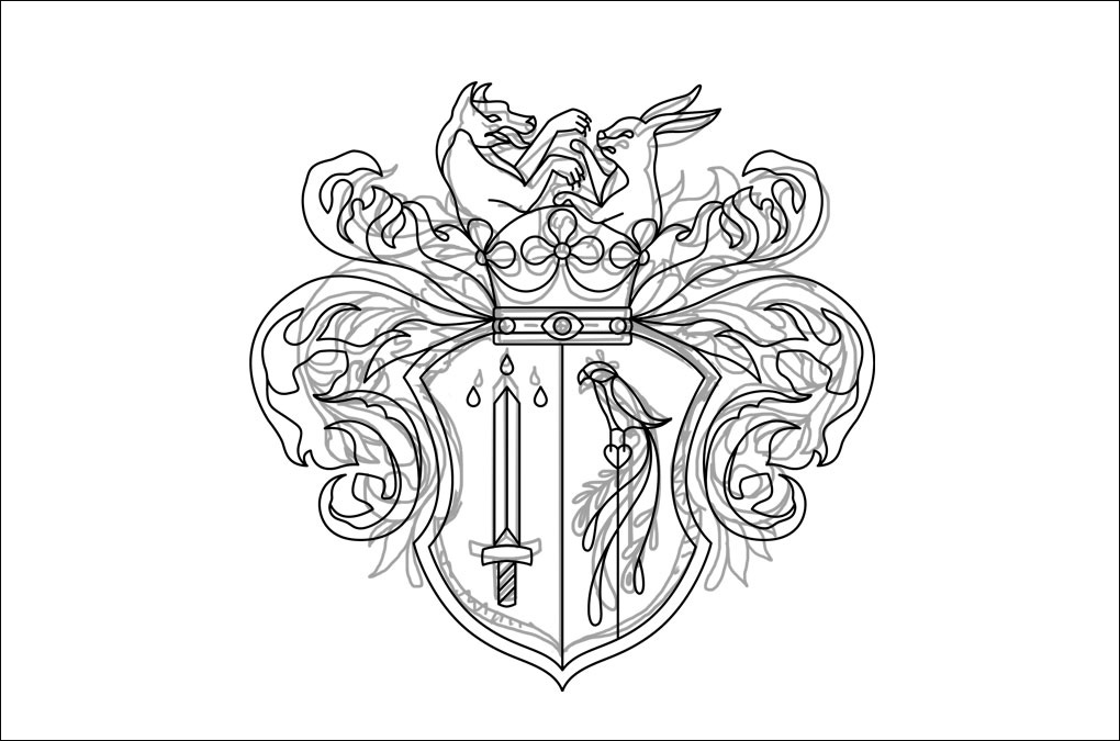
Knut Ljungfelt, Coat of arms, Sketch and final version
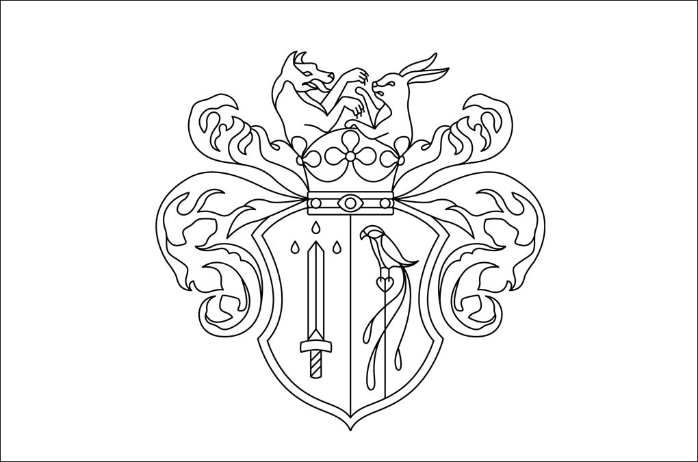
Knut Ljungfelt, Coat of arms, final design
“A mellow lit high end Swedish restaurant interior, February, lunchtime.
Where the fuck is Beatrice?, Knut thought, starring at his Bovet Fleurier 46 watch through half closed eyes as he uncomfortably sat waiting at a corner table in restaurant KB downing a vodka tonic.
Waiter, another, he called out to no one in particular.
Beatrice walked in. White blouse underneath this season’s black denim Balmain jacket and tight ivory leather skirt. Her hair was extremely blonde, her eyes bright blue, framed by heavy dark eyeliner, she gave an aura of undeniable sensual confidence.
She was amused when she glanced at her waiting cavalier with his intensely arduous face.
You where supposed to be here 10 minutes ago!
My aerobics class with Daniel at the F&F went a little over. I always finish.
You’re never ever at the gym, if you went there it was to fuck your personal trainer
Don’t be jealous.
A bald waiter in all black appeared next to the table
Today’s lunch specials are a wild goose salad with caramelised cranberries, lemongrass and bourbon reduction, a Norwegian wild salmon steamed on a bed of seaweed with a gold extract and chilli salt, a reindeer fillet with virgin asparagus and honey powder, or a….
Give us whatever is already on the plates over there I don’t care, and a Dom Perignon 1996—in half a shake!
Someone could use some tranquilisers to bring down his coke hangover from last night…
Shut up! I need to be at Riddarhuset in 45 minutes, then I have an appointment with John from AFGX, and a conference call with LA and Hong Kong at the office, your unpunctuality doesn’t make things easier. And by the way why are you dressed like that?
Like what?
Slutty
I dressed as if I was going for lunch with you.
He blinked like a notorious epileptic as he was looking from the stucco ornaments in the ceiling to his beeping iPhone 5SX and typing something cryptic, then back at his Bovet Fleurier 46 and breathed heavily. In one motion, as the waiter came up from behind, he grabbed the Dom Perignon out of the shiny ice bucket and poured it’s content to the brim of their red wine glasses at a 90 degree angle making the liquid flow out over the edges to create a Jacuzzi of French sparkles on the white tablecloth. The bald waiter came in, this time carrying something looking like electrified chicken legs in pink dressing—the wild goose salad sir.
For a moment they silently starred at the fluorescent cadaver, then, obviously in an attempt to address Knut with something important Beatrice took on a face like the secretary opening a meeting at the chamber of commerce.
Your family expects us to announce our engagement before long.
No no no no he let out to the whole restaurant, not managing to meet her look as all his bodily capacity was consumed by trying to control a spasmodic reaction. Two seconds later a black Volvo limousine V90S appeared outside the window, he grabbed his iPhone 5SX and stood up.
I cannot discuss this right now—I’ve got business to pursue! My team is operating like marines! We sail and we hunt. We can take anything.
Knut threw six 500 kronor bills into the Champagne Jacuzzi, gave out a loud unrecognisable muttering sound towards Beatrice, already in full motion he forgot his Samsoe and Samsoe coat on the hanger and just as the bald waiter started to open the entrance door, he ran through it and jumped into the car.”
Press release, Emanuel Röhss, Knut Ljungfelt:
http://projectnativeinformant.com/exhibition/knut-ljungfelt/
Year: 2014
Language: symbolic
Design/Illustration: Chan-Young Ramert
Project Info
EP Cover & Type design:
André Uhl, Creatures
André Uhl, Creatures
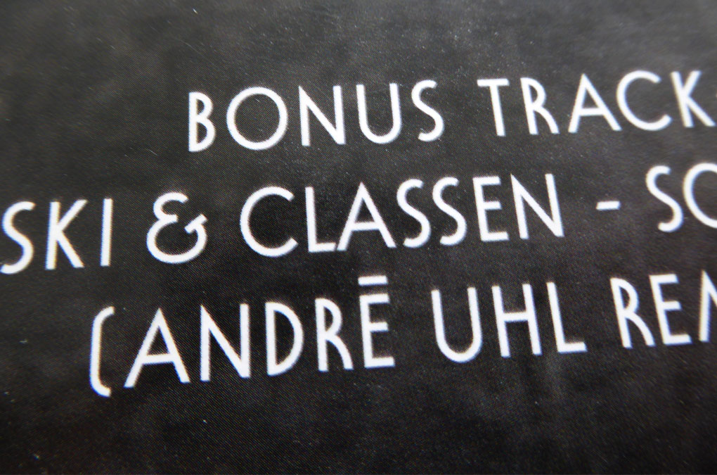
Creatures
Custom type design and layout for André Uhl’s EP Creatures, released in 2014.
Listen to his soundcloud
Listen to his soundcloud

Creatures, EP Title, Type design

Creatures, Songtitles, Type design
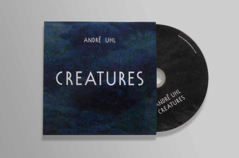
Creatures, EP Cover
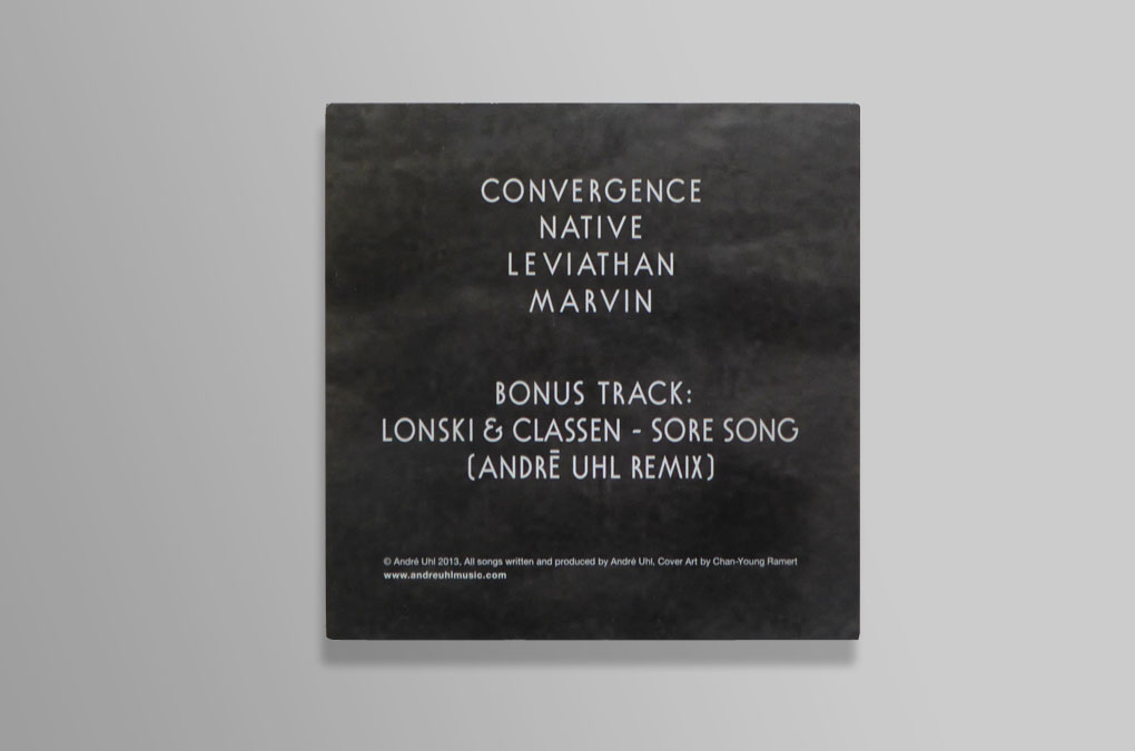
Creatures, EP Cover, Retroverso
Creatures, EP Cover, Retroverso, Detail
Year: 2013
Released: 2014
Language: EN
Type design and Layout: Chan-Young Ramert
Cover image: Max Ruf
Released: 2014
Language: EN
Type design and Layout: Chan-Young Ramert
Cover image: Max Ruf
Project Info
Artist publication:
Almanac,The Immaterial Almanac (Epilogue)
Almanac,The Immaterial Almanac (Epilogue)
The Immaterial Almanac
Epilogue
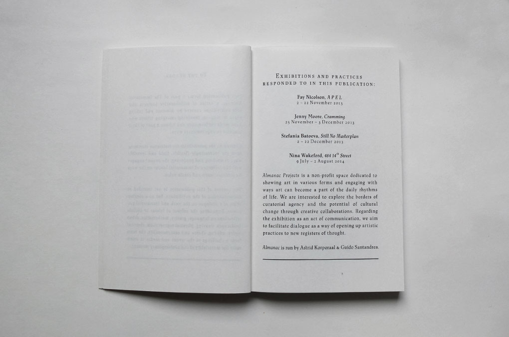
Almanac is a non-profit space based in London and Turin dedicated to showing art in various forms and engaging with ways art can become a part of the daily rhythms of life, interested to explore the borders of curatorial agency and the potential of cultural change through creative collaborations. (almanacprojects.com)
“This publication forms a part of The Immaterial Almanac, a series of collaborative projects and solo exhibitions curated by Almanac and taking place in 2013–14, involving emerging artists who have made performance and labour a part of their practice in experimental ways. Centred on the possibilities for resistance stemming from the increasingly flexible, fluid and invisible ways of working and producing, the project engages with the influence of immaterial labour on the ways we interact, learn and create value. The content of this publication is not intended as documentation of the exhibitions, but as a continuation of a dialogue on the work and immaterial processes. Expanding the subject of labour to include reflections on language, gravity, mathematics, urban landscapes, weaving, physical regeneration, classical nudes, editing, choice and sentimentality, the texts form a challenge to the writer and reader to reconsider the materiality of our contemporary moment.”
Excerpt from the Introduction, To The Reader, published in The Immaterial Almanac (Epilogue), London, 2014
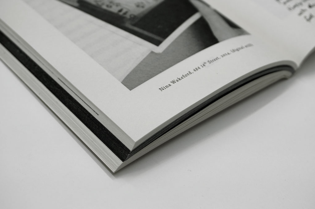
The publication was launched August 10, 2014 at Legion TV (London), on the occasion of Nina Wakeford’s solo exhibition 484 14th Street, 10 July – 9 August 2014, curated by Almanac.
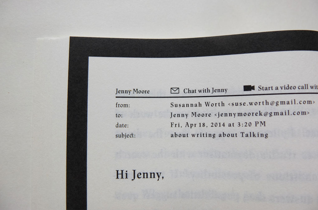
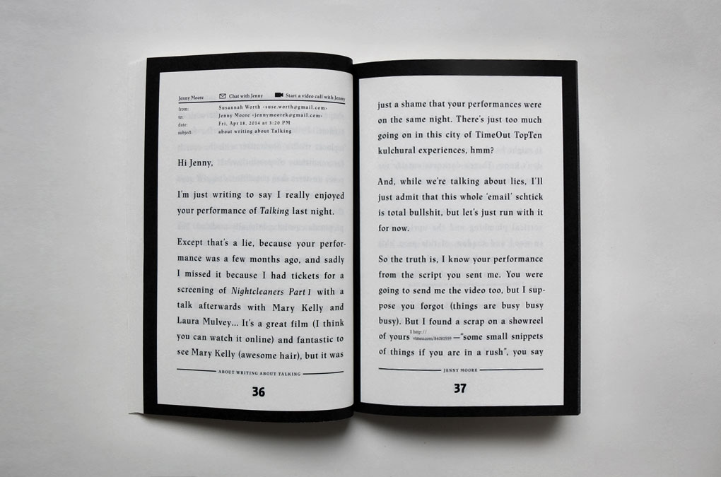
Designed inside-out, the visual appearance of the publication renounces material values to a great extent; reduced to a small format with black-and-white imagery, carefully chosen typography was fondly applied to place the main emphasis on the content. The pages of Susanna Worth’s contribution (an e-mail to Jenny Moore) in the middle of the publication, are highlighted with a simple black frame, the book edge adopts this change of color on the outside in a natural way. The experimental cover illustration is the result of a computer generated content-aware filling, normally used as a simple way to remove objects from images.
“This publication forms a part of The Immaterial Almanac, a series of collaborative projects and solo exhibitions curated by Almanac and taking place in 2013–14, involving emerging artists who have made performance and labour a part of their practice in experimental ways. Centred on the possibilities for resistance stemming from the increasingly flexible, fluid and invisible ways of working and producing, the project engages with the influence of immaterial labour on the ways we interact, learn and create value. The content of this publication is not intended as documentation of the exhibitions, but as a continuation of a dialogue on the work and immaterial processes. Expanding the subject of labour to include reflections on language, gravity, mathematics, urban landscapes, weaving, physical regeneration, classical nudes, editing, choice and sentimentality, the texts form a challenge to the writer and reader to reconsider the materiality of our contemporary moment.”
Excerpt from the Introduction, To The Reader, published in The Immaterial Almanac (Epilogue), London, 2014
The publication was launched August 10, 2014 at Legion TV (London), on the occasion of Nina Wakeford’s solo exhibition 484 14th Street, 10 July – 9 August 2014, curated by Almanac.
Designed inside-out, the visual appearance of the publication renounces material values to a great extent; reduced to a small format with black-and-white imagery, carefully chosen typography was fondly applied to place the main emphasis on the content. The pages of Susanna Worth’s contribution (an e-mail to Jenny Moore) in the middle of the publication, are highlighted with a simple black frame, the book edge adopts this change of color on the outside in a natural way. The experimental cover illustration is the result of a computer generated content-aware filling, normally used as a simple way to remove objects from images.
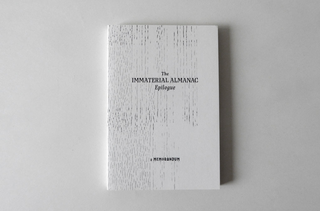
The Immaterial Almanac, Cover design
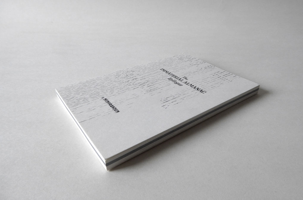
The Immaterial Almanac, Cover design
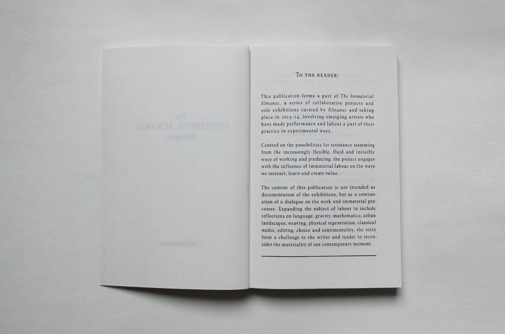
The Immaterial Almanac, Foreword, To the reader
The Immaterial Almanac, Epigraph
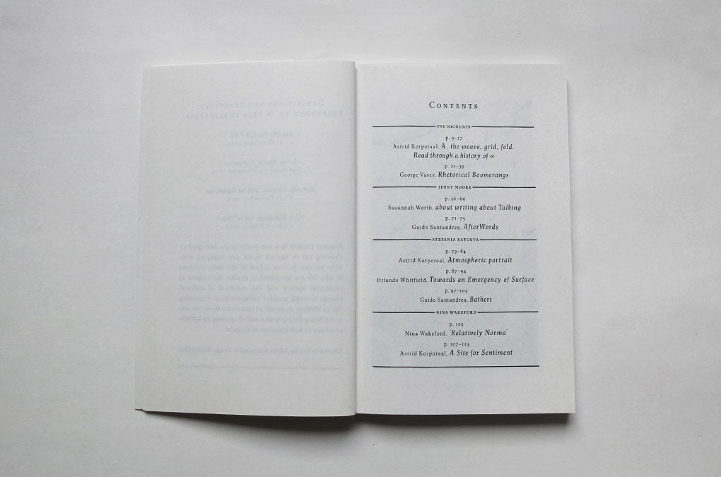
The Immaterial Almanac, Contents
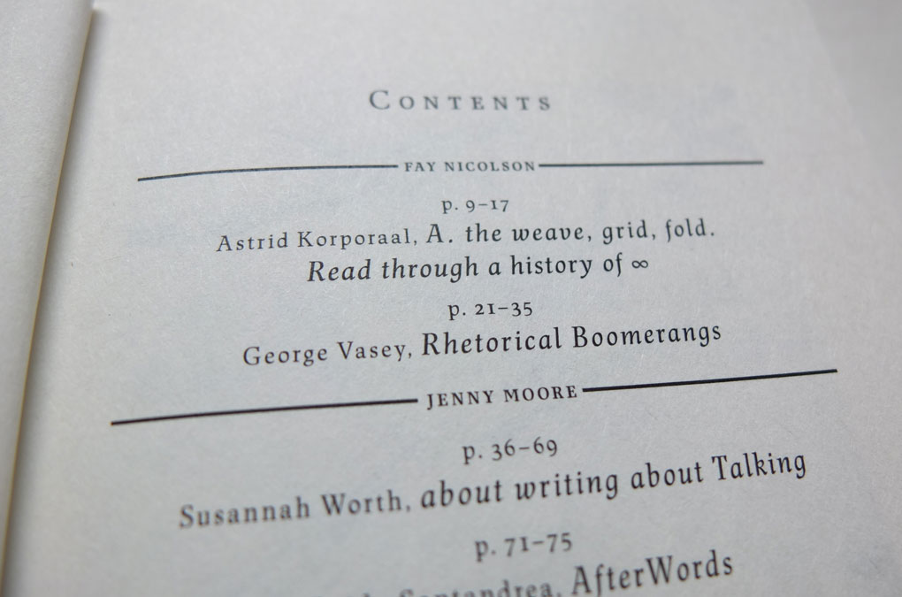
The Immaterial Almanac, Contents, detail
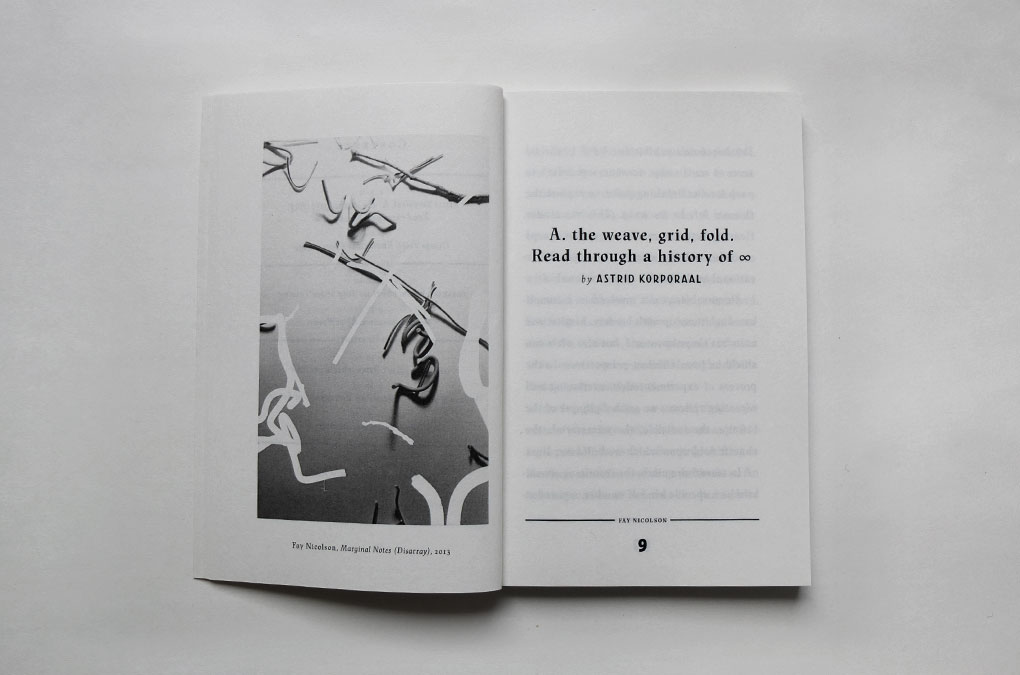
The Immaterial Almanac, Design/layout example
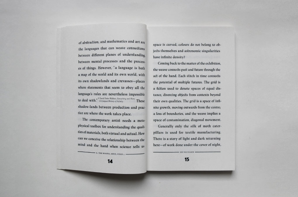
The Immaterial Almanac, Design/layout example
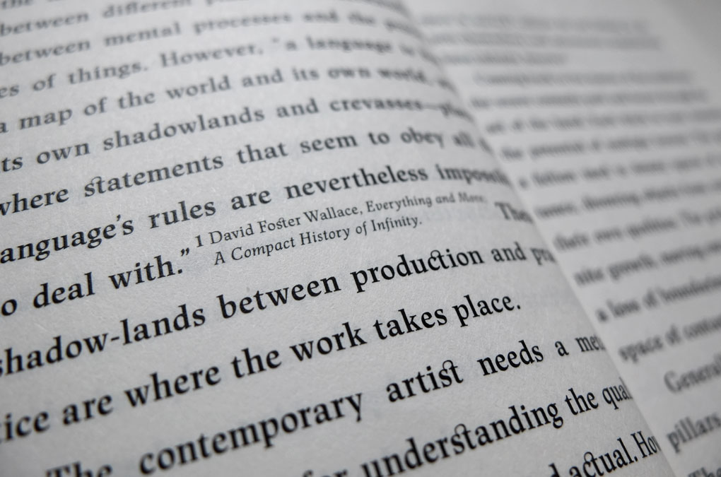
The Immaterial Almanac, Detail, ‘integrated’ footnotes
The Immaterial Almanac, Design/layout example
The Immaterial Almanac, Design/layout example, detail
The Immaterial Almanac, Design/layout example
The Immaterial Almanac, Design/layout example, detail
The Immaterial Almanac, Book edge, detail
Year: 2014
Language: EN
Specs: 10×14.8 cm, 116 pages, BW, Softcover, Perfect bound
Editor: Almanac
Artists: Fay Nicolson, Jenny Moore, Stefania Batoeva, Nina Wakeford
Text Contributors: Astrid Korporaal, Guido Santandrea, George Vasey,
Nina Wakeford, Orlando Whitfield, Susanna Worth
Cover Illustration & Design: Chan-Young Ramert
Print and Binding: Europrint Medien, Berlin
Edition of 500 copies
Available at almanacprojects.com
Project Info
Exhibition catalogue:
Lukas Schmenger, Das Dialektische Prinzip
Lukas Schmenger, Das Dialektische Prinzip
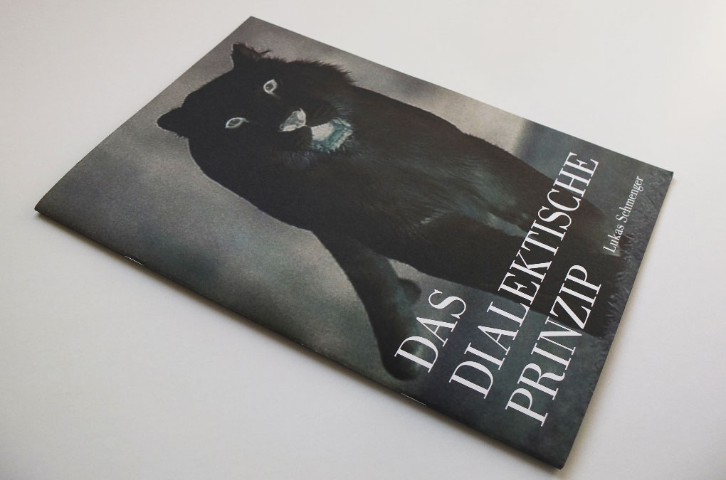
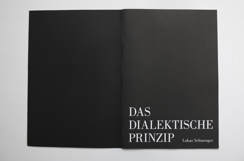
Das Dialektische Prinzip
The catalogue Das dialektische Prinzip was published on the occasion of Lukas Schmengers’ correspondent solo exhibition, Das dialektische Prinzip, 7 July–25 August 2013, Kahnweilerhaus, Rockenhausen.
Layout and Design are visually determined by the photographic reproductions of Schmenger’s paintings, and contain a text contribution by Paul Groot. The inversion of white into black and vice versa is used throughout the catalogue as a design element and picks up on the title Das Dialektische Prinzip (engl.: The Dialectical Principle) and Schmenger’s cover image, an inverted white (albino) panther.
Layout and Design are visually determined by the photographic reproductions of Schmenger’s paintings, and contain a text contribution by Paul Groot. The inversion of white into black and vice versa is used throughout the catalogue as a design element and picks up on the title Das Dialektische Prinzip (engl.: The Dialectical Principle) and Schmenger’s cover image, an inverted white (albino) panther.
Das Dialektische Prinzip, Cover
Das Dialektische Prinzip, Title page
Das Dialektische Prinzip, Design/layout example
Das Dialektische Prinzip, Design/layout example
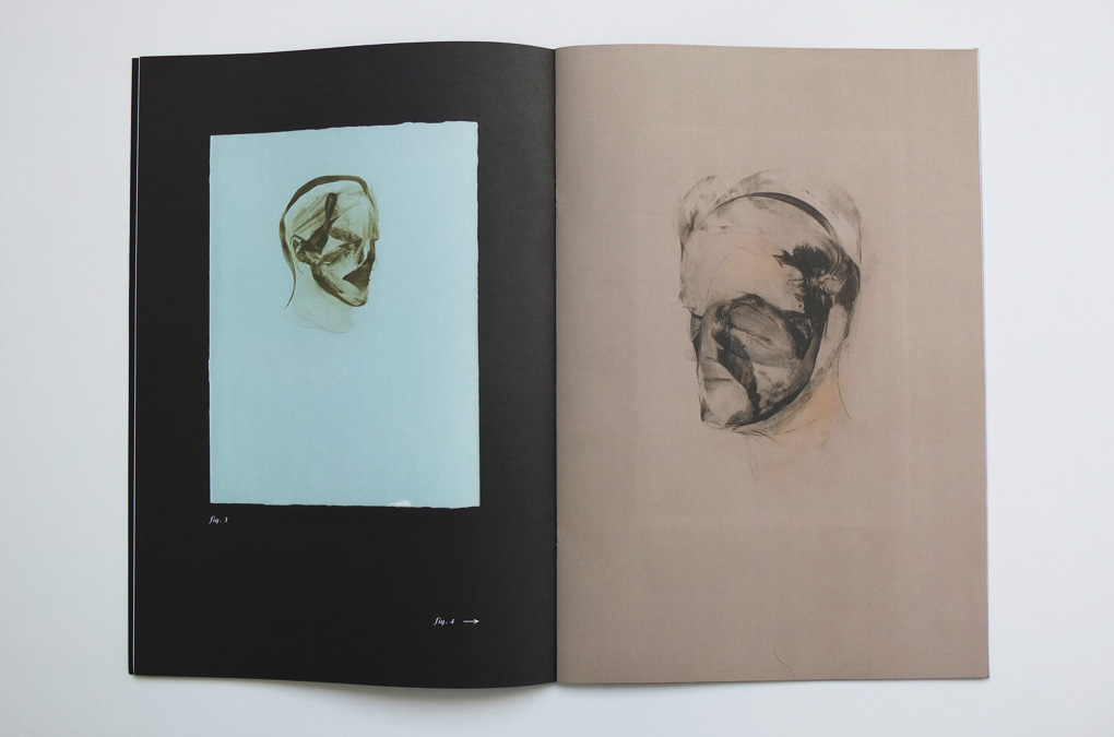
Das Dialektische Prinzip, Design/layout example

Das Dialektische Prinzip, Design/layout example
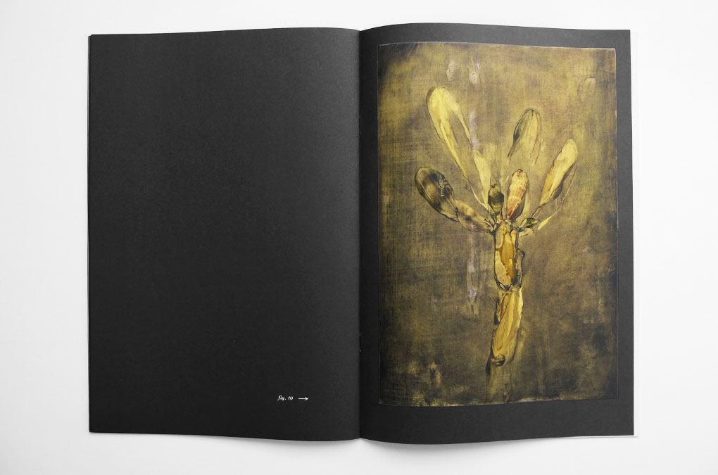
Das Dialektische Prinzip, Design/layout example
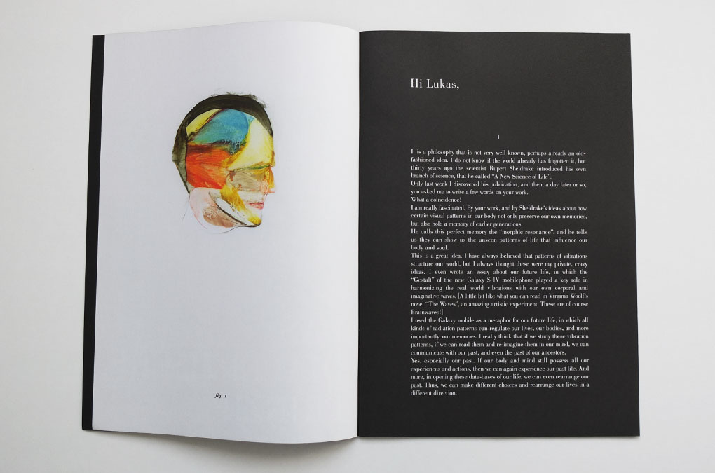
“And then, last week you sent me these reproductions of your work. At seeing these strong, nearly mechanical faces, I first felt uncomfortable. Did I really remember you as I see these faces, open and transparent like in a medical experiment? But then, while I, every day, try to imagine all kinds of vibes to discover my inner ‘morphic resonances’, to discover the patterns of my brainwaves, to see these morphogenetic fields, I suddenly realized how you made contact with me! And, immediately, the connection between you and me was repaired! We do not know each other so well. Six, seven years ago we met in Düsseldorf, where we had a short conversation in a museum. And when we met and talked, we were looking more or less at works of other artists at the wall and in the rooms. But at the same time my body and soul and brains must have built up an image of you, an unconscious image. And now, after all these years, here, your work is the memory of an unrealized insight. My question: these faces here, are these faces examples of the ‘morphic resonances’ of your life? Only asking this question makes it clear that Sheldrake‘s ideas still have a great power and a revealing energy. It feels like I can suddenly understand what Martin Heidegger in his work as the ‘Unverborgene’ (the un-hidden) describes. Here, it is your hidden self that you show us. And of course, Heidegger knew that when this ‘Unverborgene’ is shown, it is like an explosive energy. [And my God, did you ever read Heidegger? If not, you better never do it!]”
Excerpt from Paul Groot, Hi Lukas, published in Lukas Schmenger, Das dialektische Prinzip, Rockenhausen, 2013.
Year: 2013
Language: EN
Specs: 30×21 cm, 20 pages, Colour, Softcover, 2-fold stapled
Editor: Daniel-Henry-Kahnweiler-Stiftung, Stadt Rockenhausen
Artist: Lukas Schmenger
Cover image: Lukas Schmenger
Text Contribution: Paul Groot
Design: Chan-Young Ramert
Print and Binding: Buch- und Offsetdruckerei Häuser, Cologne
Edition of 500 copies
Available at kunstportal-pfalz.de
Project Info
Exhibition keyvisual/Title design and announcement material:
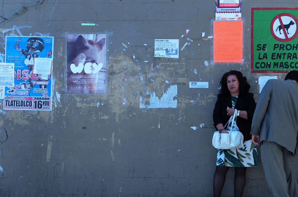
Emanuel Röhss, WEY
Emanuel Röhss, WEY
WEY
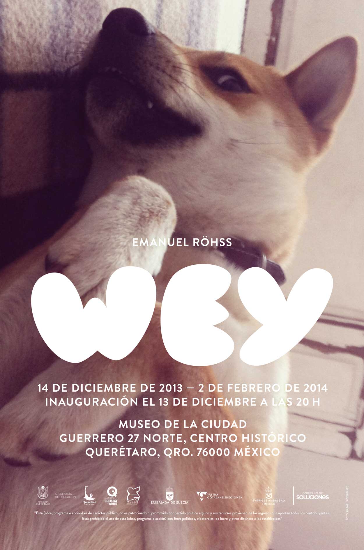
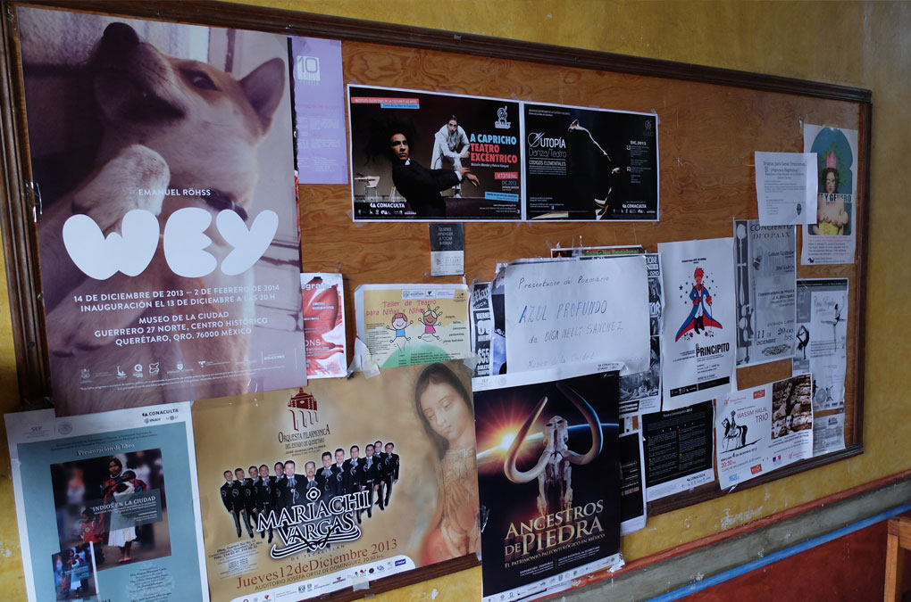
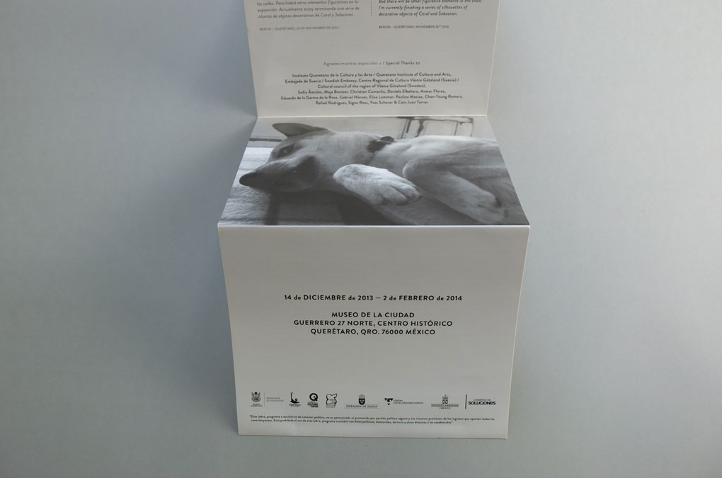
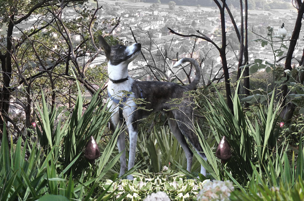
Emanuel Röhss’ solo exhibition and debut in Latin America was presented at the Museo de la Ciudad de Querétaro,(14 December 2013 – 2 Febuary 2014), in the historical center of the capital city of the state of Querétaro, located in central Mexico.
The exhibition title WEY is a word in colloquial Mexican Spanish and commonly used to refer to any person without using his name. Derived from the term buey, the word wey (Spanish pronunciation: [ˈwei]; also spelled güey, guey or we) is nowadays used in a multitude of positive and negative contexts.
Besides a series of large scale abstract paintings, the artist presented some concrete casts of dog sculptures.
One of them has an obvious pop aesthetic and brought a humorous twist to the rest of the show—it is a cast of an inflatable Scooby doo-similar toy.
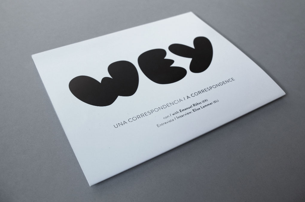
To communicate and to announce the exhibition WEY a keyvisual was developed. The three ‘balloon’ letters for the title are custom designed, with a high recognition value they aim to mirror the humorous pop reference. Together with a photograph of a real dog, the title design was used as a key element for the layout of the poster, print and e-mail invitation, social media, and an accordion flyer. The flyer contains an artist interview conducted by Elise Lammer and an inserted (press) text written by Yves Scherer entitled Notre Dame des Fleurs.
WEY, Poster
WEY, Poster documentation (photo: E. Röhss)
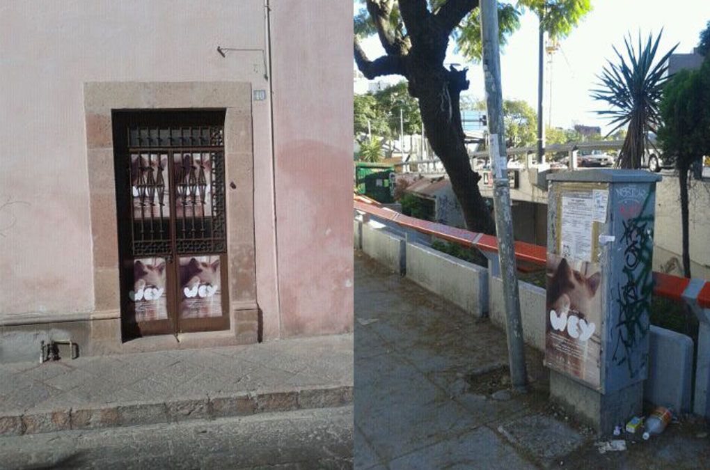
WEY, Poster documentation (photo: E. Röhss)

WEY, Type design

WEY, invitation cards (photo: E. Röhss)
WEY, Accordion (folded)
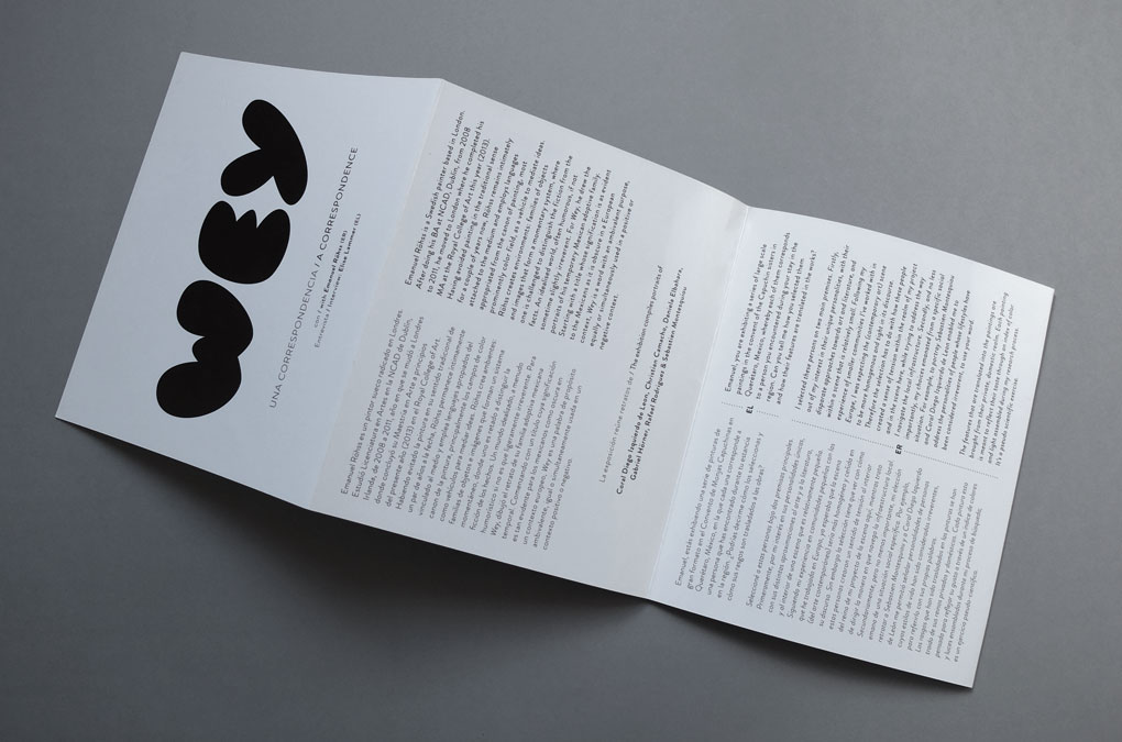
WEY, Accordion (unfolded)
WEY, Accordion (unfolded)
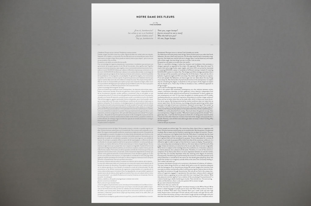
WEY, Yves Scherer, Notre Dame des Fleurs
dummy
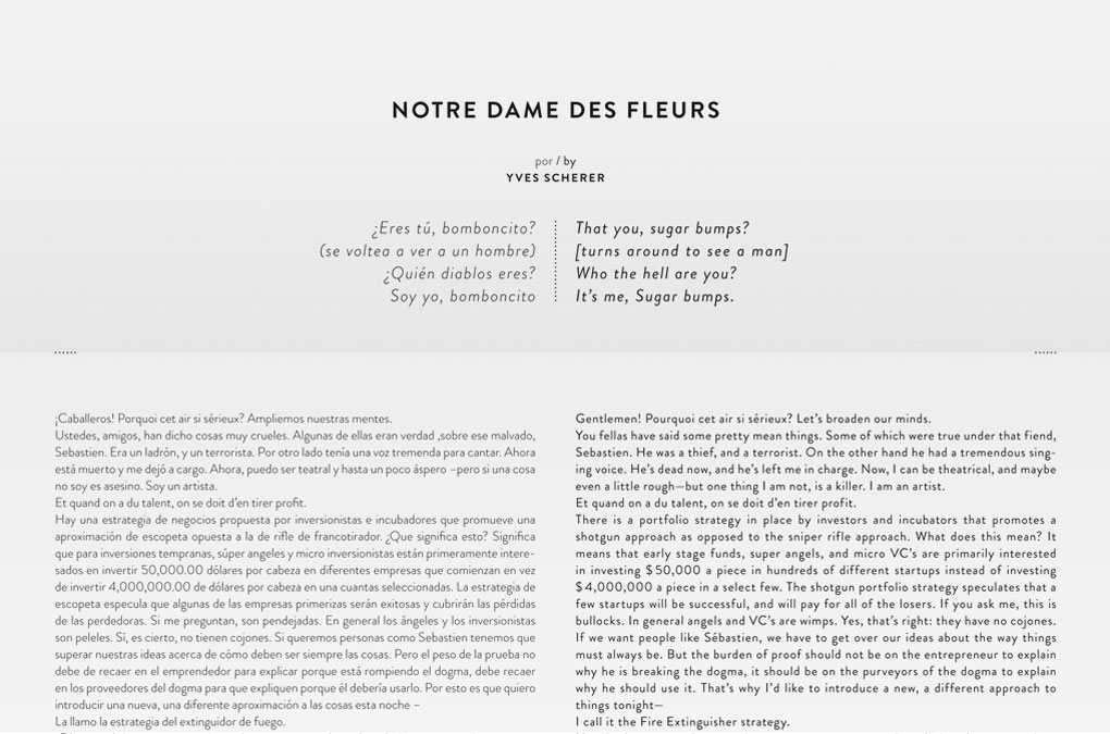
WEY, Yves Scherer, Notre Dame des Fleurs, Detail
WEY, Poster documentation (photo: E. Röhss)
Year: 2014
Language: ES, EN, FR
Art direction and graphic design: Chan-Young Ramert
Keyvisual photography: Rafael Rodriguez
Dog: Aca
Project Info
Artist publication:
Kunsthalle Roveredo
Kunsthalle Roveredo
Kunsthalle Roveredo
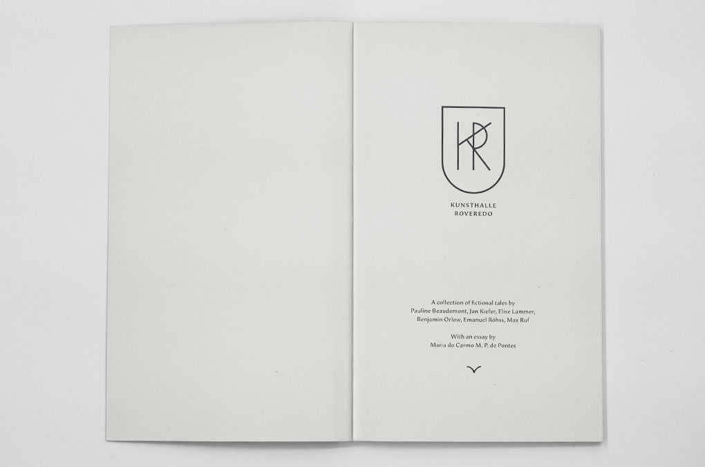
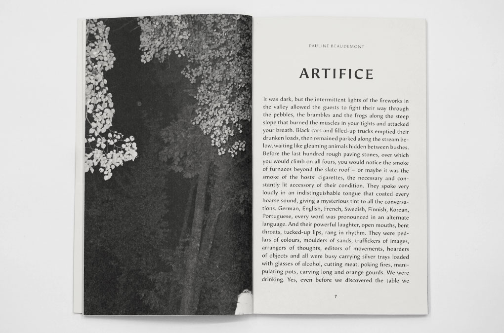
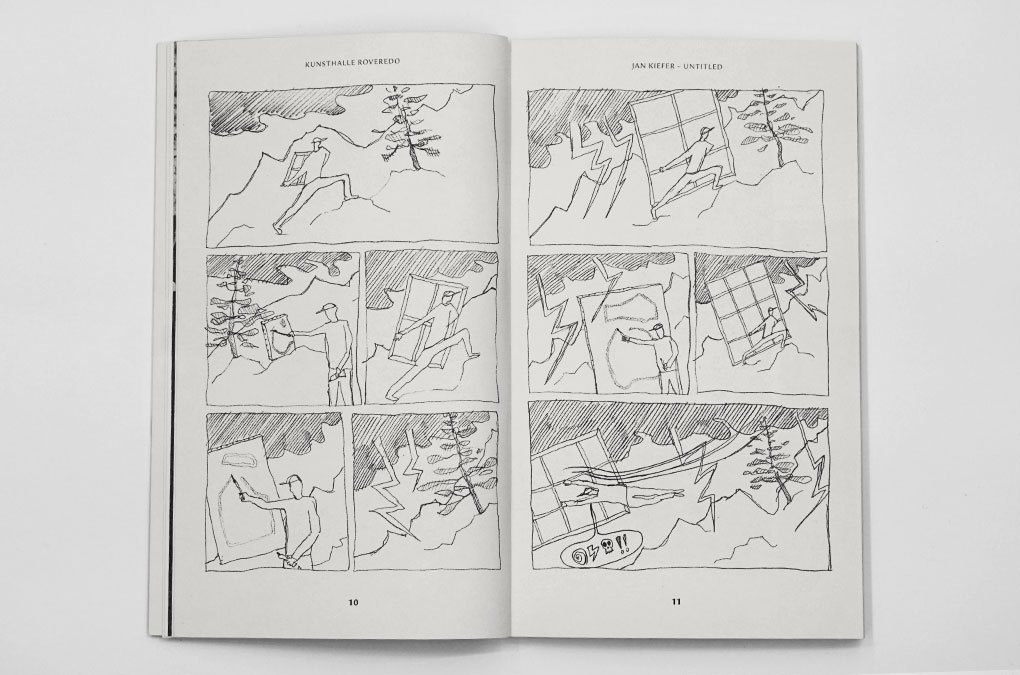
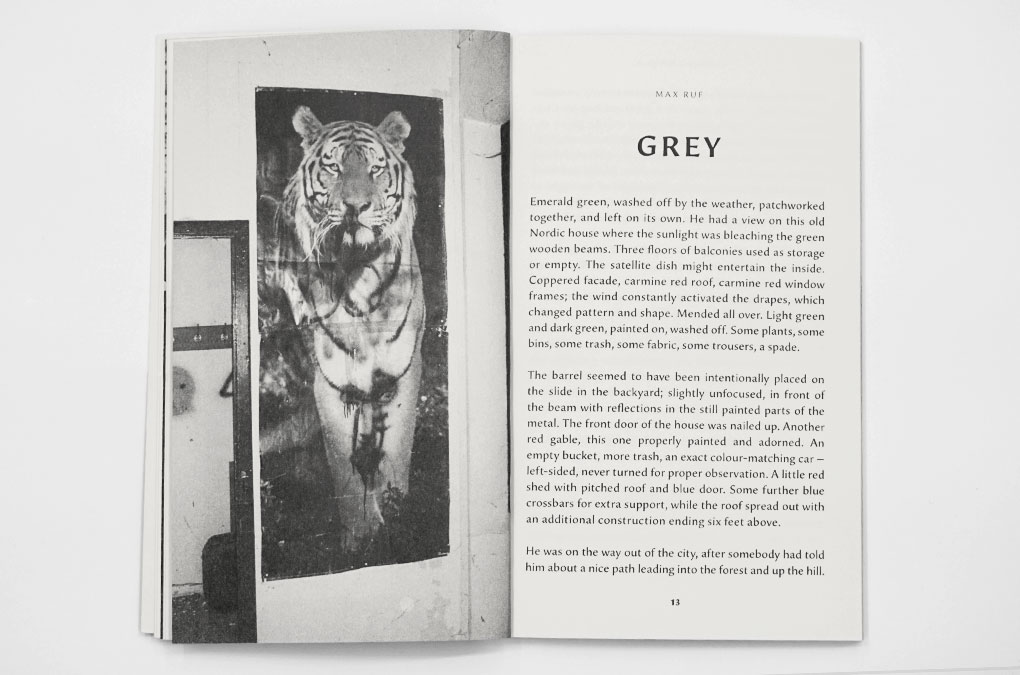
This publication features texts and works by the residents of the first edition of Kunsthalle Roveredo, a residency programme that took place in summer 2013 in Roveredo, Switzerland. A collaged portal on the cover opens up a world of fictional tales written by Pauline Beaudemont, Jan Kiefer, Elise Lammer, Benjamin Orlow, Emanuel Röhss, Max Ruf, and an essay by Maria do Carmo M. P. de Pontes, accompanied by black and white imagery.
“During the summer of 2013, I invited seven international artists and curators, many of whom didn’t know each other from before, to join me at Kunsthalle Roveredo, a week-long residency programme headquartered in a house on the slopes of the Molinera peak, in the canton of Graubünden, Switzerland. The one and only rule guiding the residency was food-related, dictating that two of the residents should pair every evening to provide everyone else’s meal; besides that, no schedule was imposed regarding its outcome. Numerous conversations took place under the wine leaves pergola and, even though the following texts pertain to the realm of fiction, they are rooted in real anecdotes gathered during the programme. Those blurry and poetic accounts translate the atmosphere of hot summer days in the Swiss Alps.”
Excerpt from Elise Lammer, Foreword, published in Kunsthalle Roveredo, 2013
Kunsthalle Roveredo was launched by Edition Taube,
17 December 2013, at Motto Berlin.
Related projects → Kunsthalle Roveredo Logo
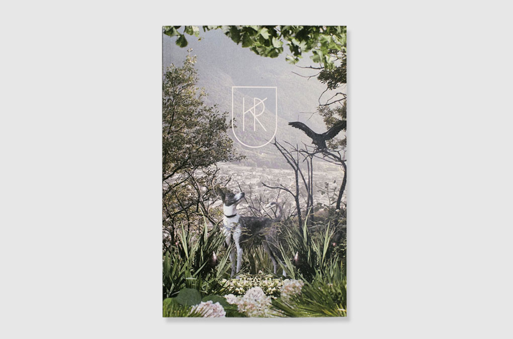
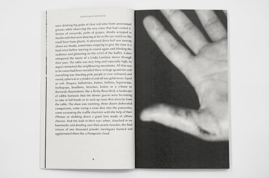
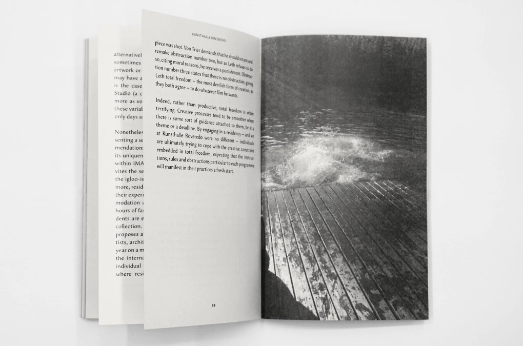
Kunsthalle Roveredo, Cover Collage
Kunsthalle Roveredo, Title Page
Kunsthalle Roveredo, Design/layout example
Kunsthalle Roveredo, Design/layout example
Kunsthalle Roveredo, Design/layout example
Kunsthalle Roveredo, Design/layout example
Kunsthalle Roveredo, Design/layout example
Kunsthalle Roveredo, Design/layout example

Kunsthalle Roveredo, invitation design/layout for the book launch
Kunsthalle Roveredo, Cover Illustration/Collage, Detail
Year: 2013
Language: EN
Specs: 11×17.5 cm, 56 pages, Softcover, Perfect Bound
Publisher: Edition Taube, Stuttgart/Berlin
Editors: Elise Lammer, Maria do Carmo M. P. de Pontes
Copy Editor: Signe Ross
Contributions: Pauline Beaudemont, Jan Kiefer, Elise Lammer,
Benjamin Orlow, Emanuel Röhss, Max Ruf, Mario do Carmo M. P. de Pontes
Cover and Design: Chan-Young Ramert
Photography: Jan Kiefer, Elise Lammer, Chan-Young Ramert, Emanuel Röhss, Max Ruf
Print and Binding: H. Heenemann, Berlin
Edition of 500 copies
ISBN-978-3-9814518-5-6
Available at editiontaube.de
Project Info
Logo design, website, exhibition invite:
Kunsthalle Roveredo
Kunsthalle Roveredo
Kunsthalle Roveredo
Logo design, ‘placeholder’ website and KR exhibition invite for the first edition of the residency programme Kunsthalle Roveredo in 2013.
Hosted and initiated by Elise Lammer Kunsthalle Roveredo “started in the summer 2013 with the aim of providing a space to think, work and live in a community, KR gathers a selection of international artists and curators each year for a week in August.
Located on the slopes of the Molinera peak, in the district of Moësa in the canton of Graubünden in Switzerland, KR offers a remote retreat in an unspoiled place of abundant natural beauty where the residents are invited to generate a new body of work that will later be presented in a partner institution or gallery.
Only accessible by foot, the house sits in the middle of a mountain vineyard and a forest and provides a space to work outdoors, a fully-equipped workshop, as well as an elementary exhibition space located in an old cow shed.”
Text source: KR Website http://www.kunsthalleroveredo.ch/#/
KR, a group exhibition at MJ Gallery, Geneva, 1–28 November 2013, presented works by the artists in residency 2013: Pauline Beaudemont, Jan Kiefer, Benjamin Orlow, Emanuel Röhss, and Max Ruf; curated by Elise Lammer.
Related projects → Kunsthalle Roveredo Publication
Kunsthalle Roveredo, Logo design

KR, Graphic design, Exhibition invite (front), photo: E. Lammer
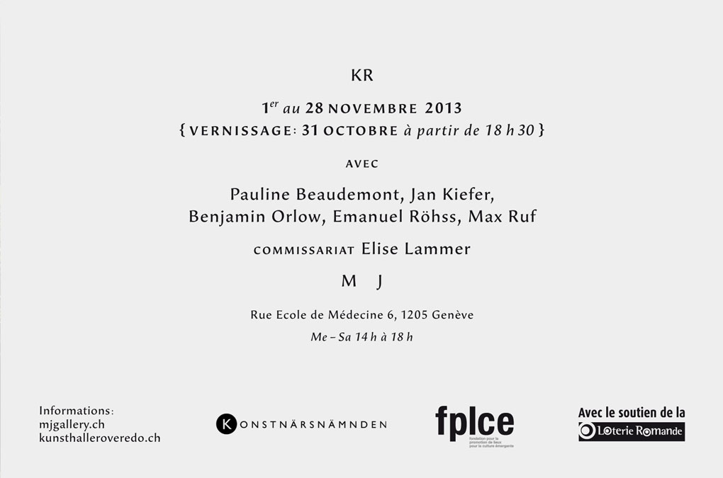
KR, Graphic design, Exhibition invite (backside)
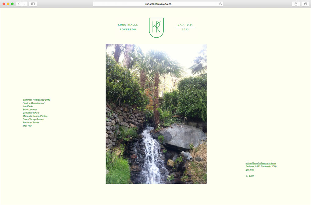
Kunsthalle Roveredo, Webdesign, “Placeholder” website 2013, Screenshot
Year: 2013
Language: EN
Design: Chan-Young Ramert
Language: EN
Design: Chan-Young Ramert
Project Info
Exhibition invitation:
Draft for a particular vision of the future
Draft for a particular vision of the future
Draft for a particular vision of the future
Graphic design for the invitation flyer announcing the exhibition Draft for a particular vision of the future, a group exhibition with Claudia Comte, Jerszy Seymour, and Philipp Timischl, curated by Elise Lammer and Samuel Leuenberger, 19 – 26 September 2013, at Kosmetiksalon Bar Babette, Berlin.
The approach of the design elements related to the graphical ‘zigzag’ structure in Claudia Comte’s site-specific work that immersed the window facade of Kosmetiksalon Babette into bright pink and black. The minimalistic backside of the flyer declared A party (20 September 2013) with Dju Dju B, Ilja Karilampi, DJ Skype, and TCF, hosted by the curators, Autocenter (Berlin), and Shanaynay (Paris). The evening of A party was commenced with the exhibition performance How to lose control by Pedro Wirz.
The approach of the design elements related to the graphical ‘zigzag’ structure in Claudia Comte’s site-specific work that immersed the window facade of Kosmetiksalon Babette into bright pink and black. The minimalistic backside of the flyer declared A party (20 September 2013) with Dju Dju B, Ilja Karilampi, DJ Skype, and TCF, hosted by the curators, Autocenter (Berlin), and Shanaynay (Paris). The evening of A party was commenced with the exhibition performance How to lose control by Pedro Wirz.
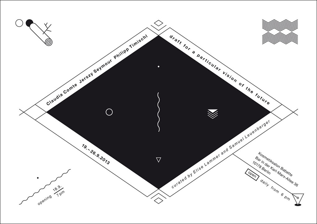
Invitation flyer, Design and Layout
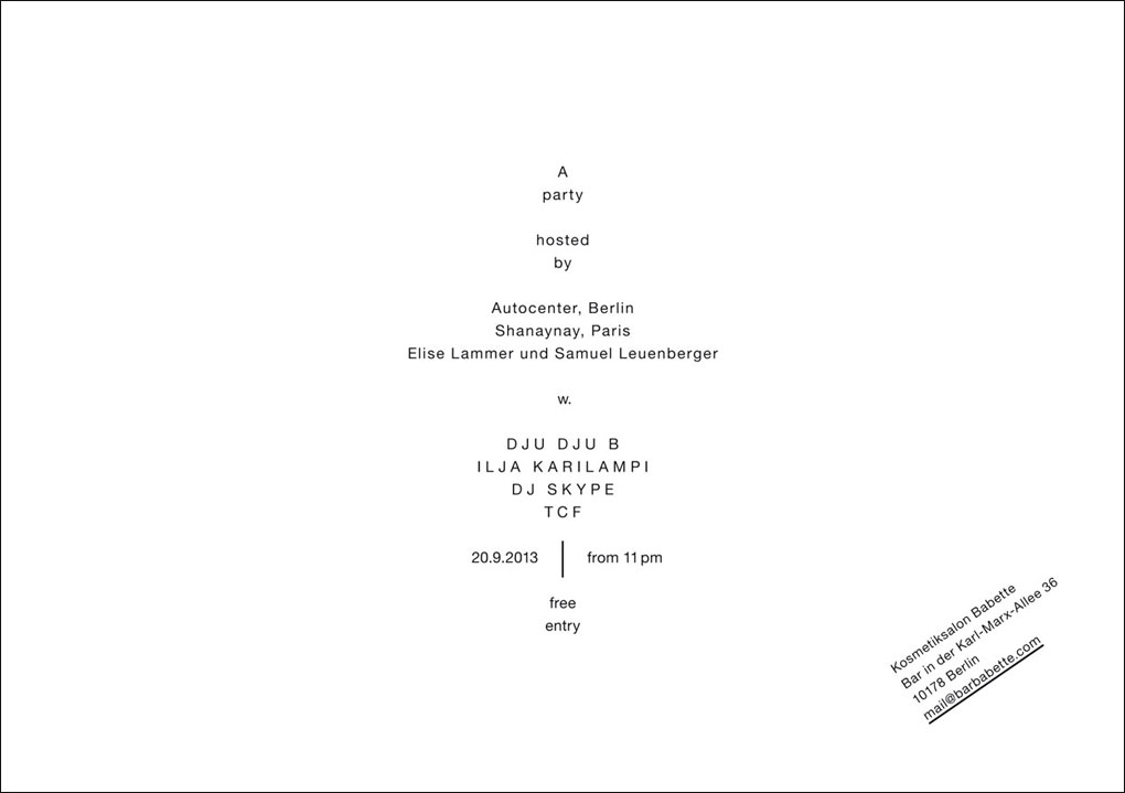
Invitation flyer (retroverso), Design and Layout
“Kosmetiksalon Babette was built in 1962 by a group of architects led by Josef Kaiser. Located at Karl-Marx-Allee 36 (formerly known as Stalinallee), it is part of a greater architectonic ensemble including the adjacent Cafe Moskau and Kino International. The project was part of East Germany’s reconstruction scheme after World War II, and a model of socialist architecture. Although it was first meant to be an exhibition space, the pavilion was used as early as 1965 as a beauty parlour. The reason why its function shifted from displaying art to enhancing human’s appearance is unclear, and mirrors contradicting visions of a certain future…
With the aim to emphasise the character of the building and in order to celebrate its original function as an art pavilion, while embracing its current use as a bar, Draft for a particular vision of the future* is conceived as a site and time-specific display. Only on show during Berlin Art Week, the exhibition brings together works by three artists who were asked to react directly to the architecture of the building. (*Boris Groys, The Loneliness of the Project, 2002)”
Source: https://www.facebook.com/events/200688026776143/
Year: 2013
Language: EN
Graphic design and implementation: Chan-Young Ramert
Project Info
Artist publication:
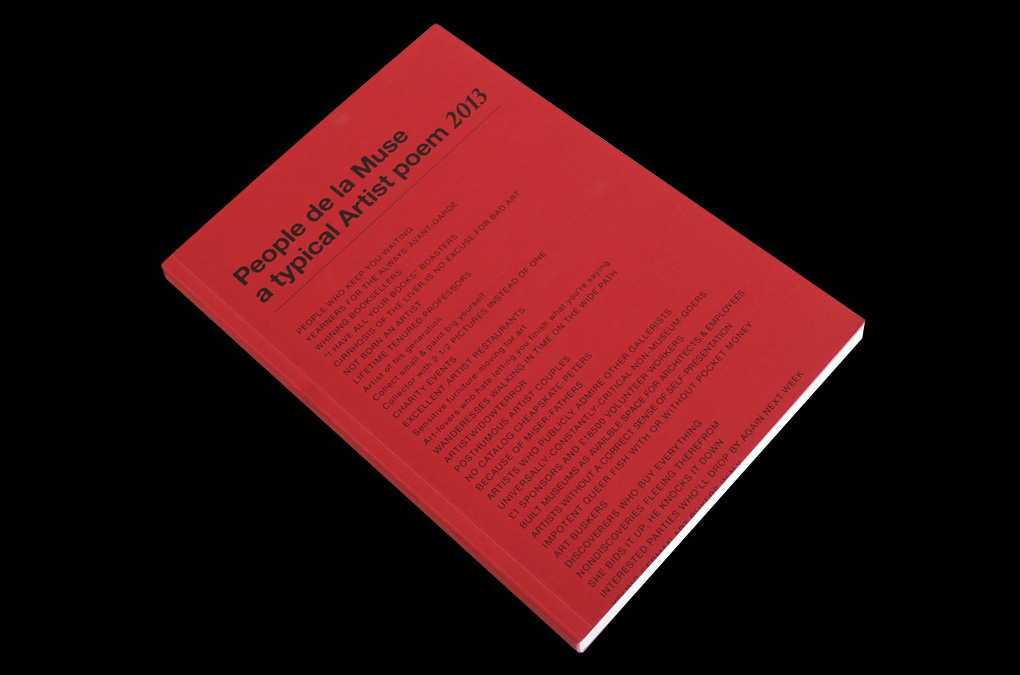
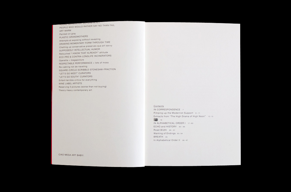
People de la Muse—a typical Artist poem 2013
People de la Muse—a typical Artist poem 2013
People de la Muse
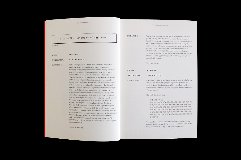
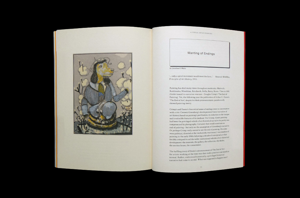
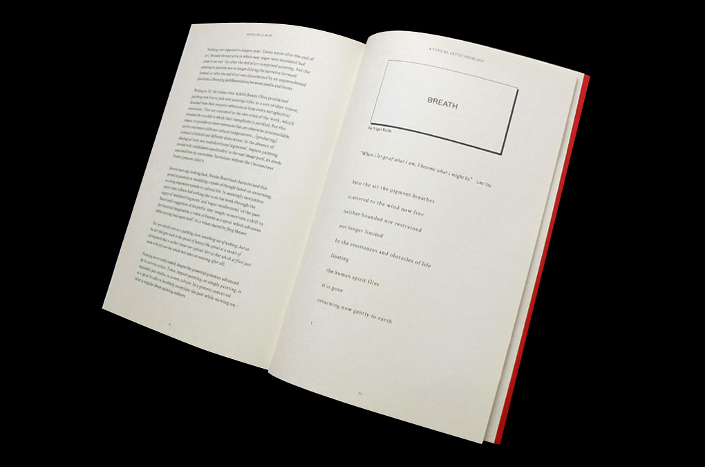
a typical Artist poem 2013
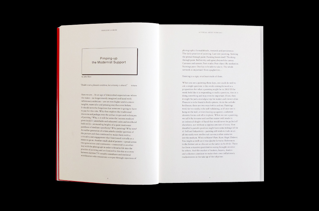
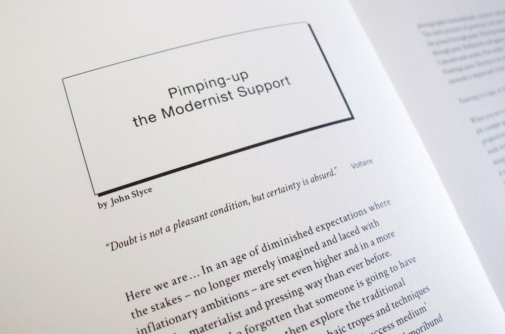
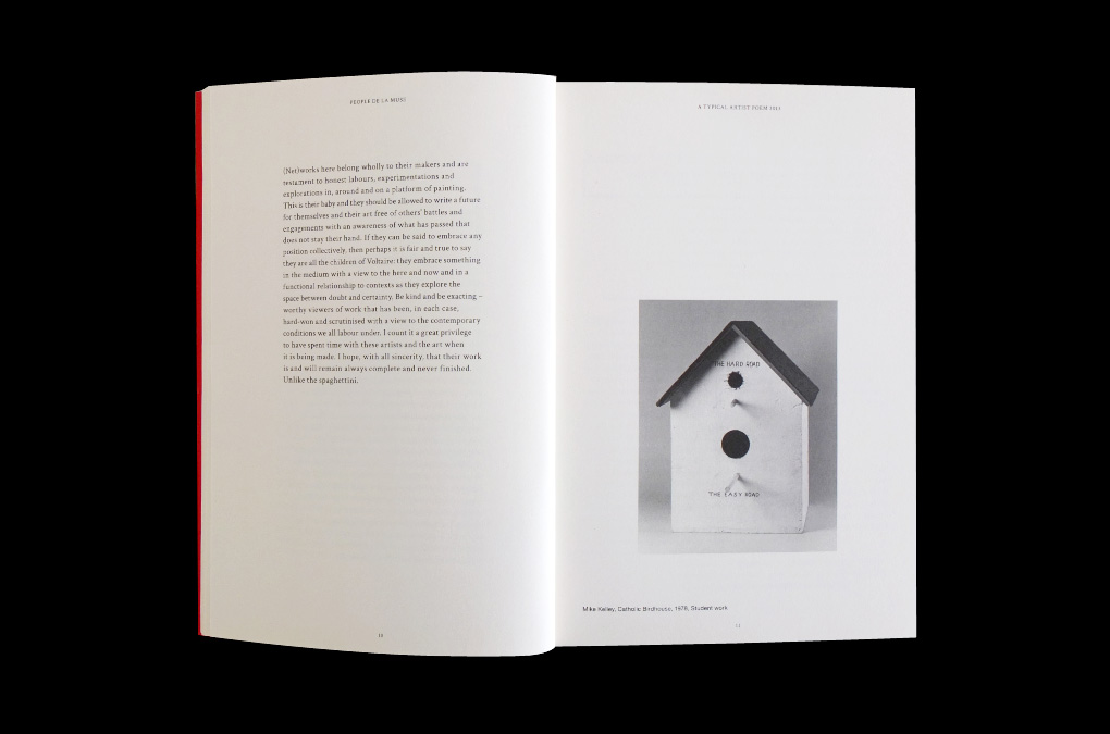
Published by graduating students of the Painting Department 2013, on the occasion of SHOW RCA 2013, 20–30 June 2013, Royal College of Art, London. The content of this publication is neither intended as a documentation of the exhibition nor a catalogue, but suggests a poetic discourse and debate on the meaning of art and painting in 2013.
By virtue of its topicality Martin Kippenberger’s poem People de la Muse—a typical Artist poem is honoured on the cover and simultanously serves (with minimal adjustments applied) as the publication title and credo.
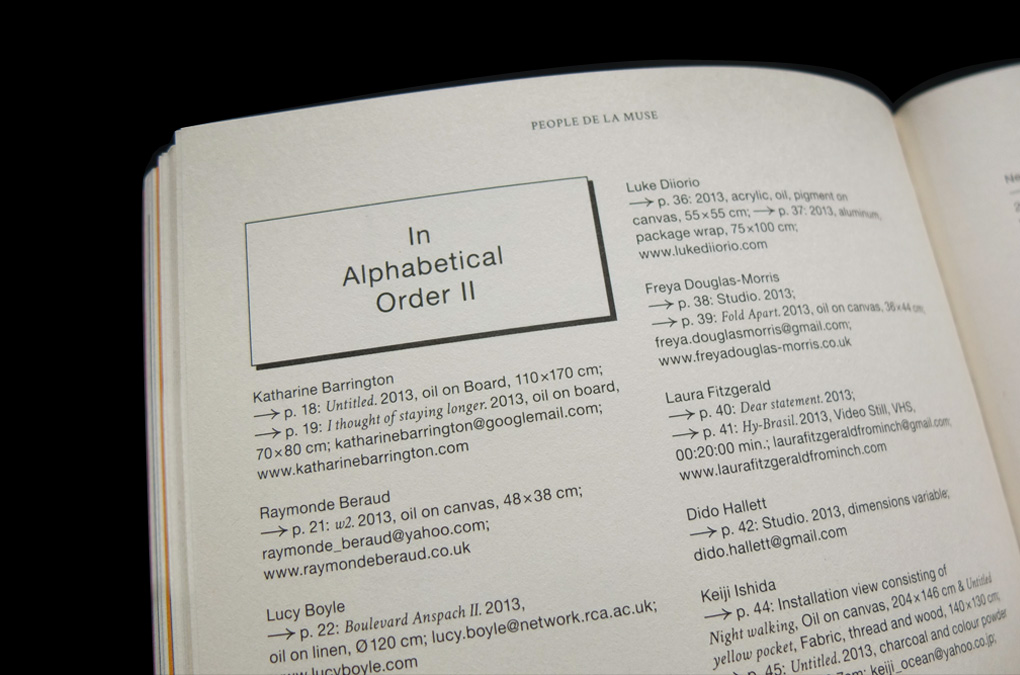
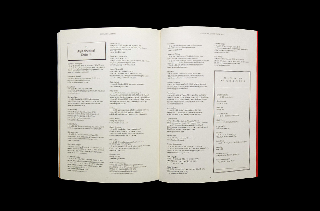
With images/works by: Katharine Barrington, Raymonde Beraud, Lucy Boyle, Benjamin Brett, Jack Brindley, Lucas Clayton, Cristina Cojanu, Emily Jane Cooper, Charlotte Develter, Luke Diiorio, Freya Douglas-Morris, Laura Fitzgerald, Dido Hallett, Keiji Ishida, Milli Jannides, Sarah Jones, Katrin Koskaru, Dalit Leon, Gabriel Lima, Catherine Personage, Neil Raitt, Emanuel Röhss, Max Ruf, Margot Sanders, Tomie Seo, Joshua Sex, Cyrus Shroff, Heidi Smith, Zoe de Soumagnat, Tyra Tingleff, Sanja Todorovic, Timothy Zercie, Lian Zhang
Contributing Writers and Artists: Cristina Cojanu, Sarah Jones, Ian Kiaer, Jonathan Miles, Ruth Noack, Nigel Rolfe, Tai Shani, John Slyce, Neal Tait, Jonathan P. Watts, Richard Wentworth
By virtue of its topicality Martin Kippenberger’s poem People de la Muse—a typical Artist poem is honoured on the cover and simultanously serves (with minimal adjustments applied) as the publication title and credo.
With images/works by: Katharine Barrington, Raymonde Beraud, Lucy Boyle, Benjamin Brett, Jack Brindley, Lucas Clayton, Cristina Cojanu, Emily Jane Cooper, Charlotte Develter, Luke Diiorio, Freya Douglas-Morris, Laura Fitzgerald, Dido Hallett, Keiji Ishida, Milli Jannides, Sarah Jones, Katrin Koskaru, Dalit Leon, Gabriel Lima, Catherine Personage, Neil Raitt, Emanuel Röhss, Max Ruf, Margot Sanders, Tomie Seo, Joshua Sex, Cyrus Shroff, Heidi Smith, Zoe de Soumagnat, Tyra Tingleff, Sanja Todorovic, Timothy Zercie, Lian Zhang
Contributing Writers and Artists: Cristina Cojanu, Sarah Jones, Ian Kiaer, Jonathan Miles, Ruth Noack, Nigel Rolfe, Tai Shani, John Slyce, Neal Tait, Jonathan P. Watts, Richard Wentworth
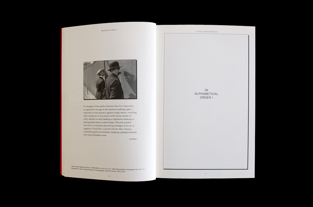
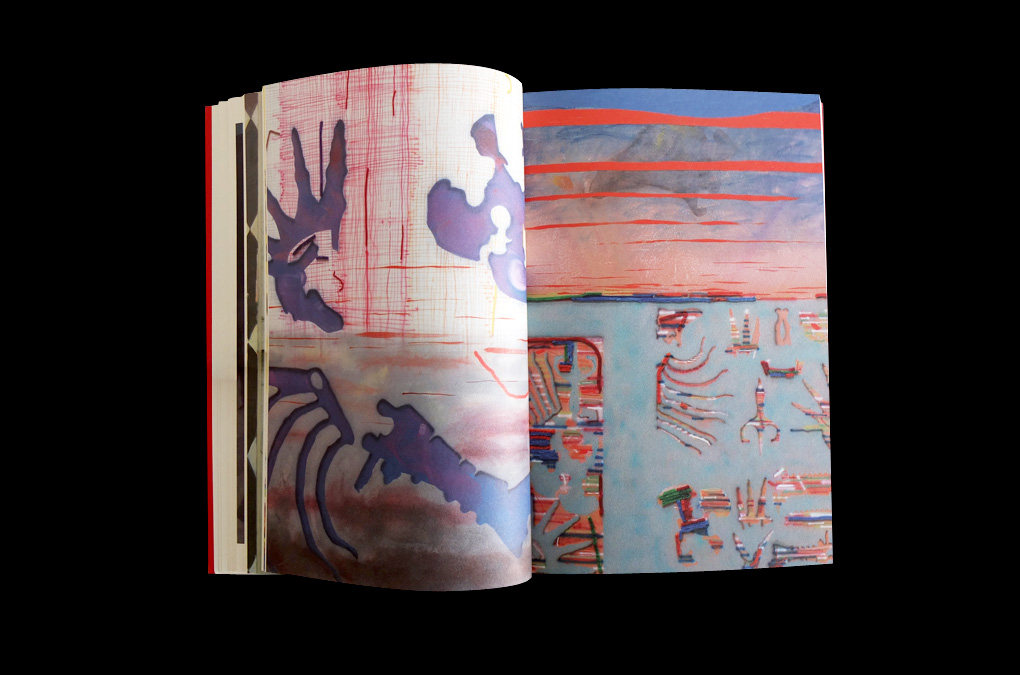
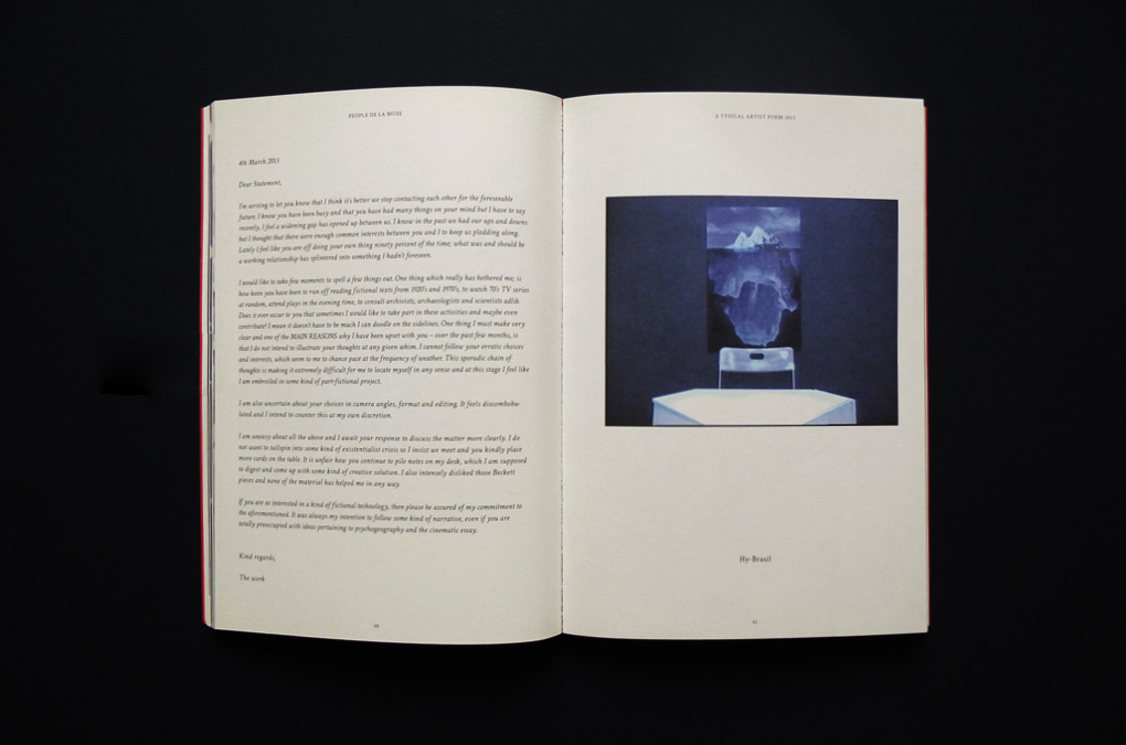
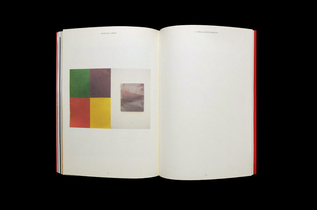
People de la Muse…, Cover design/layout
People de la Muse…, Design/layout, contents
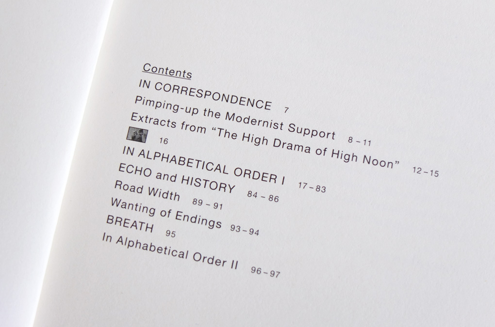
People de la Muse…, Design/layout, contents detail
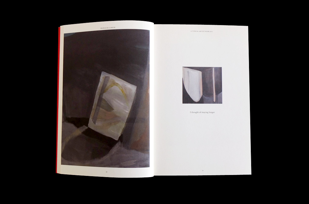
People de la Muse…, Design/layout example
People de la Muse…, Design/layout detail
People de la Muse…, Design/layout example
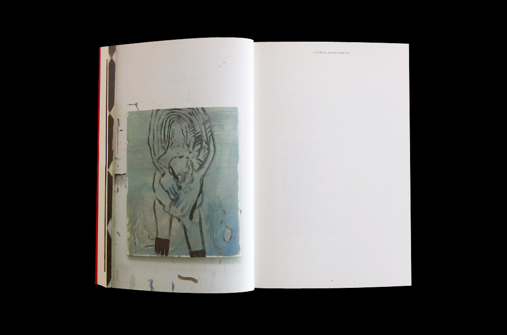
People de la Muse…, Design/layout example
People de la Muse…, Design/layout example
People de la Muse…, Design/layout example
People de la Muse…, Design/layout example
People de la Muse…, Design/layout example
People de la Muse…, Design/layout example
People de la Muse…, Design/layout example
People de la Muse…, Design/layout example
People de la Muse…, Design/layout example
People de la Muse…, Design/layout example
People de la Muse…, Design/layout detail
People de la Muse…, Design/layout example
People de la Muse…, Design/layout cover (backside) detail
Year: 2013
Language: EN
Specs: 14.8×21 cm, 98 pages, Colour, Softcover, Perfect Bound
Coordination: Emanuel Röhss, Max Ruf
Cover and Design: Chan-Young Ramert
Print and Binding: Druckerei Conrad, Berlin
Edition of 1000 copies
Language: EN
Specs: 14.8×21 cm, 98 pages, Colour, Softcover, Perfect Bound
Coordination: Emanuel Röhss, Max Ruf
Cover and Design: Chan-Young Ramert
Print and Binding: Druckerei Conrad, Berlin
Edition of 1000 copies
Project Info
Title Design and Poster:
Zuckerfilm, Wo es weh tut.
Zuckerfilm, Wo es weh tut.
Wo es weh tut.
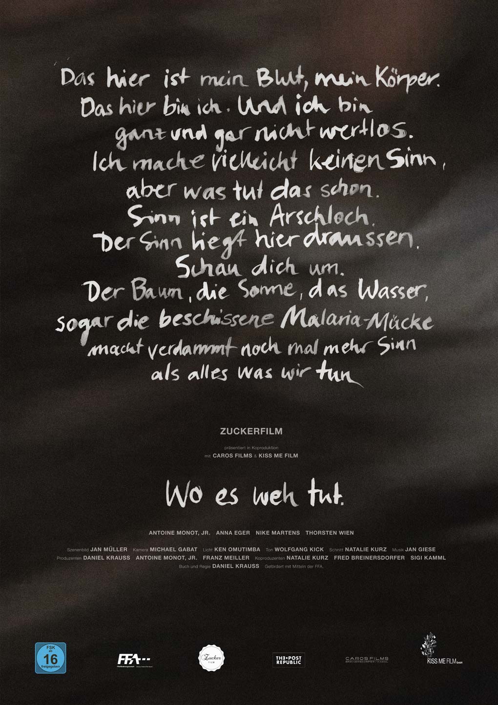
Poster and title design for Zuckerfilm’s motion picture Wo es weh tut (engl.: “Where it hurts”), written and directed by Daniel Krauss. To announce it in independent german cinemas a transcribed scene from the movie was used as the visual for the poster and flyers.
Approximate translation of the poster text:
“That (over here) is my blood, my body. That (over here) is me. And I am not at all worthless. Maybe I don’t make sense, but what makes sense anyways. Sense is an asshole. Sense is lying out here. Look around. The tree, the sun, the water, even the shitty Malaria mosquito makes damn more sense than anything we do”
Year: 2012
Language: DE
Specs: 84.1 × 118.9cm
Design and Title Typography: Chan-Young Ramert
Image: Zuckerfilm, Movie still, Wo es weh tut
Project Info
Type design:
Lastsuper,Light Asylum
Lastsuper,Light Asylum
Light Asylum
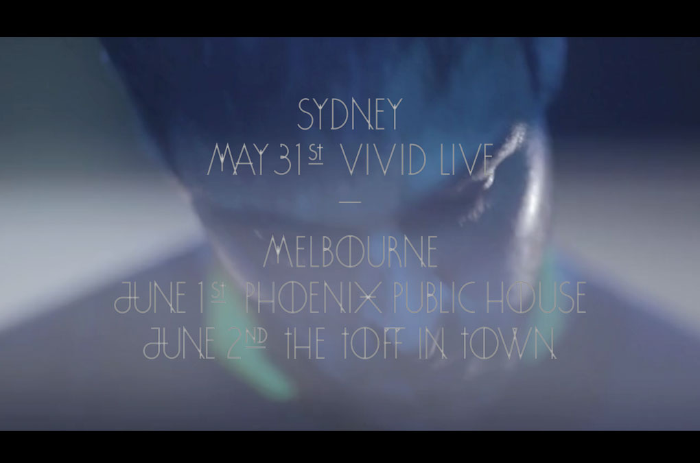
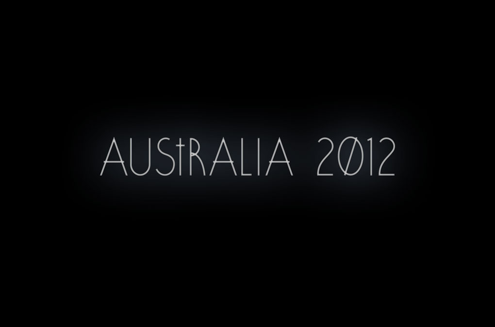
Lastsuper was asked to shoot a teaser for Light Asylum’s Australia tour 2012, so they asked for some title design. Check it out on vimeo.
Screenshot

Letters from A to Z
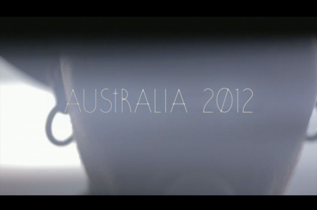
Screenshot
Teaser video made by Lastsuper
Light Asylum Tourdates

Light Asylum Title
Light Asylum Title (2)
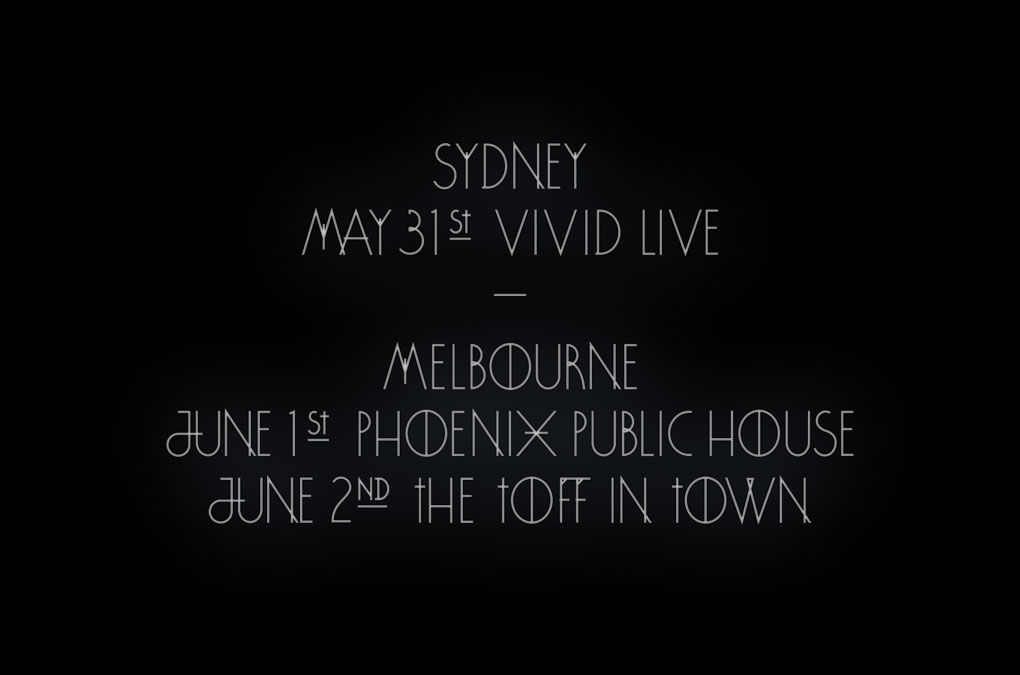
Year: 2012
Language: EN
Featuring and starring: Light Asylum
Directed and Edited by: Lastsuper (Emilia Kurylowicz, Cezary Zacharewicz)
Cinematography: Cezary Zacharewicz
Type design: Chan-Young Ramert
Language: EN
Featuring and starring: Light Asylum
Directed and Edited by: Lastsuper (Emilia Kurylowicz, Cezary Zacharewicz)
Cinematography: Cezary Zacharewicz
Type design: Chan-Young Ramert
Project Info
Artist publication:
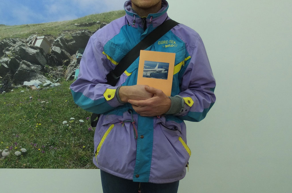
LOT
LOT
LOT
LOT was published on the occasion of the correspondent group exhibition LOT, 22 November–20 December 2012, at Cul de Sac Gallery, London, curated by N/V Projects. It features texts by Michael Birchall, Claire Craig, Elise Lammer, Esperanza Rosales, and Fabian Schöneich, with ‘notes’ on the exhibiting artists: Ane Graff, Jan Kiefer, Max Ruf, Marianne Spurr, and Pedro Wirz.
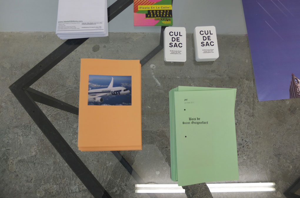
LOT, Documentation
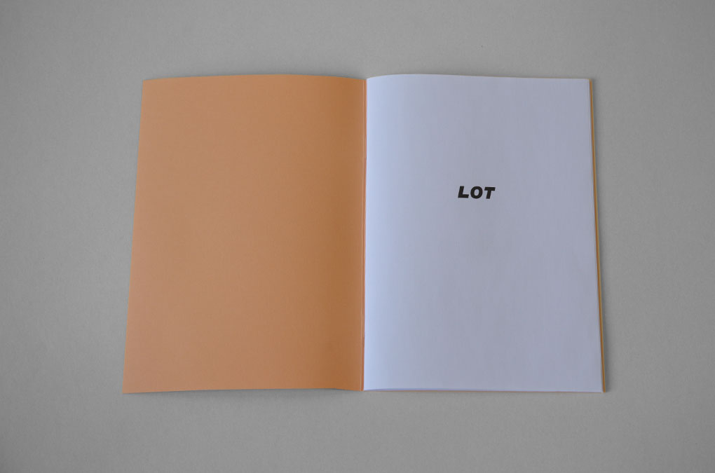
LOT, Design/layout, half title
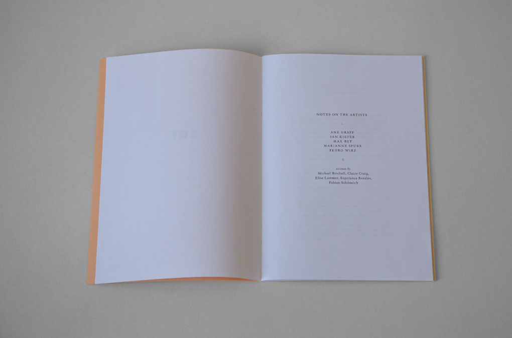
LOT, Design/layout, contents
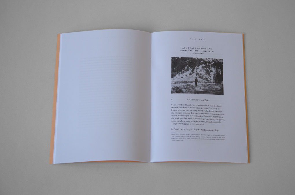
LOT, Design/layout example
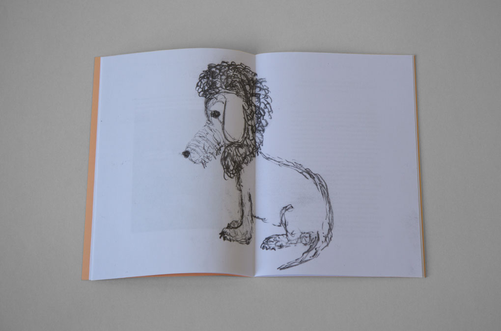
LOT, Design/layout example
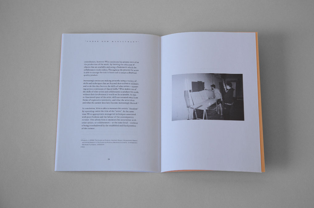
LOT, Design/layout example
LOT, Documentation
Year: 2012
Language: EN
Specs: 14.8 × 21 cm, 32 pages, BW, Softcover, 2-fold stapled, glossy Sticker
Editor: N/V Projects, London
Text Contributions: Michael Birchall, Claire Craig, Elise Lammer, Esperanza Rosales, Fabian Schöneich
Photography: Ane Graff, Thomas Jeppe, Jan Kiefer, Werner Ruf, Marianne Spurr
Print and Binding: Prototyp, Berlin
Edition of 300 copies
Available as a download pdf at culdesacgallery.com
Project Info
Announcement/info material, stationary:
Initiative HOLY WOOD (10,000 trees for Berlin)
Initiative HOLY WOOD (10,000 trees for Berlin)
HOLY WOOD
Design for the HOLY WOOD flyer, “mini”-flyer, stationary, and deed.
HOLY WOOD was the final part of a series of four large-scale public installations enabled by Entega (a provider of sustainable energy), with the aim to draw attention on the problems of climate change. HOLY WOOD was a “Denkanstoss” (engl.: Food/impulse for thought) about the indispensability of the forest and its trees to sustain a balanced ecosystem. Promoted by the Berlinale 2011 a life-sized adaptation of the Hollywood sign was constructed as a video installation in Berlin’s Tiergarten on the occasion of the 61st annual Berlin International Film Festival—a plea and tribute to the tree. The installation was the launch of a fundraising initiative founded with the ambitious goal to plant 10,000 trees: Individual donors were able to “adopt a tree” and fill the vacant tree holes lining Berlin’s streets.
The flyers, stationary and deed were all designed and produced with sustainability in mind, printed on either recycling or treefree paper. To minimize paperwaste the stationary was kept simple and the green logo was applied with a stamp only then when a letter/envelope was actually really needed to be sended out.
Initiative HOLY WOOD, Stationary, deed and “mini”-infoflyer
Initiative HOLY WOOD, Detail, deed
Initiative HOLY WOOD, Stationary, Business cards
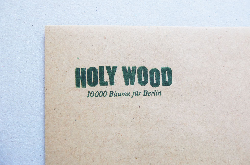
Initiative HOLY WOOD, Detail, stamped envelope

Initiative HOLY WOOD, “Mini”-infoflyer, Cover, folded
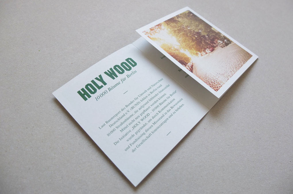
Initiative HOLY WOOD, “Mini”-infoflyer, unfolded

Initiative HOLY WOOD, “Mini”-infoflyer, unfolded
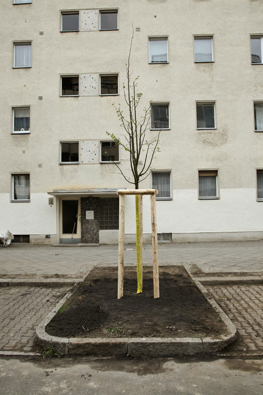
Initiative HOLY WOOD, Documentation of the first planted tree (photo: Marcus Höhn)
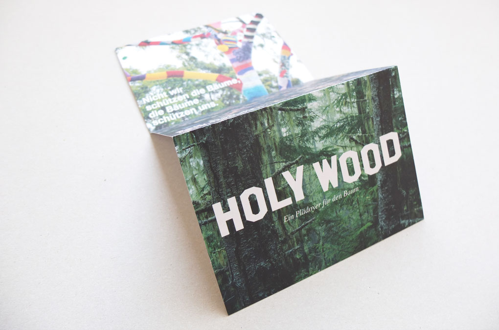
Installation HOLY WOOD, Infoflyer (fanfold), Cover design/layout (side A)
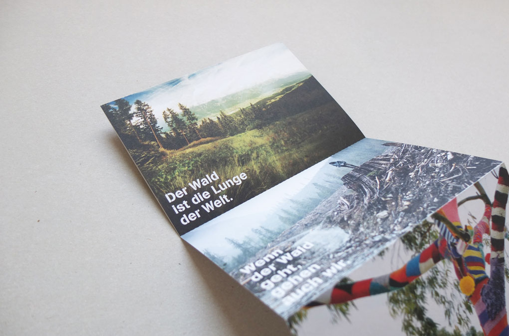
Installation HOLY WOOD, Infoflyer (fanfold), Side A: tributes to the tree, Design/layout example
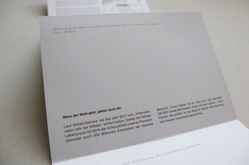
Installation HOLY WOOD, Infoflyer (fanfold), Side B: Informations, Design/layout example

Installation HOLY WOOD, Infoflyer (fanfold), Side B: Installation Info, Design/layout/illustration
Installation HOLY WOOD, Infoflyer (fanfold), Cover design/layout (side B)
Year: 2011
Language: DE
Text: Ludwig Berndl
Design: Chan-Young Ramert
Photo and image contributions (Infoflyer): Andréa Andrade, Denise Litchfield, Steven Miller, Ralf Schmerberg, TJ Watt
Image contribution (“Mini”-flyer): Ludwig Berndl
The installation and initiative HOLY WOOD was conceived under the creative direction of Ludwig Berndl and the artistic direction of Ralf Schmerberg in collaboration with the Mindpirates collective and k2011.
Installation and Opening, HOLY WOOD, Video documentation by Mindpirates
Project Info
Title/Type design:
Fairy Kings — If Trees Could Talk
Fairy Kings — If Trees Could Talk
Fairy Kings — If Trees Could Talk
Title and type design, poster and invitation layout for the documentary Fairy Kings, directed by Sandra Schaede and Robert Kummer, based on an idea by Holger Mayer and Ludwig Berndl. The handmade type characters were supposed to remind on marked trees you can find in the forest. You can watch the full documentary on vimeo.
“Why does a group of respected inuit-elders travel from the top of the world, from Greenland to the rainforest of Amazonia? Why do they want to talk with Indigineous people of Amazonia about trees? How much is a hectare of forest converted into CO2-tonnages? What value does our forest have beyond the prize of its timber? These and other questions are leading the film-team of Fairy Kings through a captivating journey from Greenland to Brazil and across Canada. A roadtrip that contrasts the intuitive view of the indigenous people on the global warming effects with the solution statements of the so-called ‘civilized world’, which tries to get the problem under control with its own immanent, market based, but innovative mechanisms. This film is about the people, who committed themselves to this task, about climate and forestry experts, and the ones who just appeared along the raod. Traditional antagonistic thinking—the natural enmity between economy and ecology becomes here less relevant. Beyond ideological blinder/barriers the whish to find an acceptable, reasonable contribution to one of the most pressing issues of our times: the climate crisis—unifies all involved persons.”
Text source: Sandra Schaede, Trailer — Fairy Kings (https://vimeo.com/98025438)
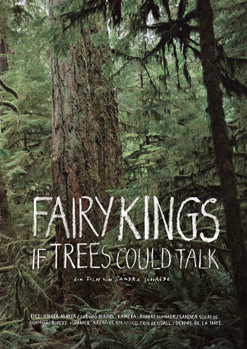
Fairy Kings, Poster and type design
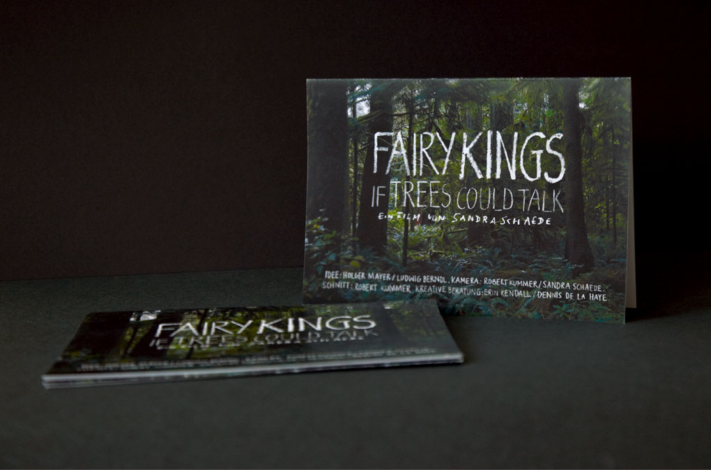
Fairy Kings, Screening Invitation and type design
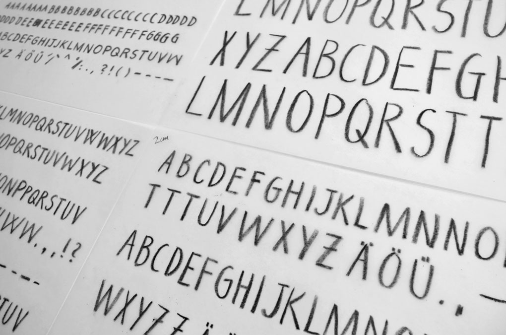
Fairy Kings, Type design
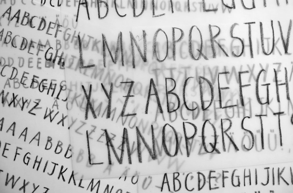
Fairy Kings, Type design
Fairy Kings, Trailer by Sandra Schaede
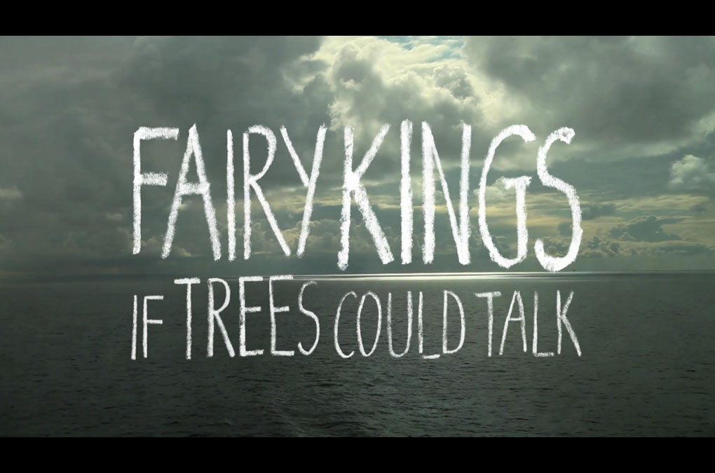
Fairy Kings, Screenshot (full documentary), Title design

Fairy Kings, Screenshot
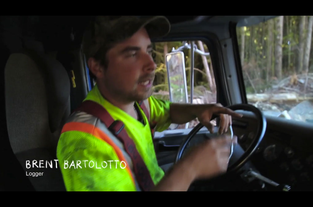
Fairy Kings, Screenshot
Fairy Kings, Screenshot
Fairy Kings, Screenshot
Year: 2011
Language: EN, DE
Type/Poster/Invitation design: Chan-Young Ramert
Photography (Poster & Invitation): Dennis de la Haye
Language: EN, DE
Type/Poster/Invitation design: Chan-Young Ramert
Photography (Poster & Invitation): Dennis de la Haye
Project Info
Selected Desks
2006–2017
2006–2017
Selected Desks
Some working stations starting back in the year 2006…
Selected Desks, 2006, Trier (Working on the diploma for visual communication)
Selected Desks, 2008, Moscow (Working for TBWA Moscow)
Selected Desks, 2010, Berlin (Working for DDB Berlin)
Selected Desks, 2011, Oyambre, Spain (Working on a road trip)
Selected Desks, 2013, Hackescher Markt, Berlin (Last day of working with k2011–k2013)
Selected Desks, 2014, São Paulo, Brazil (Working for the Postcodes project)